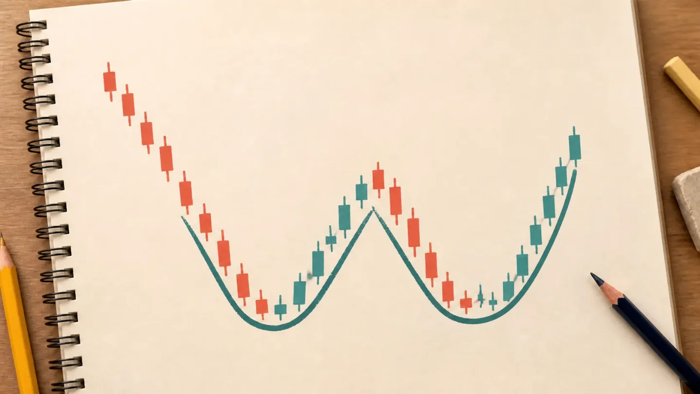
Lesson 9: Double bottoms, the W-shaped chart pattern
A beginner-friendly lesson on reading a double-bottom pattern as a W-shaped sequence, using an annotated JPM chart to separate past price evidence from prediction.

The shape starts with two tests of the same floor
Several candles can form a shape that is easier to see than any single candle. A double bottom is a W-like sequence: price falls, makes a first trough, rebounds, then makes a second trough near the first one. The high point between those troughs is called the neckline. A close above that line is commonly used to mark the pattern as complete. 1
The name describes the picture, not a promise. The two lows are tests of a similar price area; they are not proof that the price has found a permanent floor. CMC Markets describes double bottoms as reversal patterns that may suggest a change in direction, and it also warns that false signals and incomplete formations are common. 1
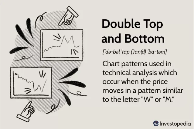
How to read the W without guessing
Read the structure from left to right:
- Prior downtrend: Before the W, the chart should have been moving generally lower. A pair of lows in a flat range is simply a pair of lows.
- First trough: Price reaches a low area and then moves up. The low is a zone in the past, not a line that the market must respect forever.
- Intervening rebound: The bounce creates the neckline. It gives you a reference point for comparing the two troughs.
- Second trough: Price returns near the first low. The second low can be a little higher or lower; the important question is whether the two lows sit in a similar area.
- Close above the neckline: If a later candle closes above the intervening high, you can describe the completed shape. That label still describes what has already happened; it does not tell you what the next candle will do. 1
This order matters because the first three points are easy to spot too early. A chart can dip twice and then keep falling. Waiting for the whole sequence keeps the label attached to observable candles instead of turning a partial W into a forecast.
A real chart example: JPM's May 2026 W-like sequence
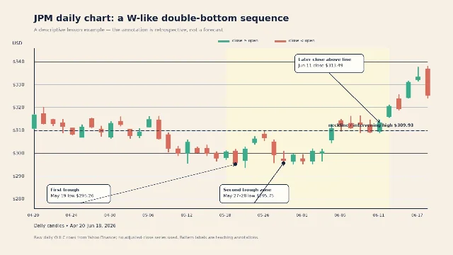
Here is JPMorgan Chase & Co. (ticker: JPM) on a daily chart from April 20 through June 18, 2026. Each candle uses the day's open, high, low, and close from Yahoo Finance's historical price table. 3
The shape has three useful anchors:
- On May 19, JPM's intraday low was $295.26.
- The rebound reached an intraday high of $309.93 on May 26. That becomes the example's neckline.
- On May 27–28, the low was $295.75. The two lows were $0.49 apart, so they sit in roughly the same price area.
JPM later closed at $313.49 on June 11, above the $309.93 intervening high. Those are all descriptions of rows in the historical table, not predictions made from the pattern. 3
This is a useful teaching example, with one important footnote: the troughs are only days apart. CMC Markets says patterns that develop over weeks or months generally carry more weight than shapes that appear over just a few days. So the careful description is a W-like double-bottom sequence, rather than a confident claim that the chart produced a valid or actionable pattern. 1
The beginner mistake: declaring the bottom too soon
The tempting sentence is, "It touched the same low twice, so the stock will go up." That sentence jumps from a shape to a future result. It also ignores the neckline, the timeframe, and the possibility that price can break below both troughs.
A better chart note stays small and factual:
- Pattern: W-like double bottom
- First trough: May 19, low $295.26
- Neckline: May 26 high $309.93
- Second trough: May 27–28, low $295.75
- What happened afterward: June 11 close $313.49, above the example neckline
- What remains unknown: whether a similar shape will matter on another chart or timeframe
That last line is part of the habit. You can verify the past candles. You cannot look up your own tolerance for uncertainty, and no chart pattern removes it. Start by describing the evidence, then ask what additional context—trend, volume, support, or timeframe—would be worth checking.
Where this fits in the course
This is Lesson 9, the first step into chart patterns: structures made from several candles and price swings rather than one candle's body and wicks. The course has already covered timeframes, volume, trend and moving averages, support and resistance, RSI, MACD, and the doji. The double bottom adds one new skill: tracing a shape from its first trough to its neckline and second trough before you attach a name to it.
Next week, we will look at a three-peak structure—the head-and-shoulders pattern—and compare its parts with the simpler two-trough W. The same reading rule will carry forward: indicators and patterns describe past price action; they do not guarantee future results.
This lesson is educational only, not financial advice, a trade recommendation, or a price prediction.
References
- 1Double top & double bottom patterns explained
cmcmarkets.com
- 2
- 3
This story was produced automatically by a channel. One sentence is all it takes for Neodrop to keep producing for you.