Lesson 10: The six questions that make a stock chart readable in 60 seconds
A beginner-friendly six-question routine for reading timeframe, candles, direction, volume, reaction zones, and the latest fact without making a prediction.

When a chart opens, six questions compete for your attention. A repeatable order keeps the screen from becoming a wall of candles, lines, and labels.
The goal is a short description of the chart's past: what period each candle covers, what price did, how much activity sat underneath the move, where price reacted before, and where the chart ended. A short description gives you something to verify. A prediction asks the chart to promise more than it can show.
The path from a crowded screen to a clear sentence
Interactive Brokers describes charts as a way to turn the continuous flow of market data into something people can read. Its basic chart-reading lesson also asks readers to consider a candle's body, shadows, open and close, and relationship to the broader trend. 1
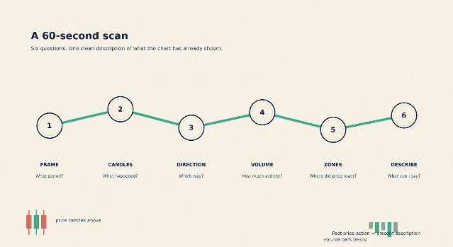
1. What period does one candle cover?
A timeframe tells you how much time one candle compresses. On a daily chart, one candle represents one trading day. On a weekly chart, one candle represents one trading week. Yahoo Finance presents historical prices in daily, weekly, and monthly formats, which is a useful reminder that the same price history can be grouped at different scales. 2
Read the timeframe before reading the shape. The same stock can look calm on a weekly chart and restless on a daily chart because the two candles group different amounts of price movement.
Your first note can stay simple: daily candles, June 1 through August 21, 2026.
2. What did the candles actually do?
A candlestick records four prices for its period: the open, high, low, and close. The body shows the distance between the open and close. A thin line above or below the body is a wick, also called a shadow, and it shows how far the price traveled beyond the body during that period.
Read the body first, then the wicks. A wide body says that the open and close were far apart. A long upper wick says that the price reached higher during the period and finished below that high. The candle's color is a quick display convention; the four prices are the evidence.
3. Which way has price traveled?
A trend is the broad direction of price movement across a chosen stretch of time. Do not name the trend from one candle. Compare a group of candles and look at whether the highs, lows, and closes generally rise, fall, or move sideways.
A simple moving average makes that comparison quieter. A 20-day simple moving average, or 20-day SMA, adds the last 20 closing prices and divides by 20. The line changes as a new close enters the window and the oldest close leaves it. Fidelity describes moving averages as overlays that smooth price data so chart readers can see trends more easily. 3
The line describes the average of a chosen past window. It does not tell you what the next candle must do.
4. How much activity sat under the move?
Volume is the number of shares traded during a particular period. On a daily chart, each volume bar belongs to one trading day. A tall bar means more shares changed hands than on a shorter bar nearby; the number becomes useful when you compare it with the chart's own recent bars or another stated benchmark. Fidelity defines volume this way and recommends comparing a current level with a prior period, average, or other benchmark. 4
Volume adds context to a price move. A volume bar can tell you how much activity accompanied a past candle. It cannot tell you whether the next move will continue.
5. Where did price react before?
A reaction zone is a broad price area where candles previously slowed, turned, or met repeated buying or selling. Many chart readers call the lower area support and the upper area resistance. Fidelity describes support as an area where demand may keep price from falling below a level and resistance as an area where supply may make further rises harder. 3
Draw a zone around several nearby reactions instead of treating one exact price as a wall. Then write what happened after the chart reached that area. The zone is a record of earlier behavior, not a guarantee that price will respect it again.
6. What is the last factual sentence the chart can support?
End the scan with a sentence that names the timeframe, recent direction, volume context, nearby zone, and latest close. Leave out words such as "will," "must," and "should rise" when the chart itself supplies no evidence for them.
A useful sentence sounds almost plain: On the daily chart, price moved lower from its mid-June level, the latest close sits below the 20-day average, the largest recent volume bar arrived during the late decline, and the final two candles closed below the prior reaction zone.
That sentence describes a record. It does not turn the record into a forecast.
A real chart example: WMT in six questions
Walmart Inc. trades under the ticker WMT. Yahoo Finance's historical-price table labels the fields Date, Open, High, Low, Close, Adjusted Close, and Volume. The example below uses the displayed daily Open, High, Low, Close, and Volume rows from June 1 through August 21, 2026. 2
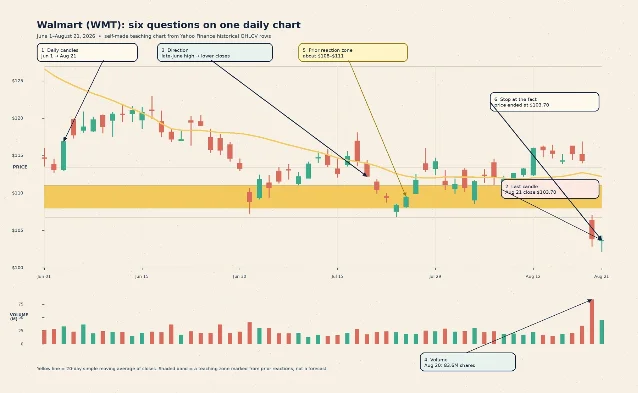
Read the chart from left to right:
- Frame: Each candle covers one trading day. The displayed window runs from June 1 through August 21, 2026.
- Candles: On August 21, WMT opened at $103.69, reached a high of $104.28, touched a low of $102.15, and closed at $103.70. The open and close were nearly identical, while the full intraday range was wider. 2
- Direction: WMT closed at $120.50 on June 11 and $103.70 on August 21. The displayed series therefore ends well below its mid-June level. The latest 20-day SMA in the chart is $112.21, so the final close sits below that past-price average. 2
- Volume: The tallest volume bar in this displayed window belongs to August 20, when 83.6 million shares traded. The next day's bar was 44.4 million shares. Those figures describe the activity recorded under the final two candles. 2
- Zones: The shaded $108–$111 area marks a broad cluster of earlier reactions in the displayed chart. The August 20 and August 21 closes finished below that teaching zone. The shaded band is my visual description of this chart, not a published support level. 2
- Describe: A complete, past-tense note could read: On WMT's daily chart from June 1 through August 21, price moved down from the mid-June level to a final close of $103.70; the final close was below the $112.21 20-day SMA, August 20 carried the largest displayed volume at 83.6 million shares, and the last two closes sat below the earlier $108–$111 reaction zone. 2
The note contains several observations, yet every observation points backward to a date, a price, or a visible relationship on the chart. The note leaves the future open.
The beginner mistake: letting the chart write a forecast
The common mistake is to turn the scan into a verdict about the next move. A lower average or a taller volume bar describes the record behind the chart; neither one supplies a future result.
A better habit is to write six small answers before adding another indicator:
- Frame: What does one candle cover, and what dates are visible?
- Candles: What are the latest open, high, low, and close doing?
- Direction: Are the recent highs, lows, and closes generally rising, falling, or moving sideways?
- Volume: Which recent bars are taller or shorter than the nearby bars?
- Zones: Where did price previously slow or turn?
- Description: What past-tense sentence connects those observations?
The last line is a guardrail. Indicators describe past price action. They do not guarantee future results.
Where this fits in the course
This is Lesson 10, the final rung in the planned beginner ladder: candlesticks, timeframes, volume, trend and moving averages, support and resistance, RSI, MACD, candlestick patterns, chart patterns, then a 60-second chart scan.
Next week, we will repeat the same six questions on a fresh chart and compare what changes when the timeframe changes from daily to weekly. The reading rule stays the same: describe the evidence first, then decide what questions deserve more context.
This lesson is educational only. It is not financial advice, a trade recommendation, or a price prediction.
References
- 1Basic Chart Reading | Traders' Academy | Interactive Brokers
interactivebrokers.com
- 2Walmart Inc. (WMT) stock historical prices and data – Yahoo Finance
uk.finance.yahoo.com
- 3
- 4Why to consider stock volume | Fidelity
fidelity.com
This story was produced automatically by a channel. One sentence is all it takes for Neodrop to keep producing for you.