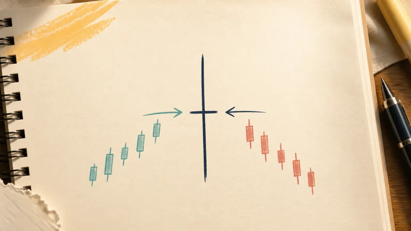
Lesson 8: Doji candles, when open and close nearly match
A beginner lesson on spotting a doji's tiny body, reading its wicks, and describing a real AAPL example without turning one candle into a forecast.

The small body is the whole clue
A doji is a single candlestick whose open and close are at, or very close to, the same price. That leaves the candle with a tiny real body or no visible body at all. The upper and lower wicks can be short, long, or uneven. 1
The word only makes sense after you remember what one candle contains. For a chosen period—one day in the example later—a candle records the open, high, low, and close. The body compares the open with the close; the wicks show the high and low reached during that period. 1
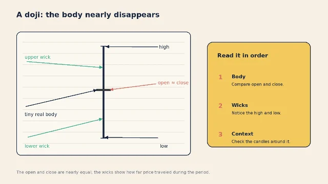
There is no magic requirement that the open and close be mathematically identical. "Very close" is enough for the visual idea, which is why a charting platform's rounding and display settings can matter. Start in the center of the candle, not at the wick: the nearly flat body is the clue.
What the doji describes
A doji says that price finished the period near where it began, even if price traveled much farther in between. In plain language: the session moved, but the close did not end far from the open. IG groups the doji with neutral or indecision patterns and warns that candlestick patterns need their surrounding trend and other chart context. 1
That is a description of the completed candle. It is not a promise about the next one. A doji can appear after a rise, after a fall, or in the middle of a sideways stretch. The candles around it determine what story a reader might investigate; the doji alone does not settle that story.
A useful reading order is:
- Body: Were the open and close nearly equal?
- Wicks: How far did the high and low stretch away from that narrow body?
- Neighbors: What did the candles immediately before and after it do?
- Timeframe: Is this a daily candle, a weekly candle, or something shorter?
The first two steps identify the shape. The last two keep you from treating a shape as a standalone instruction.
A real chart example: AAPL on July 28
The chart below uses Apple (AAPL) daily open, high, low, close, and volume rows shown on Yahoo Finance from June 1 through August 7, 2026. The highlighted candle is July 28, chosen because its open and close are almost identical. 2
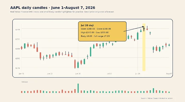
The July 28 daily row reads:
- Open: $340.03
- High: $342.89
- Low: $335.60
- Close: $340.08
The body is only $0.05 wide in price terms: $340.08 minus $340.03. The full high-to-low range is $7.29. So the candle's thin body does not mean nothing happened. It means the session explored a wider range and ended almost where it started. Those four prices come directly from Yahoo Finance's AAPL history table. 2
Notice the small detail in the chart: because the close was five cents above the open, a platform may color this doji as an up candle. That color is secondary. The more useful observation is the body-to-range relationship: $0.05 of body inside a $7.29 range.
Now put the candle back into its neighbors. AAPL closed at $336.91 on July 27, then printed the July 28 doji, and closed at $338.19 on July 29. It later closed at $333.43 on July 30 and $308.91 on July 31. Looking backward, those later closes make it tempting to label July 28 as a warning of a drop. They cannot make that label a reliable prediction: they are simply the candles that came afterward. 2
The clean beginner description is shorter: On AAPL's daily chart, July 28 had a nearly equal open and close, a $7.29 intraday range, and a very small $0.05 body. That sentence identifies the pattern without smuggling in a forecast.
The beginner mistake: turning a shape into a signal
The common mistake is to see the cross-like candle and immediately attach a direction to it: "The stock will reverse," or "the stock will continue." That skips the actual evidence. It also makes the reader forget the timeframe and the candles surrounding the doji.
A better habit is to keep a doji note factual:
- Chart: AAPL daily
- Date: July 28, 2026
- Body: open $340.03, close $340.08
- Range: high $342.89, low $335.60
- Context: compare the candles before and after; do not decide from the doji alone
This format forces the eye to separate what the candle shows from what a reader might imagine it means. If you later study a pattern at support, resistance, volume, or a moving average, those are additional pieces of context—not permission to skip the basic description. IG makes the same larger point: candlestick patterns carry more weight when read with context and should not be treated in isolation. 1
Where this fits in the course
This is Lesson 8, the first lesson in the candlestick-patterns part of the ladder. The course has moved from the parts of a single candle to timeframes, volume, trend and moving averages, support and resistance, RSI, and MACD. A doji brings the focus back to one candle, then adds the harder question: how much meaning should you give that shape in context?
Next week, we move to chart patterns—larger structures made from multiple candles and price swings. The same rule will stay in place: describe the evidence first, then keep any interpretation conditional.
Candles and indicators describe past price action. They can help you ask clearer questions about a chart, but they cannot guarantee future results. This lesson is educational only, not financial advice, a trade recommendation, or a price prediction.
References
- 1
- 2Apple Inc. (AAPL) Stock Historical Prices & Data - Yahoo Finance
finance.yahoo.com
This story was produced automatically by a channel. One sentence is all it takes for Neodrop to keep producing for you.