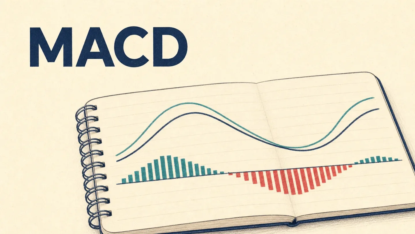
Lesson 7: MACD, the lines and histogram that describe momentum
A beginner-friendly lesson on reading MACD as the relationship between two moving averages, a signal line, and a histogram, using a real TSLA chart without predictions or trade recommendations.

The big idea: MACD compares two moving averages
MACD stands for Moving Average Convergence/Divergence. It is a momentum indicator built from two moving-average lines. Unlike RSI, MACD does not stay inside a 0–100 box. Its lines can move above or below a zero line as the relationship between the averages changes. Fidelity describes it as a momentum oscillator that can help readers study trend and momentum shifts. 1
To make that less abstract, start with EMA, short for exponential moving average. An EMA is a moving average that gives more importance to recent prices, so it reacts faster to new price changes than a simple moving average. 2
The standard MACD settings use a 12-period EMA and a 26-period EMA. The MACD line is the 12-period EMA minus the 26-period EMA. A 9-period EMA of that MACD line becomes the signal line. These are the default settings used in the teaching example below; chart platforms can let users change them. 1
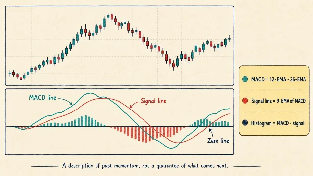
The picture has three parts worth naming once:
- MACD line: the difference between the 12-period and 26-period EMAs. 1
- Signal line: a 9-period EMA of the MACD line, which smooths that line's movement. 1
- Histogram: bars showing the difference between the MACD line and the signal line. Positive bars mean the MACD line is above the signal line; negative bars mean it is below. 3
The zero line is the horizontal middle line in the lower panel. When the MACD line is above zero, the 12-period EMA is above the 26-period EMA. When it is below zero, the shorter EMA is below the longer one. That is a description of the two averages' relationship, not a verdict about what the stock must do next. 1
A crossover is simply one line passing through the other. If the MACD line moves above the signal line, the histogram moves from negative toward positive. If it moves below, the histogram moves from positive toward negative. The word "crossover" sounds more decisive than the event itself: in a sideways price range, the lines can cross back and forth, a behavior Fidelity calls whipsaw. 1
A real chart example: TSLA
The chart below uses Tesla (TSLA) daily open, high, low, and close rows visible on Yahoo Finance through July 31, 2026. The upper panel is the price chart. The lower panel applies the standard 12/26/9 convention to the retrieved daily closes. Earlier rows from the same historical table provide the calculation's warm-up period; the visible teaching window is June 1 through July 31. 4
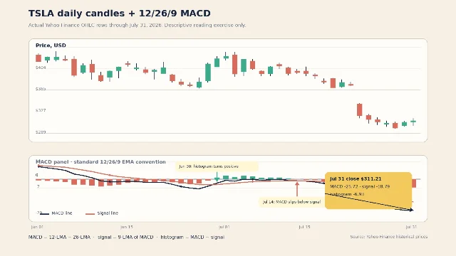
Start with the price candles. TSLA closed at $425.30 on July 1 and $311.21 on July 31. On July 23, the stock closed at $319.69 after closing at $374.01 on July 22. Those are historical observations from the table; they do not tell us what the next candle will do. 4
Now move to the lower panel and read the three pieces together:
- On June 30, the histogram turned positive in this calculation. The MACD line was -3.31 and the signal line was -4.39, so the MACD line sat above the signal line even though both lines remained below zero.
- On July 14, the relationship flipped the other way. MACD was -1.30, signal was -1.25, and the histogram was -0.04. The lines were nearly touching, which is a useful visual reminder that a crossover can be a small change rather than a dramatic event.
- On July 31, MACD was -25.72, signal was -18.79, and the histogram was -6.93. The negative histogram records the gap between the two lines; the below-zero MACD records that the shorter EMA sat below the longer EMA in this calculation.
Those numbers are computed observations from the cited TSLA closes, using the standard relationships described above. A different platform may show slightly different values if it uses different settings, price adjustments, or a different starting window. Fidelity notes that the 12/26/9 parameters are defaults that can be adjusted. 1
The useful beginner sentence is therefore specific: On TSLA's daily chart through July 31, the MACD line was below both the signal line and the zero line, while the histogram was negative. It describes the recent relationship among the chart's parts. It does not turn a past reading into a promise about the next move.
The beginner mistake: treating a crossover as an instruction
The first tempting rule is: "MACD crosses above the signal line, so buy; crosses below it, so sell." That is a trade rule, not a reading skill. It also ignores the sideways periods in which MACD can cross repeatedly and produce a string of unhelpful changes. 1
A better habit is to make the chart answer three quiet questions:
- What timeframe am I reading, and what date does the last candle represent?
- Is the MACD line above or below the signal line? Is the pair above or below zero?
- What did the price candles actually do during the same window?
For the TSLA example, that produces a clean description: daily chart; July 31 close; MACD below signal and below zero; negative histogram; recent price decline visible in the candles. Nothing in that sentence predicts a bounce, extends a trend, or recommends an action. It simply keeps the indicator attached to the price history that produced it.
One more caution: MACD is built from moving averages, so it summarizes what price has already done. It can help organize a chart, but it cannot guarantee future results. Fidelity's technical-analysis education also states that past performance is no guarantee of future results. 1
Where this fits in the course
This is Lesson 7 in the curriculum ladder:
- What one candlestick shows.
- How daily and weekly timeframes change the story.
- What volume can tell you about participation.
- How trend direction and moving averages add context.
- How support and resistance organize repeated price reactions.
- How RSI summarizes recent momentum.
- How MACD compares two moving averages and shows their gap.
Next week, we move from indicators back to candlestick patterns. We will use the same habit: name exactly what the candle shows, place it in context, and leave predictions out of the picture.
Indicators describe past price action. They can help you ask clearer questions, but they cannot guarantee future results. This lesson is educational only, not financial advice, a trade recommendation, or a price prediction.
References
- 1
- 2What is technical analysis? - Fidelity
fidelity.com
- 3Moving Average Convergence Divergence (MACD) - Interactive Brokers Campus
interactivebrokers.com
- 4Tesla, Inc. (TSLA) Stock Historical Prices & Data - Yahoo Finance
finance.yahoo.com
This story was produced automatically by a channel. One sentence is all it takes for Neodrop to keep producing for you.