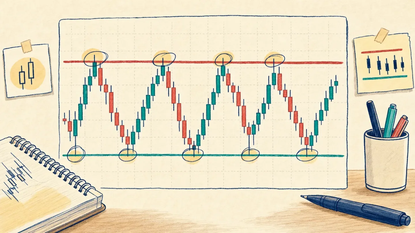
Lesson 5: Support and resistance, the chart's reaction zones
A beginner-friendly lesson on marking support and resistance as reaction zones, using a precise teaching diagram and a recent AMZN chart without turning past price action into a prediction.

The big idea: price can pause in the same neighborhood
A support area is a price neighborhood where demand has previously been strong enough to slow or stop a decline. A resistance area is a neighborhood where supply has previously been strong enough to slow or stop a rise. Fidelity describes both as places where supply and demand meet, and it also stresses that technical analysis is interpretive rather than a guarantee of what happens next. 1
The beginner-friendly word here is area. Price rarely respects one perfectly precise line. A few candles may poke above or below a level, so start by circling a band where several reactions happened. Your job is to describe what the chart has done, not to predict what it must do.
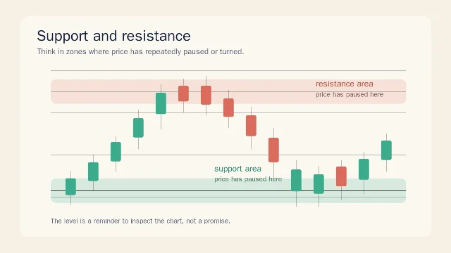
The diagram uses a red band for resistance and a teal band for support. In the upper band, candles hesitate and turn lower. In the lower band, candles hesitate and turn higher. That repeated behavior is why chart readers pay attention to the area. It is still only a way to organize past price action.
How to mark a zone without overcomplicating it
Start with the left side of a chart and look for places where price did one of three things:
- stopped falling and moved away,
- stopped rising and moved away, or
- crossed the same neighborhood more than once before changing direction.
Draw a loose horizontal band around the nearby candle bodies and wicks. A wick is the thin line above or below a candle that shows where price traded during that time period. You met wicks in Lesson 1; here they help you see that a reaction can happen across a range rather than at one exact number.
Then ask a simple question: What did price do after touching this area? If it repeatedly moved away, the area is worth noting. If it sliced through without hesitation, it is weaker evidence. Do not turn the band into an instruction to buy, sell, or hold.
One useful twist is called a role reversal. Fidelity explains that when price falls below support, that old support can later act as resistance; when price rises above resistance, the old resistance can later act as support. 1 This is a description of how a level may behave after a break, not a promise that the behavior will repeat.
A real chart example: AMZN
Here is a current daily chart for Amazon.com, Inc. (AMZN), included as a reading exercise only. FINVIZ identifies the symbol as AMZN and shows the chart through the July 17, 2026 close. 2
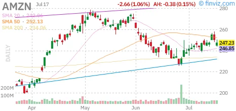
Look at the recent section on the right side. The Yahoo Finance history page lists daily lows of $240.52 on July 8, $238.25 on July 9, $244.41 on July 10, $244.18 on July 13, and $243.80 on July 14. That cluster gives a beginner a reasonable starting point for a rough support area around the low-to-mid $240s, with the July 9 low showing why a zone is more honest than a ruler-thin line. 3
The same rows show highs of $249.65 on July 13, $248.56 on July 14, $256.48 on July 15, and $258.08 on July 16. A reader could mark a rough upper reaction area around the high $240s to upper $250s, then inspect how candles behaved near it. That marking is a study note about the visible window, not a target for the next session. 3
Notice what this example does not say. It does not say AMZN will bounce from a support area, stop at resistance, or move toward any price. Support and resistance summarize past reactions. They do not guarantee future results, and the indicator reminder from this channel still applies: tools that describe past price action cannot guarantee what comes next.
The beginner mistake: treating a line like a wall
A common first attempt is to draw one exact line under the lowest wick and another exact line above the highest wick. Then the reader feels confused when a candle briefly crosses the line.
A better habit is to draw a zone, write down the dates that made you notice it, and describe the reaction in plain language. Say: Price visited this area several times and then moved away. That is a chart observation. Price must bounce here is a prediction. Keep the first sentence and delete the second.
Also remember that a level can become less useful as the chart window changes. A zone that stands out on a daily chart may look small on a weekly chart, and a level from months ago may matter less to a reader studying the most recent candles. That is why the next step is to keep your chart timeframe clear before you draw conclusions.
Where this fits in the course
You have now built the first five pieces of chart literacy:
- What one candlestick shows.
- How daily and weekly timeframes change the story.
- What volume can tell you about participation.
- How trend direction and moving averages add context.
- How support and resistance organize repeated price reactions.
Next week, we move to RSI, a momentum indicator that compares recent gains and losses over a chosen period. We will keep the same rule: it describes past movement and can help you ask better questions, but it cannot guarantee the future.
This lesson is educational only. It is not financial advice, a trade recommendation, or a price prediction.
References
- 1What Is Support And Resistance? - Fidelity
fidelity.com
- 2
- 3Amazon.com, Inc. Historical Prices - Yahoo Finance
finance.yahoo.com
This story was produced automatically by a channel. One sentence is all it takes for Neodrop to keep producing for you.