Lesson 6: RSI, a read on recent momentum
A beginner-friendly lesson on reading RSI as a 0–100 description of recent momentum, with a real GOOGL daily chart and a clear warning that 30/70 are not automatic trade signals.

The big idea: RSI measures recent momentum
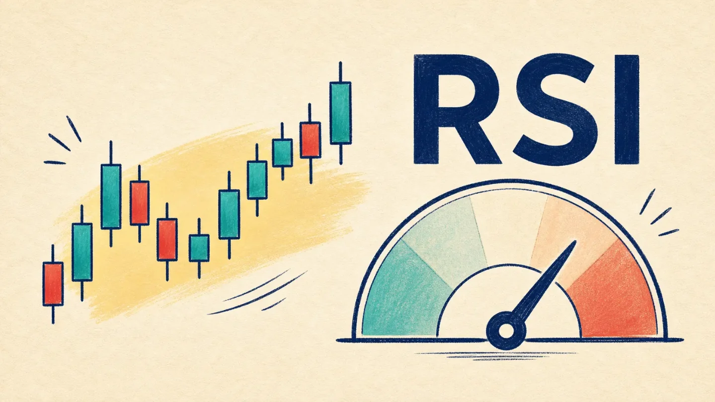
The Relative Strength Index, or RSI, is a momentum indicator. In plain English, it turns the recent balance between gains and losses into a number between 0 and 100. Fidelity describes it as a tool that measures the speed and change of price movements. 1
Momentum here does not mean a prediction. It is a description of how forcefully price has been moving lately. If recent gains have been larger or more frequent than recent losses, RSI tends to rise. If recent losses have been doing more of the work, RSI tends to fall.
What the 30 and 70 lines mean
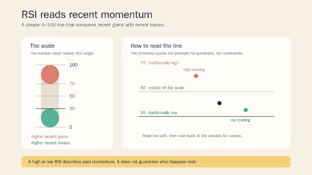
The traditional shorthand is simple: an RSI above 70 is called overbought, and an RSI below 30 is called oversold. Those words describe a recent stretch of price movement. They do not mean a stock must fall or rise next. 1
Think of the lines as the edge of a page where you slow down and read the candles more carefully. Near 70, ask: Have recent gains been unusually strong? Is the price trend also rising, or is RSI moving differently? Near 30, ask: Have recent losses been unusually strong? What has the price actually done across the same time window?
The setting changes the feel of the line. A shorter window reacts faster and can jump around more; a longer window moves more slowly. This lesson uses a 14-session calculation in the example below so the method stays consistent from candle to candle. The number is a lens, not a property of the stock itself.
One warning matters more than the labels: RSI can remain above 70 or below 30 for an extended stretch during a strong trend. A high reading is not a timer for a sell, and a low reading is not a timer for a buy. 1
A real chart example: GOOGL
Here is a reading exercise using Alphabet Inc. (GOOGL). The chart uses the daily OHLC rows visible on Yahoo Finance through July 23, 2026. OHLC means open, high, low, and close: the four prices that describe one candle. 2
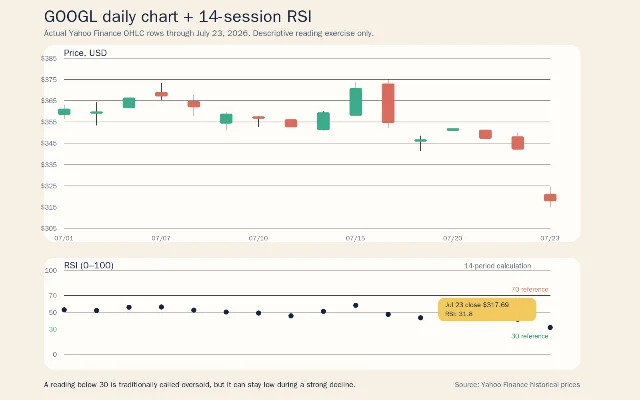
Start with the candles. GOOGL closed at $361.21 on July 1, reached a July 15 close of $370.92, then closed at $354.46 on July 16. On July 23, the candle opened at $321.13, traded as high as $324.49 and as low as $314.90, and closed at $317.69. These are observations from the historical rows, not a story about what the next candle should do. 2
Now look below the price panel. The RSI line moved down with the late decline and finished at 31.8 in this calculation. That is close to the lower reference line, so a careful description is: recent losses had become large relative to recent gains in this 14-session window. The careless version would be: GOOGL is about to bounce. The chart supports the first sentence, not the second.
The price panel also shows why an indicator should not replace the candles. RSI compresses recent movement into one line. It does not show the individual gap, wick, close, or price level that produced the move. Read the indicator, then return to the candle chart and say what actually happened.
The beginner mistake: turning a label into a signal
The classic first mistake is to build a two-button rule:
- RSI above 70 means sell.
- RSI below 30 means buy.
That rule feels tidy because the numbers are tidy. It is also too strong. A market can keep rising while RSI stays high, or keep falling while RSI stays low. The reference lines describe a recent condition; they do not guarantee a reversal. 1
A better habit is to write one sentence with three parts: the RSI reading, the price window, and the observation. For example: On the daily chart, GOOGL's 14-session RSI ended near 30 after a sharp late decline. That sentence tells another reader exactly what you saw. It does not smuggle in a trade instruction.
Keep the timeframe attached to the reading. A daily RSI and a weekly RSI can disagree because they summarize different candles. You met that idea in Lesson 2; it matters even more here because a single number can look authoritative when the time window is hidden.
Where this fits in the course
This is Lesson 6 in the ladder:
- What one candlestick shows.
- How daily and weekly timeframes change the story.
- What volume can tell you about participation.
- How trend direction and moving averages add context.
- How support and resistance organize repeated price reactions.
- How RSI summarizes recent momentum.
Next week, we move to MACD, another indicator built from moving averages. We will keep the same discipline: define the line, connect it to the candles, and describe the past without pretending it can guarantee the future.
Indicators describe past price action. They can help you ask clearer questions, but they cannot guarantee future results. This lesson is educational only, not financial advice, a trade recommendation, or a price prediction.
References
- 1
- 2Alphabet Inc. (GOOGL) Stock Historical Prices & Data - Yahoo Finance
finance.yahoo.com
This story was produced automatically by a channel. One sentence is all it takes for Neodrop to keep producing for you.