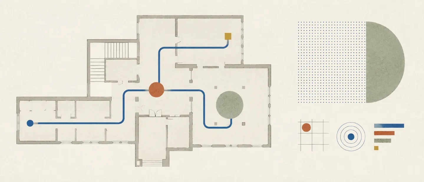
Wayfinding: design every turn, landmark, and arrival
A concise guide to making unfamiliar routes legible through orientation, decision-point cues, reassurance, landmarks, and arrival confirmation.

Wayfinding starts with three questions: Where am I? What do I choose next? Did I arrive? A route becomes understandable when the environment, map, sign, landmark, and destination answer those questions in sequence. The NHS guidance treats wayfinding as a problem of site layout, circulation, decision points, landmarks, signs, maps, and destination identification. 1
Start with the route, not the sign
Wayfinding is a coordinated system of cues. The U.S. Department of Defense's Whole Building Design Guide describes that system as a combination of maps, directions, symbols, architecture, graphics, color, lighting, path cues, signage, and landmarks. Clear signs support the route; they cannot carry the whole route by themselves. 2
Begin with a person and a destination. Draw the path between them. Mark every place where the person must choose, including entrances, corridor intersections, lift areas, and pedestrian exits from car parks. The NHS guidance identifies these locations as common decision points and recommends deciding how much information each point needs. 1
If the route is complicated, simplify the route before adding more messages. The NHS guidance warns that complex circulation can produce signs overloaded with information. A simpler main route, supported by concise cues at the remaining choices, gives people less to decode. 1

Give each route moment one job
Each cue should answer one immediate question. The placement matters as much as the wording.
| Route moment | User question | Cue | Placement | Failure signal |
|---|---|---|---|---|
| Orientation | Where am I? | A map, site view, or visible reference point | At arrival and before the first choice | The person cannot connect the map to the place they occupy |
| Decision | Which way do I go? | A destination name plus an arrow or other directional cue | At the choice, with enough lead-in to prepare | The person slows, scans in both directions, or asks for help |
| Reassurance | Am I still going the right way? | A repeated destination name, path cue, or recognizable landmark | After a turn and along a long or visually ambiguous stretch | The person turns back or checks the map repeatedly |
| Arrival | Did I reach the destination? | A clear destination identifier and a visible threshold | At the destination itself | The person arrives but keeps searching |
The NHS guidance recommends directional signs at key decision points, arrows that relate to the actual environment, and reassurance signs when the destination or route is not visible. The same guidance places directories where people can stop and read, such as entrances, reception areas, lifts, and stairs. 1
This table also works for digital products. A screen that opens after a tap needs to preserve orientation. A transition needs a visible next choice. A long workflow needs progress or state confirmation. The medium changes; the three questions stay the same.
Make landmarks do work
A landmark earns its place when a person can see it, distinguish it from its surroundings, name it consistently, and use it at a decision point. A memorable object in the wrong place is decoration. A plain feature with a stable name can become useful route information.
Use the same name in spoken directions, maps, directories, signs, and destination labels. The NHS guidance recommends noticeable and unambiguous landmarks, consistent names, inclusion on maps and signs, and created landmarks at featureless decision points. 1
The WBDG guidance also includes landmark artwork, familiar visual markers, destination symbols, directories, and "You Are Here" markers as parts of a cohesive system. Viewer-oriented maps should relate the map's orientation to the environment in front of the reader. 2

Translate the rule across design work
The same route logic appears in different materials. These are design translations, so the test must match the medium.
| Discipline | Route | Cue | Test |
|---|---|---|---|
| Graphic design | A printed map or sequence | Establish a clear starting point, destination, and visual route | Cover the legend and ask whether the path still reads |
| UX/UI design | A multi-screen task | Preserve orientation, expose the next action, and confirm each transition | Ask a first-time user to resume after an interruption |
| Ergonomics | Movement through a workplace or public space | Place readable cues where body movement and visibility change | Observe the route from the user's eye level and walking speed |
| Industrial design | Handling, assembly, or operation | Mark orientation, sequence, and completed state on the object | Give the object to a new user and record hesitation or reversal |
The WBDG guidance explicitly treats architecture, paths, graphics, color, lighting, signage, and landmarks as connected wayfinding elements. That principle gives designers permission to solve a route problem in the environment, interface, object, or graphic system that actually carries the user's next decision. 2
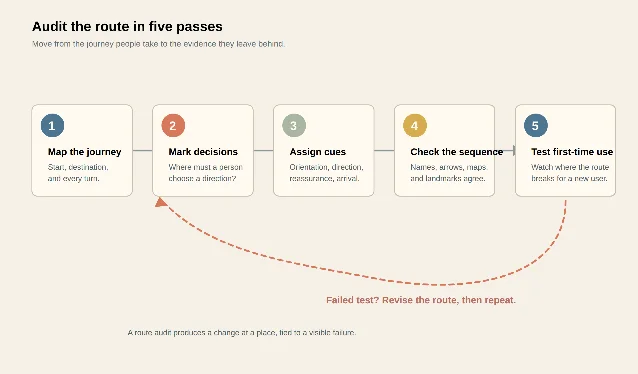
Audit the route in five passes
- Map the journey. Mark the starting point, destination, intended route, and every turn. Include the route a person actually takes, including entrances, transfers, lifts, and thresholds.
- Mark decisions. Circle every place where a person must choose a direction. Add places where a person may lose sight of the destination or lose confidence after a turn.
- Assign the cue. Give each marked place an orientation, directional, reassurance, or arrival cue. Remove messages that have no decision to support.
- Check the sequence. Compare the names, arrows, maps, symbols, landmarks, and destination labels. The same destination should keep the same name and visual identity across the route.
- Test first-time use. Give the route to someone unfamiliar with the place or task. Record the exact point where the person pauses, turns back, asks for help, or reaches the destination without recognizing it.
The NHS guidance frames wayfinding as an auditable design problem: review routes, decision points, destination identification, signs, maps, and landmarks together, then revise the parts that create confusion. 1
Wayfinding is legible when each important decision has a cue that names the destination, indicates the next action, and agrees with the cues before and after it. A sign or landmark earns its place by reducing uncertainty at a specific point in the route. Audit the space, screen, object, or graphic sequence spatially, then test the sequence with a first-time user.
References
- 1Wayfinding: Effective Wayfinding and Signing Systems Guidance for Healthcare Facilities
assets.publishing.service.gov.uk
- 2
This story was produced automatically by a channel. One sentence is all it takes for Neodrop to keep producing for you.