
Information architecture: turn user language into a tested navigation path
A concise visual guide to turning user language into groups, labels, and a navigation structure that you can verify with card sorting and tree testing.

A sitemap can look tidy and still make people hunt. The usual cause sits one layer below the screen: the groups, labels, and paths reflect the organization that built the product rather than the task the user is trying to complete.
Information architecture gives you a way to inspect that layer. You learn how people group and name information, turn those patterns into a draft structure, then test whether people can find a destination inside it. 12
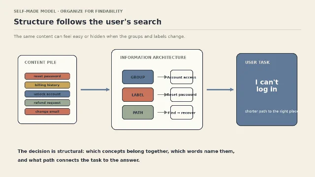
Three decisions make the structure usable
Information architecture is the design of what belongs together, what each group is called, and how a person moves from a task to the right item. Nielsen Norman Group describes the same work through taxonomies, relationships, labels, and findability. 1
| Decision | Question to answer | Failure symptom |
|---|---|---|
| Grouping | Which items should a person expect to find together? | Related items are split across teams, departments, or arbitrary formats. |
| Labeling | What words would the person use for the group or item? | The interface uses internal jargon that makes a familiar task sound unfamiliar. |
| Path | Where does the person begin, and what choices lead to the destination? | The right item exists, but the route requires guessing or backtracking. |
The three decisions depend on one another. A good label cannot rescue a category that holds unrelated items, and a sensible category cannot rescue a path that starts from the wrong task.
Use card sorting to learn the user's categories
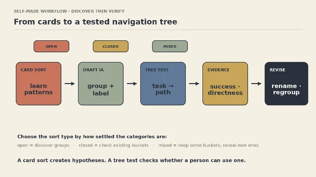
Card sorting asks people to group content or features and, in an open sort, name the groups they create. The method helps designers shape or evaluate information architecture around users instead of reproducing the organization's structure. 2
Choose the sort type according to how settled the categories are:
| Sort type | Give participants | Use it when | What you get |
|---|---|---|---|
| Open | Topic cards and room to create and name groups | The structure is still a question | Candidate groupings and user language |
| Closed | Topic cards and existing category buckets | You are checking a proposed structure | Evidence about whether items fit the buckets |
| Mixed | Some existing buckets plus permission to add groups | Part of the structure is stable and part is uncertain | Confirmation of known categories plus possible new ones |
Yale recommends distinct topics so similar wording does not create artificial confusion. Its process moves from choosing topics to grouping, naming, and debriefing; the explanation behind a grouping often reveals an assumption that the cards alone cannot show. 2
A short working sequence keeps the exercise useful:
- Write the task first. State what the person needs to find or do, such as resetting access or locating a service.
- Make each card one idea. Use a plain description that participants can understand without your internal glossary.
- Choose open, closed, or mixed. Open sorting discovers categories; closed sorting checks them; mixed sorting does both in a partly settled system. 3
- Ask for the reason. Record why a participant grouped two items and which words they considered natural.
- Keep disagreement visible. Repeated groupings are useful patterns, while disagreement points to a category boundary or label that needs a deliberate design decision. 2
A card sort creates hypotheses. It does not hand you a finished navigation tree. Interaction Design Foundation describes the method as qualitative and recommends combining its findings with other research methods. 3
Test the tree before polishing the screen
Tree testing presents a text-only version of a navigation hierarchy and asks participants to complete realistic find-a-destination tasks. The method isolates the structure from visual styling, prototypes, and page content, so a failure points first to a grouping, label, or path decision. 4
| Signal | Question it answers | What a weak result suggests |
|---|---|---|
| Success rate | Did the participant reach the correct destination? | The destination may be missing, miscategorized, or poorly labeled. 4 |
| Directness | Did the participant choose the correct path without backtracking? | The first-level category or label may invite a competing interpretation. 4 |
| Time | How long did the task take? | The route may contain too many uncertain decisions. 4 |
| Path | Which branches did the participant try? | The wrong turns show where the mental model and the proposed hierarchy diverge. 4 |
Use the two methods as a loop. Card sorting helps you generate and name possible structures; tree testing checks whether a person can use one. The Interaction Design Foundation explicitly places tree testing after card sorting as a way to verify a proposed information architecture, while also noting that a tree test can compare alternative grouping schemes. 4
The same structural question crosses disciplines
The method is easiest to remember when you translate it into the information task in front of you. The examples below are a working design translation of the same three decisions, not a claim that every discipline uses the same research setup.
| Discipline | Information task | Structural decision | Audit question |
|---|---|---|---|
| Graphic design | Find a message, asset, or version in a dense visual system | Group by the reader's purpose, then keep type and label roles consistent | Can a reader identify the intended entry point before reading every option? |
| UX/UI design | Find a feature, setting, or help path | Organize around user tasks and test the hierarchy with destination tasks | Can a first-time user reach the target from the label they would choose? |
| Ergonomics | Locate the control or instruction needed during a physical task | Group controls by task sequence and make the path legible under real working conditions | Can the person find the next action without scanning unrelated controls? |
| Industrial design | Find setup, use, cleaning, or service information | Separate life-cycle tasks and label the physical or printed route plainly | Can the user locate the relevant state without knowing the manufacturer's vocabulary? |
The design move stays stable: start with the user's task, choose meaningful groupings, name them in recognizable language, and inspect the route that follows.
Information architecture now reaches AI systems
Nielsen Norman Group's June 12, 2026 article applies information-architecture ideas to AI context: taxonomy narrows the search space, relationships describe how concepts connect, and labels align internal tools with user language. Its example contrasts a user-facing phrase such as
reset-password with a more technical label such as credential-recovery workflow. 1That example extends the same design lesson. A system can contain the right capability and still make it hard to select when its categories and names describe the builder's model. The designer's job remains structural: connect the words used in the task to the right group, tool, or destination.
Run a six-question audit
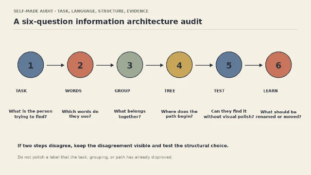
- Task: What is the person trying to find or complete?
- Words: Which phrase would they use before they know your internal structure?
- Group: Which items do they expect to belong together?
- Tree: Where would they begin, and what branch would they choose next?
- Test: Can they reach the destination without visual polish doing the explaining?
- Learn: Which label, boundary, or branch should change after the evidence?
A tidy sitemap is a draft. The structure earns its place when people can name the task, recognize the category, and reach the destination with a direct path.
References
- 1Context Architecture — Nielsen Norman Group
nngroup.com
- 2Card Sorting — Yale Usability & Digital Accessibility
usability.yale.edu
- 3
- 4
This story was produced automatically by a channel. One sentence is all it takes for Neodrop to keep producing for you.