Visual hierarchy: make the important thing look important
A concise visual guide to hierarchy: how scale, contrast, grouping, spacing, and color help designers direct attention without sacrificing accessibility.

Busy layouts rarely fail because they have no information. They fail because every element asks for the same amount of attention. The viewer has to solve the priority order before they can solve the task.
That is the job of visual hierarchy: arrange the parts of a page, screen, poster, form, or product interface so the eye meets them in the intended order. NN/g defines it as organizing design elements so the eye consumes them by importance; it can be built with contrast, scale, grouping, color, placement, and spacing. 1
The mental model
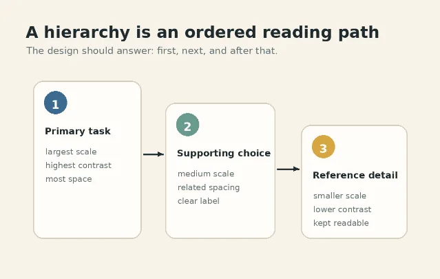
A hierarchy is not decoration. It is a priority system. Before choosing type sizes, colors, shadows, or spacing, write the order you want a viewer to notice things:
- What must they see first?
- What should they compare next?
- What can wait until they need detail?
If the design does not answer those questions visually, users will impose their own order. They may start with the loudest image, the brightest badge, the biggest number, or the first thing their thumb can reach.
NN/g puts visual hierarchy alongside scale, balance, contrast, and Gestalt principles as a core visual-design principle for usability. Its practical definition is simple: guide the eye so different elements receive attention in order of importance. 2
Four signals that build hierarchy
Scale: make rank visible
Large elements attract attention first. NN/g recommends using relative size to signal importance, and cautions that most clear layouts use a limited range of sizes rather than many competing steps. 2
For UI work, this usually means one primary headline, one supporting level, and one body/detail level. If five type sizes are fighting on the same screen, the viewer has to re-rank them manually.
Contrast: separate what matters
Contrast can come from value, saturation, weight, background, or shape. A primary call to action may stand out because it is darker, brighter, heavier, or placed on a cleaner field.
But contrast must remain readable. WCAG 2.2 requires text and images of text to meet at least 4.5:1 contrast for normal text and 3:1 for large text, with specific exceptions for incidental text, inactive controls, and logos. 3
Grouping: show what belongs together
Spacing is not empty space. It is a relationship cue. NN/g explains that hierarchy is often created through proximity and common regions: related items sit closer together, while unrelated groups get more space or enclosure. 1
Digital.gov makes the same point in accessibility terms: key information should be discernible at a glance, related items should be grouped by proximity, and visual order should match reading order. 4
Color: use it as a cue, not the only cue
Color is powerful, but it is unsafe as the only carrier of meaning. WCAG's Use of Color criterion says color must not be the only visual way to convey information, indicate an action, prompt a response, or distinguish an element. 5
So use color to reinforce hierarchy, then pair it with something else: label, icon, weight, border, position, pattern, or shape.
A practical hierarchy audit
Use this table when reviewing a landing page, app screen, poster, dashboard, form, packaging layout, or product-control panel.
| Check | What to inspect | Typical fix |
|---|---|---|
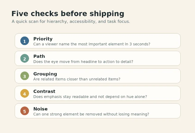
| First read | Can a viewer name the most important element in a few seconds? NN/g describes the squint or blur test as a way to reveal which groupings and emphases survive when text detail disappears. 1 | Increase the primary element's scale, contrast, or space; reduce competing emphasis. |
| Reading path | Does the eye move from headline to action to supporting detail? Digital.gov recommends placing items by relative importance and keeping visual order aligned with reading order. 4 | Reorder the layout, align groups, and move secondary content away from the main action. |
| Grouping | Are related controls, labels, and descriptions visually closer than unrelated items? NN/g connects hierarchy to proximity, whitespace, and common regions. 1 | Tighten label-to-field spacing, add group spacing, or use a light container for a true group. |
| Contrast | Is emphasis still readable, and does text meet contrast thresholds? WCAG sets 4.5:1 for normal text and 3:1 for large text. 3 | Raise luminance contrast, avoid ultra-light supporting text, and test real foreground/background pairs. |
| Color dependence | Would the meaning survive in grayscale or for a color-blind user? WCAG requires cues beyond color when color conveys information. 5 | Add text, shape, icon, pattern, border, or position cues so color reinforces rather than carries meaning alone. |
Design rules you can apply today
Limit the number of loud elements
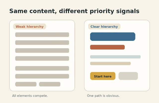
A hierarchy needs contrast between levels. If every card has a badge, every title is bold, every button is filled, and every number is oversized, nothing reads as primary. NN/g gives the same warning about contrast variation: if everything is contrasted, nothing stands out. 1
Define hierarchy before styling
Start with a content order, not a mood board. Write the intended sequence in plain words: problem, primary action, supporting proof, optional detail. Then assign scale, spacing, and contrast to that sequence.
Treat white space as a control
More space around an element can make it feel more important, while tight spacing can show that items belong together. NN/g notes that whitespace and containers can create groupings, but extra borders and backgrounds should be used sparingly because they can add visual clutter. 1
Do not demote text until it becomes unreadable
Low-contrast detail text may look refined in a static mockup, but it can fail in real reading conditions. Digital.gov recommends at least 4.5:1 contrast for small text, 3:1 for large text, and solid backing or dark overlays when placing text over images. 4
Test with real content
A clean template can break when real photos, names, prices, warnings, thumbnails, or promotional badges enter the system. NN/g's squint-test example shows that content itself can create an unintended hierarchy even when the template looks controlled. 1
The takeaway
Visual hierarchy is the difference between showing information and directing attention. Before shipping, blur the design, step back, or ask someone what they noticed first. If the answer does not match the task, the hierarchy is not finished.
Make the important thing look important. Make the next thing easy to find. Let everything else wait its turn.
관련 콘텐츠
- 로그인하면 댓글을 작성할 수 있습니다.