Gestalt principles: how your brain organizes what you see
Six foundational Gestalt principles — proximity, similarity, closure, figure/ground, continuity, and Prägnanz — explained with cross-discipline examples across graphic design, UX/UI, industrial design, and ergonomics.
When you look at the NBC peacock logo, you don't see six abstract leaf shapes — you see a bird. When you scan a well-designed form, you don't consciously analyze where each label belongs — you just know. That near-instant comprehension is not accidental. It's the result of how human perception works, and designers who understand it can build it in deliberately.
In the 1920s, German psychologists Max Wertheimer, Kurt Koffka, and Wolfgang Köhler studied how the mind makes sense of visual complexity. Their finding: the brain doesn't process what it sees element by element. It groups, fills gaps, and resolves ambiguity into the simplest coherent whole — before conscious thought kicks in.1 Kurt Koffka summarized it precisely: "The whole is other than the sum of the parts."2
Designers absorbed these principles quickly. Today they underpin layouts, logos, UI navigation, product forms, wayfinding systems, and ergonomic controls. Whether you work in graphic design, UX/UI, industrial design, or ergonomics, Gestalt gives you a shared perceptual vocabulary for explaining why a design works — or why it fails.
This article covers the six most practically applicable Gestalt principles, with concrete cross-discipline examples for each.
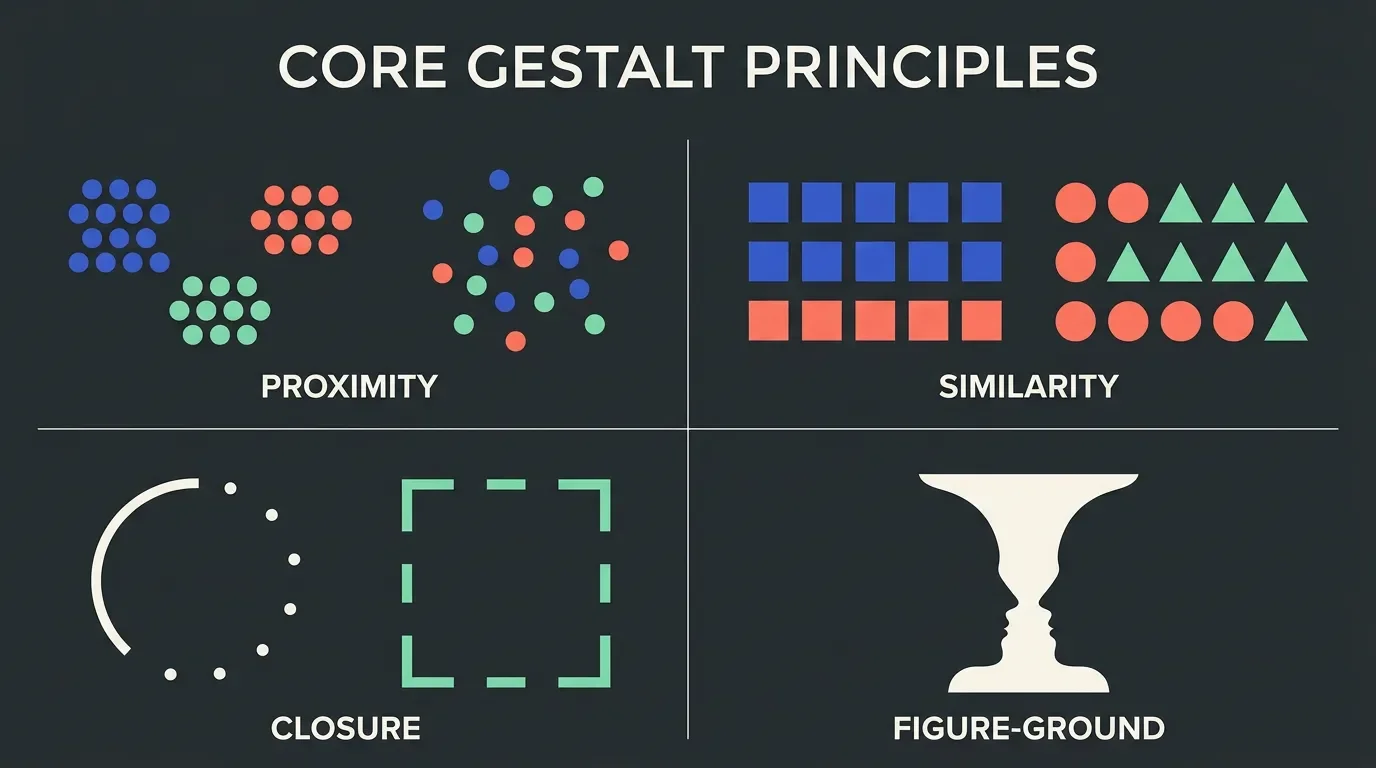
The six principles at a glance
| Principle | Core idea | Design signal |
|---|---|---|
| Proximity | Close elements are perceived as grouped | Spacing communicates relationship |
| Similarity | Like-looking elements are perceived as related | Shared style = shared meaning |
| Closure | The brain completes incomplete shapes | Negative space can carry a full image |
| Figure/Ground | We separate a focal object from its background | Contrast controls what reads as "content" |
| Continuity | The eye follows smooth paths | Alignment guides attention |
| Prägnanz | The brain resolves complexity into the simplest form | Simpler forms are processed faster |
Proximity
Proximity is the single most powerful grouping cue: elements close together are perceived as related; elements spaced apart are perceived as separate.3 Critically, proximity can override competing signals like color or shape — a group of differently-colored objects placed close together will still read as one group.
Graphic design: Whitespace is the mechanism. A heading placed closer to its following paragraph than to the preceding one signals ownership. Pull it away and readers have to puzzle out the structure. Every newspaper grid, editorial spread, and poster relies on this.
UX/UI: The Uber sign-up form uses proximity to pair each label with its input field.4 The 2017 US tax Form 1040, by contrast, compresses fields so tightly that labels from one person's section visually bleed into the next — a textbook proximity failure at scale.
Industrial design: Physical control clusters on dashboards and medical devices apply proximity to signal which buttons govern the same function. On a car's steering column, wiper controls are a single stalk grouped away from the indicator stalk — proximity tells your hand what each does before you look.
Ergonomics: Workstation layout studies (informed by ISO 9241-5 guidance on workspace layout and postural requirements) use proximity reasoning to cluster frequently used tools within the primary reach zone. Items used together go together. Violating proximity in a physical workspace adds micro-pauses and error risk.
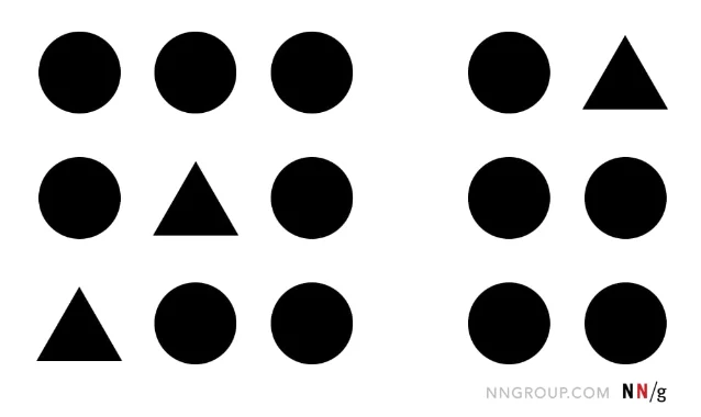
Similarity
Similarity groups elements that share visual characteristics — shape, color, size, texture, or orientation. When things look alike, the brain assumes they belong together.2
Graphic design: Design systems and brand guidelines use similarity to ensure consistency. A coherent editorial system is one where all primary headings share the same typeface, weight, and color — not because it looks nice, but because readers instantly identify anything wearing that style as a top-level heading.
UX/UI: Every button on a well-built interface shares a style. The IxDF homepage makes all clickable buttons visually identical — users immediately recognize them as actionable.2 Breaking similarity even once — say, making one button a different color — signals a different function. That's intentional disruption, used on iOS's red delete buttons to signal destructive actions.4
Industrial design: Product families use similarity to communicate lineage. The Braun design language developed under Dieter Rams created strong cross-product similarity through material, proportion, and color — consumers immediately recognized a new Braun product as part of the ecosystem. The same logic drives automotive design languages and Apple's product portfolio.
Ergonomics: Color-coded controls in aviation and industrial settings exploit similarity to reduce error. Controls that do the same class of thing (e.g., all fuel valves) are the same shape and color. This is a direct implementation of similarity as an error-prevention strategy, aligned with ISO 9355 guidance on visual coding of controls.
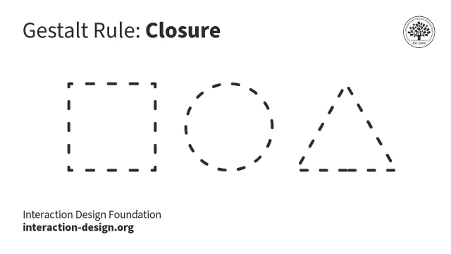
Closure
Closure is the brain's tendency to complete incomplete shapes. Given enough visual information, perception fills in missing edges and outlines to create a whole.5
Classic examples: IBM's striped logo reads as "IBM" despite the horizontal gaps. The WWF panda logo resolves from black shapes into a recognizable animal. The FedEx logo hides an arrow in the negative space between the E and x — once you see it, you cannot unsee it.
Graphic design: Logos built on closure are more memorable precisely because the brain does work to complete them. The engagement of resolving the image creates retention. This is why dashed-outline icons and open geometric forms are a staple of high-quality icon design.
UX/UI: Partial content at the edge of a scroll area signals "more below." A card that's slightly cropped at the right edge of a carousel uses closure to communicate that the row continues — users know to swipe without being told. This is closure deployed as a UX affordance.5
Industrial design: Closed form language communicates completeness and quality. Products that resolve to clean, closed silhouettes (think Apple's rounded rectangles, Dieter Rams's Braun appliances) feel finished. Exposed edges, visible seams, and discontinuous contours undermine perceived closure and signal lower quality — even if the manufacturing is identical.
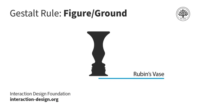
Figure/ground
Figure/ground describes how we separate any visual scene into a focal element (figure) and everything else (ground).2 We perceive the figure as having a defined shape; the ground recedes. The classic demonstration is Rubin's vase: the same image reads as a white vase on black ground, or two black faces on a white ground — depending on which region the eye treats as figure.
Graphic design: Text-on-background is the everyday figure/ground decision. High contrast between type (figure) and field (ground) makes reading effortless. Low contrast collapses the distinction — the text no longer pops as figure, and legibility suffers. WCAG 2.2 Level AA requires a minimum 4.5:1 contrast ratio for normal text for exactly this reason.
UX/UI: Modal dialogs and overlays use figure/ground by dimming the background (ground) to make the dialog (figure) pop. Google Material Design's light and dark themes both maintain figure/ground clarity: text remains the figure regardless of whether it's black-on-white or white-on-black, because the relative contrast is preserved.2
Industrial design: Three-dimensional objects have inherent figure/ground relationships. A well-designed button sits proud of its panel surface — it reads as figure against the chassis ground. Recessed labels, flush controls, and low-contrast finishes all erode figure/ground contrast and make products harder to use by feel and sight.
Ergonomics: Control visibility on equipment is a figure/ground issue. OSHA and ISO 11684 (safety signs and markings) require that hazard signals maintain sufficient contrast to read as figure against any plausible background — including poor lighting conditions. A warning label that blends into the machine surface fails figure/ground and becomes a safety risk.
Continuity
Continuity (also called continuation) is the tendency to perceive elements arranged on a smooth path as related, and to follow that path even when it's interrupted.2 The eye prefers the path of least abrupt change.
Graphic design: Column grids work because continuity keeps the eye tracking down a column without jumping. Alignment is continuity in spatial arrangement — elements that share a left edge imply a vertical axis the eye follows. Breaking alignment even once creates a visual jolt.
UX/UI: Progress steppers, breadcrumb trails, and wizard flows exploit continuity to communicate sequence. A horizontal row of numbered steps implies a path from left to right; the user understands their position in that flow without reading every label. Timeline charts and swimlane diagrams use the same principle.
Industrial design: Automotive designers rely heavily on continuity. Body lines that flow uninterrupted from bumper to bumper create a sense of speed and cohesion. A body crease that terminates awkwardly — or one that the eye can't resolve to a smooth path — breaks the visual continuity and makes the design feel unresolved. The "character line" on most modern vehicles is a direct continuity cue.
Ergonomics: In information displays — cockpit instruments, industrial control panels, medical monitors — continuity governs the layout of scan paths. Operators are trained to scan instruments in a specific order; the layout should support that scan path with visual continuity. Interrupted sequences or random instrument placement increase cognitive load and error probability.
Prägnanz
Prägnanz (from the German for "precision" or "conciseness") is the master principle: the brain resolves any ambiguous image into the simplest, most regular, most symmetric form possible.2 When you see the Olympic rings, you perceive five circles — not ten C-shapes and five lens-shaped overlaps. Your visual system picked the simpler interpretation automatically.
Graphic design: Complexity that serves no informational purpose adds cognitive load without return. Every chart, diagram, and layout choice should reduce to the fewest visual elements needed to convey the message. Edward Tufte's concept of data-ink ratio — maximize ink used to represent data, minimize non-data ink — is Prägnanz applied to data visualization.
UX/UI: Interface design has converged on simple, geometric component shapes (rectangles, circles, rounded squares) precisely because these are the forms Prägnanz resolves most quickly.5 Airbnb's UI wireframes down to basic rectangular blocks and circular avatars — that simplicity is why it feels legible even at a glance. Visual noise — gradients, shadows, textures added without purpose — works against Prägnanz.
Industrial design: The modernist principle "form follows function" is deeply aligned with Prägnanz. Products that remove ornament expose functional form, which the brain processes faster. Rams's ten principles of good design — particularly "good design is as little design as possible" — are statements of Prägnanz.
Ergonomics: Prägnanz has direct implications for display design. Complex instrument panels should group related meters, simplify scales, and reduce the number of distinct visual elements in any one zone. Research in human factors (see Wickens et al., Engineering Psychology and Human Performance, 4th ed.) shows that simpler displays reduce response time and error rate in high-stakes monitoring tasks.
Applying Gestalt across a real design problem
These six principles don't operate in isolation. A single layout decision typically invokes three or four simultaneously. Consider a typical form:
- Proximity groups the label with its input, and separates one section from the next
- Similarity makes all required fields look identical and all optional fields different
- Continuity keeps the scan path moving top-to-bottom down the column
- Prägnanz argues for fewer fields, simpler labels, and unambiguous input types
Understanding which principle is violating a design is as useful as knowing which one should be added. When a user is confused by a navigation menu, the diagnostic question isn't "does this look good?" — it's "which Gestalt principle is broken here?"
Quick-reference: principle × discipline
| Graphic design | UX/UI | Industrial design | Ergonomics | |
|---|---|---|---|---|
| Proximity | Whitespace = structure | Label-field grouping, card layouts | Control clusters on panels | Workstation reach zones |
| Similarity | Design systems, type hierarchy | Button states, interactive affordances | Product family language | Coded controls (color, shape) |
| Closure | Logo negative space | "More below" affordance via cropped cards | Clean product silhouettes | — |
| Figure/Ground | Text contrast, type on image | Modals, overlays, dark/light modes | Control legibility on chassis | Safety signage contrast |
| Continuity | Column grids, alignment | Progress steppers, timelines | Automotive body lines | Instrument scan paths |
| Prägnanz | Data-ink ratio, minimal layout | Simple component shapes | "Form follows function" | Simplified display panels |
Sources and further reading
- Wertheimer, M., Koffka, K., Köhler, W. — Gestalt psychology, 1920s. Summary via 1
- 2
- 3
- 4
- 5
- Wickens, C.D., Hollands, J.G., Banbury, S., & Parasuraman, R. Engineering Psychology and Human Performance, 4th ed. Psychology Press, 2013.
- Tufte, E.R. The Visual Display of Quantitative Information, 2nd ed. Graphics Press, 2001.
- Rams, D. Ten Principles of Good Design. Referenced in Less but Better, Gestalten, 2014.
Add more perspectives or context around this Post.