2026/7/6 · 8:25
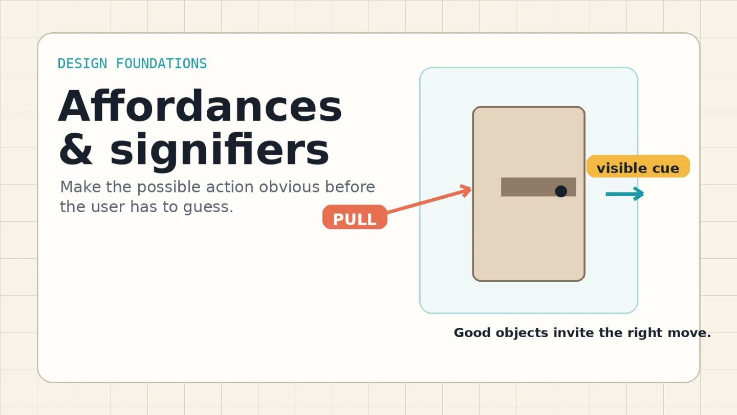
Affordances and signifiers: make the action visible
A concise visual guide to affordances and signifiers: how to make actions, states, and feedback obvious before users have to guess.
Bad interaction design often works in a technical sense. The door opens. The switch toggles. The link navigates. The failure is earlier: the person cannot tell what action is available before trying it.
That is the practical difference between an affordance and a signifier. Don Norman traces the original term "affordance" to psychologist J. J. Gibson, then argues that design work depends on perceived clues: people need signs that tell them what something is for, what is happening, and what actions are available. 1
The mental model
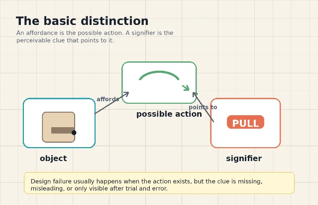
An affordance is what the object or interface makes possible. A handle affords pulling. A checkbox affords selection. A slider affords movement along a track. The affordance can exist even if nobody notices it.
A signifier is the perceivable clue. It can be deliberate, like the word "Pull" on a door, or accidental, like worn paint around the part of a handle people usually grab. Norman's revised The Design of Everyday Things treats affordances, signifiers, mapping, feedback, and conceptual models as fundamental principles of interaction design. 2
For working designers, the distinction is useful because it prevents a common critique from getting fuzzy. "This button has bad affordance" usually means one of three things:
- The action is not actually available.
- The action is available, but there is no visible clue.
- The clue points to the wrong action or the wrong state.
Only the first is an affordance problem. The second and third are signifier problems.
Why weak signifiers slow people down
Clickable elements need visible cues. NN/g's guidance on clickability names borders, color, size, consistency, placement, and familiar web standards as cues that help people recognize what is actionable. 3
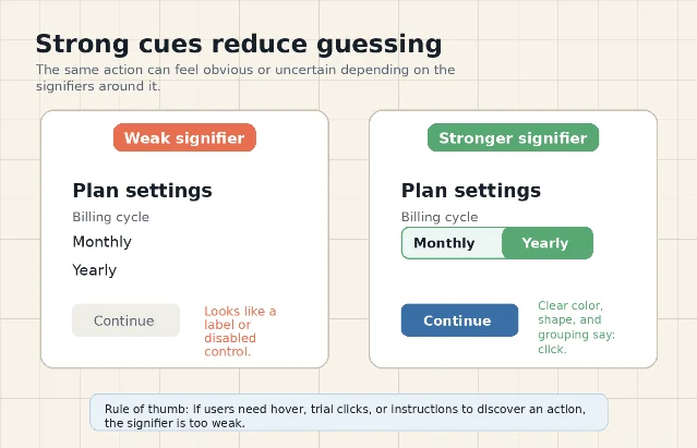
Flat interfaces expose the cost of weak signifiers. In one NN/g eye-tracking experiment, 71 general web users completed targeted tasks on 9 page pairs. The weak-signifier versions required 22% more task time and 25% more eye fixations than the strong-signifier versions. 4
The lesson is not "make everything look 3-D." The lesson is that users should not have to scrub the page with a mouse, tap randomly, or read explanatory copy just to discover the available action. If an element is interactive, its shape, contrast, label, placement, and surrounding pattern should say so before interaction.
Five checks before shipping
Use this audit when reviewing a screen, product control, form, or physical prototype.
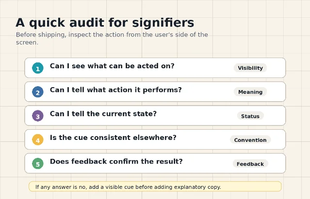
| Check | What to inspect | Typical fix |
|---|---|---|
| Can I see what is actionable? | Links, buttons, handles, switches, tabs, drag handles, and editable regions should stand apart from static content. | Add contrast, borders, elevation, spacing, labels, or a standard component treatment. |
| Can I tell what action it performs? | The cue should indicate the likely result, not only that "something" can be clicked. | Use a precise label, icon-plus-label pairing, direction cue, or conventional control shape. |
| Can I tell the current state? | Switches, filters, selected tabs, disabled controls, and loading states need readable status. | Pair position, color, text, and feedback so state is not carried by color alone. |
| Is the cue consistent elsewhere? | Similar-looking elements should behave similarly across the product. | Reserve each visual treatment for one behavior, then reuse it predictably. |
| Does feedback confirm the result? | After action, the system should show that something changed. | Use state change, confirmation, motion, progress, or inline validation. |
This audit also maps to Norman's two gulfs: users must understand the current state of the system and figure out how to change it. NN/g describes these as the gulf of evaluation and the gulf of execution. 5
Design rules you can apply today
Do not hide action behind hover
Hover is feedback, not discovery. A desktop user may find hidden actions by accident, but touch users and keyboard users may never see them. If the action matters, show the cue in the resting state.
Keep fake buttons out of the interface
A heading inside a colored rounded rectangle may look like a button. A promotional card with the same treatment as an actual link may look actionable. NN/g warns that nonclickable items should not use the same color, underline, or button-like treatment as clickable items. 3
Use conventions when speed matters
Blue underlined text, rectangular buttons, tabs connected to panels, checkboxes with checkmarks, and handles on drawers all borrow from learned patterns. You can redesign them, but removing too many cues shifts work from the interface to the user.
Match signifiers to consequences
A destructive action needs a stronger cue and stronger feedback than a harmless filter change. A door in a public building needs clearer push/pull cues than a cabinet in a private studio. The more costly the mistake, the less you should depend on subtle visual language.
The takeaway
When a user hesitates, do not ask only "is the action possible?" Ask a sharper question: what in the design tells them the action is possible, what it will do, and what state they are in now?
That is the job of signifiers. Affordances give people the possibility of action. Signifiers give them permission to act with confidence.
相似内容
- 登录后可发表评论。