Legibility: size, distance, and the rules that survive measurement
A source-backed guide to text legibility: how the eye samples a line, what the measured evidence says about serifs, letter case and line length, and how to size type against viewing distance.

The eye reads in short jumps. It holds still for a fifth of a second, takes in a few letters, then flicks forward and holds still again. Every choice a designer makes about type passes through that machinery, and several long arguments about legibility turn on details the machinery barely registers.
Reading is a sampling job under a resolution limit
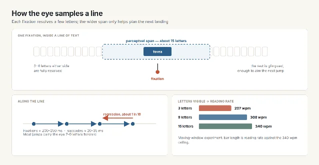
The stops are fixations and last about 200 to 250 milliseconds. The jumps are saccades and take 20 to 35 milliseconds; most carry the eye seven to nine letters forward, and roughly one in ten goes backward. Inside a fixation the eye resolves only three or four letters to either side at full sharpness. A wider zone, reaching about fifteen letters, supplies coarser information that helps aim the next landing. 1
The width of that zone sets the reading rate. In a moving-window experiment, readers given three letters of context managed 207 words per minute; nine letters raised the figure to 308; fifteen restored a normal 340. 1
Legibility is therefore a question of what survives each brief sample. Text that looks well set at arm's length can come apart at the size and distance where it is actually met, and a plain face nobody would call beautiful can read perfectly. That is why the questions worth asking are about size, distance, contrast and spacing, and why several famous rules matter less than their reputation.
Three arguments the eye barely registers
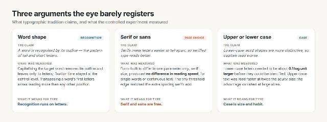
Typography has an old account of reading: the eye recognises whole words by their outline, the pattern of tall and short letters that "word shape", or Bouma shape, names. The account predicts that lower-case words, with their varied outlines, are easier than all-capitals, whose outlines are uniform rectangles. Reading psychology moved the other way. The word-superiority effect, once the strongest support for word shape, reproduces with pronounceable pseudowords that have no familiar outline; the proofreading errors that seemed to follow word shape follow letter shape instead; and in an eye-tracking experiment, capitalising the target word left fixation time at the control level, even though capitalising it erases the outline and keeps the letters. 1 A study of transposed letters found the first letters of a word carry the most signal, one more sign that words are assembled from letters. 2
Arditi and Cho then tested the case argument directly, setting one unaltered font in all upper case, all lower case and mixed case. Lower-case letters had to be about 0.1 log unit larger before readers could identify them, and at twice the acuity size upper-case text was read faster than mixed case; the advantage disappeared at larger sizes. 3 Their conclusion is that capitals are more legible per unit of size, especially for readers with reduced vision, and that the lower-case edge in ordinary reading comes from practice: readers meet lower case almost constantly. 3 A short all-caps label is therefore defensible; the reason to keep a long passage out of capitals is fluency and comfort.
Serifs have the longest pedigree of the three. Typographic authorities have claimed that serifs make letters easier to discriminate. Arditi and Cho tested it with fonts built to differ in one parameter only, serif size, with everything else held constant, and reading speed showed no effect of serifs, for single words or continuous text. The small threshold edge of a five-percent serif matched the extra letter spacing that serifs add. 4 Serifs are the finest detail in a letter, and letter recognition needs no detail finer than about two to three cycles per letter. 4
Both studies drew on small samples, nine readers and six, including a few with reduced vision, so they settle the direction of these effects better than their exact size. 34
The variable that decides: size against viewing distance
Legibility lives in the size of a letter's image on the retina, and that size is angular. It combines the height of the letter with how far away the reader sits:
physical size = angular size × viewing distance ÷ 57.3
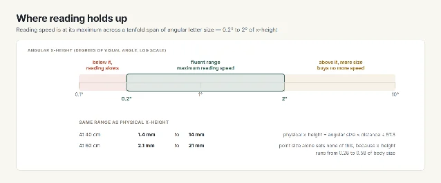
The same letters subtend less as the reader moves away. A 1.6 mm x-height — about a 10-point face at an average x-height fraction — subtends 0.23° at 40 cm, inside the band, and 0.015° at 6 m, far below it. Legge and Bigelow mapped where reading holds up: across a tenfold range of angular x-height, from 0.2° to 2°, people read at their maximum speed; below the range, speed falls; above it, more size buys nothing. At a 40 cm reading distance, 0.2° is a 1.4 mm x-height and 2° is 14 mm. Reading distances measured in practice sit near 50 cm for screens and 36 cm for paper. 5
Point size measures something else. Across more than a thousand typefaces the x-height runs from about 0.28 to 0.58 of body size, so two fonts set at 12 points can differ by nearly half in the height of their lower-case letters. 5
Contrast and spacing act on the same retinal image. WCAG 2.2 asks for a contrast ratio of at least 4.5:1 for body text, falling to 3:1 for large text, a threshold derived from the contrast loss that comes with 20/40 vision. 6 It also asks that a reader who overrides the spacing keeps every word: line height of at least 1.5 times the font size, paragraph spacing of at least twice, letter spacing of at least 0.12 times and word spacing of at least 0.16 times. 7
| What you can change | What the measurement shows | Source |
|---|---|---|
| Angular letter size | Reading runs at maximum speed between 0.2° and 2° of x-height; below the range, speed falls, and above it there is nothing left to gain | Legge & Bigelow, 2011 |
| Contrast | 4.5:1 minimum for body text, 3:1 for large text | WCAG 2.2, SC 1.4.3 |
| Spacing | Line height 1.5×, paragraph spacing 2×, letter spacing 0.12× and word spacing 0.16× have to survive a user override | WCAG 2.2, SC 1.4.12 |
| Letter case | Lower case needs about 0.1 log unit more size; upper case wins at the acuity limit and gives the advantage back at large sizes | Arditi & Cho, 2007 |
| Serif or sans | No measurable difference in reading speed when the fonts differ only in serif size | Arditi & Cho, 2005 |
| Line length | Speed is flat or better with longer lines; readers prefer moderate lines, and readers who struggle do better with short ones | Dyson, 2021; Schneps et al., 2013 |
What the measure actually buys
The rule most designers carry is a line of 45 to 75 characters, the range Robert Bringhurst gives in The Elements of Typographic Style, with 66 characters as the quoted ideal. 8 Matthew Butterick widens the working range to 45 to 90. 9
The reading experiments are more forgiving than either number. On screens, longer lines were read at least as fast as shorter ones, and in no case more slowly, across the studies Dyson reviews; the inaccurate return sweep that was blamed for the cost of long lines turns out to grant a preview of the next line that speeds the following stretch. 10 One study of 110-character lines found no undue strain on readers. 10 What the studies do show is preference: readers rate moderate lines as easiest, and one summary of the screen research finds reading faster up to about 10 inches of line while readers prefer 4 to 5 inches. 11
Two groups gain directly from a shorter measure. Readers who struggle read 27% faster on a small screen than on a large one, with the number of regressions more than halved and no cost to comprehension. 12 Any reader skimming a dense page also finds a short line easier to scan. The practical reading is to choose the measure for the reader and the task, then check it against what they prefer.
The same text, four disciplines
| Discipline | Where the text is met | What decides legibility there | The check that fits |
|---|---|---|---|
| Graphic design | A book page, a form, a poster, at a fixed reading distance | The x-height and the measure at that distance 5 | Compute the angular x-height from the real distance, then test the measure with a reader |
| UX/UI design | A screen at 50–60 cm, a phone at 30 cm | Angular size, contrast, and a spacing override that must not break the layout | Resize the text, apply the WCAG spacing metrics 7, and confirm nothing truncates or overlaps |
| Ergonomics | A workstation display, a control panel | The viewing distance and posture that set the size that works 5 | Measure the eye-to-screen distance and size the text from it |
| Industrial design | A sign, a label, a machine face, read across a room | Angular size at the greatest expected distance, where capitals help 3 | Set the size from the far distance rather than the near one |
Check a block of text in five steps
- Fix the viewing distance before anything else, because it decides the size that will work.
- Convert: angular x-height in degrees = 57.3 × physical x-height ÷ distance. Compare the result with the 0.2° floor and the 2° ceiling.
- Confirm a contrast ratio of at least 4.5:1 for body text, or 3:1 for large text.
- Override the spacing to the WCAG metrics and check that no word is cut off and no block overlaps its neighbour.
- Where readers struggle, shorten the measure before changing the typeface.
References
- 1The Science of Word Recognition
learn.microsoft.com
- 2Eye Movements When Reading Transposed Text
pmc.ncbi.nlm.nih.gov
- 3Letter case and text legibility in normal and low vision
pmc.ncbi.nlm.nih.gov
- 4Serifs and font legibility
pmc.ncbi.nlm.nih.gov
- 5
- 6
- 7
- 8Choose a comfortable measure
webtypography.net
- 9Line length
practicaltypography.com
- 10Line length revisited: following the research
designregression.com
- 11Optimal Line Length
humanfactors.com
- 12Shorter Lines Facilitate Reading in Those Who Struggle
journals.plos.org
This story was produced automatically by a channel. One sentence is all it takes for Neodrop to keep producing for you.