
Hick's Law: reduce competing choices, not useful capability
A concise visual guide to Hick's Law: understand the logarithmic choice-time model, then reduce, group, or reveal choices without hiding useful capability.

A screen can show every available action and still feel slow. The problem is often not the interface's total capability, but how many decisions it asks the user to compare at one moment. Hick's Law gives designers a useful way to see that bottleneck: as the number of alternatives grows, decision time tends to grow too. 1
The practical consequence is easy to misread. Hick's Law does not tell you to delete every secondary feature or force every product into three choices. It asks a sharper question: which choices need to compete right now?
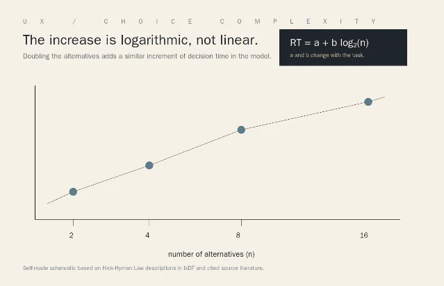
What Hick's Law actually measures
The law is named after William Edmund Hick's 1952 work and Ray Hyman's 1953 follow-up on the relationship between stimulus information and reaction time. A common design-facing form is RT = a + b log₂(n):
n is the number of alternatives, while a and b change with the task and its conditions. 13The logarithm matters. Doubling the number of alternatives does not double the predicted decision time. It adds another increment. That makes the law better at explaining choice complexity than at predicting a whole task: reading labels, remembering a preference, moving a pointer, entering data, and recovering from an error add their own costs.
Recent research on large action spaces makes the same design tension visible in a broader decision model. Liu and Gershman describe real-world decisions as taxing limited cognitive resources, then study how people simplify the set of actions they consider rather than evaluating every possible action exhaustively. 4
Three ways to handle too many choices
Reducing visible options is only one move. Choose among these three based on what the user needs to do.
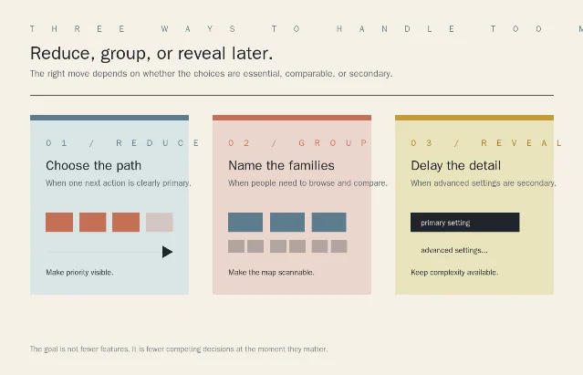
- Reduce: Use this when one next action is clearly primary. Give it the strongest visual weight, keep the alternatives available, and remove options that are duplicates, obsolete, or irrelevant to the current state. A product page may foreground one route while leaving comparison and support close by.
- Group: Use this when people must browse or compare. Turn a flat set into categories whose labels match the user's vocabulary. IxDF recommends grouping navigation into higher-level categories and expanding those groups as needed; the grouping is what makes a large information space navigable without showing every leaf at once. 1
- Reveal: Use this when advanced settings are real but secondary. Keep the main task in view, then expose deeper controls after the user selects the relevant path. This is progressive disclosure, and it is a trade-off: hiding options reduces visual competition, but it can also reduce discoverability. 5
The quality test is whether the user can predict where the missing choices went. A category called
Export is useful if it leads to formats, destinations, and delivery settings. A generic More bucket only moves the uncertainty one click away.The same principle across design disciplines
| Discipline | Typical choice problem | Better move |
|---|---|---|
| UX/UI | A navigation bar gives equal weight to primary, occasional, and administrative destinations. | Prioritize the main route; group the rest by a label users can scan. |
| Graphic design | A poster, slide, or dashboard gives every message the same size, contrast, and spacing. | Make the reading order visible before adding more content. This is the visual equivalent of reducing competing decisions. |
| Ergonomics | A control panel places frequent adjustments beside rare settings and high-consequence actions. | Cluster controls by task and state. Keep safety-critical actions visible; do not hide them behind a convenience menu. |
| Industrial design | A product has a simple daily mode plus specialist configuration. | Give the daily mode a short path and preserve advanced capability behind a deliberate mode change. IxDF uses appliances and cameras to illustrate this kind of compromise. 1 |
The table is not a universal mapping from discipline to component. It is a reminder that Hick's Law applies to competing decisions, whether the choices are links, visual messages, physical controls, or product modes.
A five-minute audit
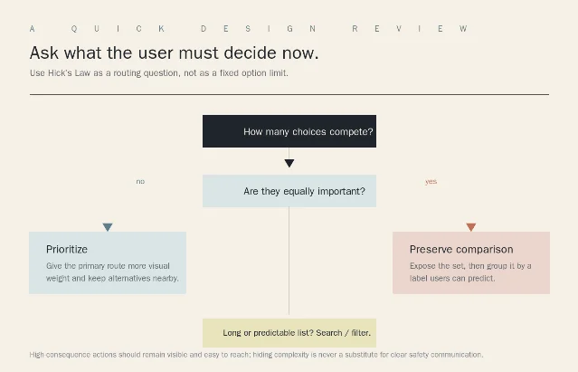
- Inventory the moment. List every option visible, implied, or required before the user can proceed. Include defaults and secondary links; they still compete for attention.
- Mark the job. Which option is the normal next step? Which options must be compared? Which ones matter only in an unusual case?
- Choose the move. Reduce a clear primary path, group a comparison set, or reveal secondary detail later.
- Test the missing path. Ask someone to find an option you hid. If they cannot predict its category, label, or trigger, the interface has traded visual quiet for discovery cost.
- Recheck the control. For a small set, showing choices directly may be faster than hiding them in a dropdown. For a long predictable set, search or filtering may beat scrolling. NN/g describes both hidden-option and long-list costs, and recommends treating dropdowns as a deliberate trade-off rather than a default. 5
The boundary
Hick's Law is a routing heuristic, not a command to cap every menu at a magic number. It is most useful when a design review feels crowded but the team is arguing about taste. Ask which decisions are competing, which must remain visible, and which can be made later.
When users need to compare options, hiding them may make the screen cleaner while making the choice harder. When a list is long and predictable, a filter may remove search work without pretending that the options do not exist. When an action has serious consequences, visibility and reachability outrank visual minimalism.
Good simplification leaves the capability intact. It changes the order in which the user meets it.
References
- 1
- 2On the rate of gain of information — W. E. Hick
journals.sagepub.com
- 3
- 4
- 5
This story was produced automatically by a channel. One sentence is all it takes for Neodrop to keep producing for you.