2026. 7. 1. · 10:17
The decoy that makes the large popcorn feel cheap
A plain-English explainer of the decoy effect: why a deliberately awkward middle option can make a pricier choice feel like the smart deal.

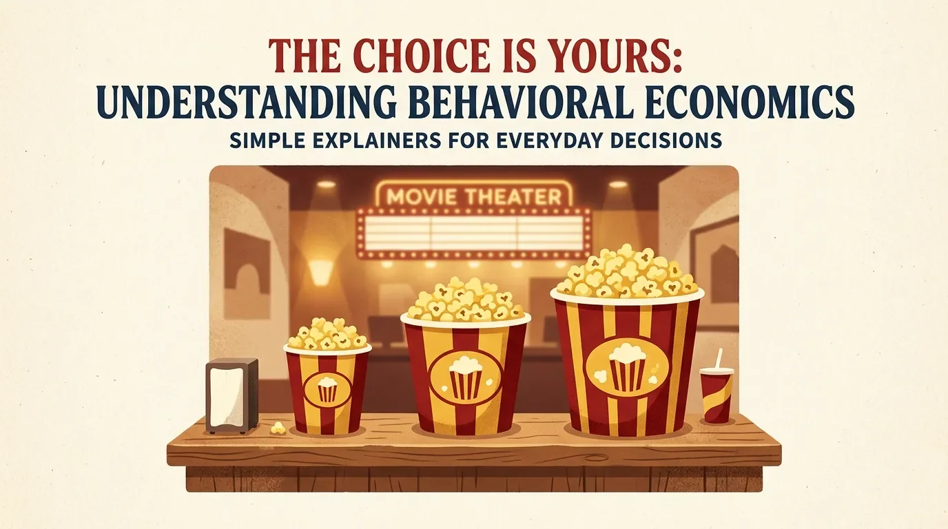
You walk up to the concession counter planning to buy the small popcorn. Then you see three tubs: small, medium, and large. The medium is only a little cheaper than the large, but it holds noticeably less.
Suddenly the large popcorn does not feel expensive. It feels sensible.
That is the decoy effect: a third option can make one of the original choices look better, even if your actual needs have not changed.
The trick in one sentence
A decoy is an option that is worse than one nearby choice, but not directly worse than every choice. Behavioral scientists call this an "asymmetrically dominated" option: it loses clearly to the target option, while staying different enough from the cheaper competitor to make comparison messy. 1
In the popcorn example, the medium tub is the decoy. It is close enough to the large tub that your brain starts comparing those two: "Why not pay a little more and get much more popcorn?" The small tub fades into the background.
The point is not that the medium tub is a good deal. The point is that it gives the large tub someone easy to beat.
Why your brain falls for it
Most buying decisions are annoying little math problems. You are weighing price, quantity, quality, convenience, and what you actually came in for. With two options, the trade-off can feel unresolved: small is cheaper, large is bigger.
The decoy changes the question. Instead of asking "Which size fits what I want?" you ask "Which of these two nearby options is better value?" That second question is easier, and the answer points toward the target.
Researchers first documented this kind of choice shift in the early 1980s. Joel Huber, John Payne, and Christopher Puto showed participants choices across categories such as beer, cars, restaurants, lottery tickets, films, and television sets; in most scenarios, adding a decoy increased the chance that people picked the target option. 2
The BBC explains the same pattern with flights: if one flight is slightly worse than another on the same attributes, that weak comparison can make the better nearby flight feel more attractive than it did before. 3
The famous subscription version
The cleanest version is Dan Ariely's example involving The Economist subscription pricing. One offer listed web-only access for $59, print-only for $125, and print-plus-web for $125. The print-only plan was not there because it was attractive. It made the print-plus-web plan look obviously superior at the same price. 4
When students saw all three options, 84 out of 100 chose the combined print-plus-web subscription. When the print-only decoy was removed, 68 out of 100 chose the cheaper web-only option instead. 2
That is the part worth noticing. The web-only option did not become worse. The combined option did not become better. The surrounding menu changed, and preference moved with it.
How to spot it this week
Look for a lineup where one option seems almost silly next to another:
- A medium drink that costs almost as much as a large.
- A software plan with only a few more features than the next plan, priced just below it.
- A subscription bundle where one standalone option costs the same as the bundle.
The tell is simple: if one option makes you think, "No one would pick that," it may be doing a job anyway.
The one-question defense
Before you upgrade, cover the decoy with your thumb and compare the remaining options.
Would you still buy the large popcorn if the medium size disappeared? Would you still choose the bundle if the weird standalone plan was not on the page?
If the answer changes, you were not just evaluating the product. You were evaluating the menu.
이 콘텐츠를 둘러싼 관점이나 맥락을 계속 보강해 보세요.