2026. 6. 22. · 08:20
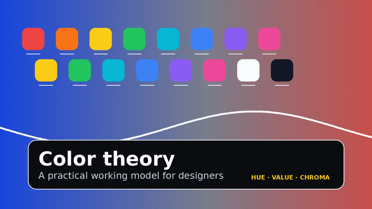
Color Theory for UI Designers: Hue, Value, Chroma, and Contrast
A practical guide to using hue, value, chroma, contrast, and color roles to build accessible UI color systems instead of one-off palettes.

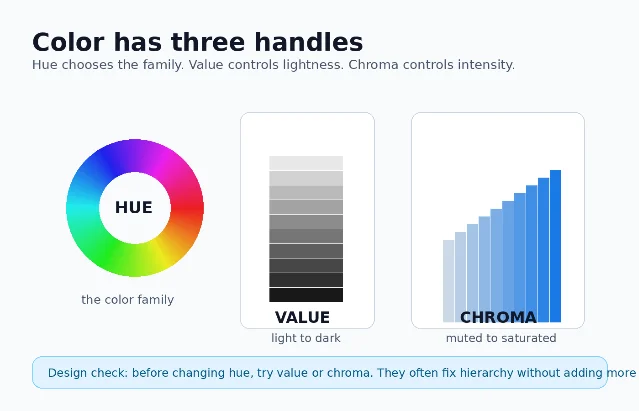
Most color problems in interface work are not solved by finding a prettier blue. They are solved by separating four decisions that designers often mix together: what color family it belongs to, how light or dark it is, how intense it is, and what job it performs in the system. The Munsell color system names the first three handles as hue, value, and chroma: hue is the color family, value is lightness/darkness, and chroma is saturation or brilliance. 1
Use this as a compact working model: choose hue for identity, value for hierarchy and legibility, chroma for emphasis, and roles/tokens for consistency.
The three handles: hue, value, chroma
A useful color critique starts by naming which handle is wrong:
| Handle | What it controls | When to adjust it |
|---|---|---|
| Hue | The color family: red, green, blue, yellow, or a point between them. 1 | Change hue when the meaning, brand association, or category needs to change. |
| Value | How light or dark the color is. 1 | Change value when hierarchy, contrast, or foreground/background separation is weak. |
| Chroma | How bright, saturated, or vivid the color is. 1 | Change chroma when the palette feels too loud, too dull, or when everything is competing for attention. |
In practice, value usually does more structural work than hue. If a card title, icon, or button label is hard to scan, try changing lightness before changing the color family. If every surface feels equally loud, reduce chroma on secondary elements before inventing more palette colors.
Pass contrast before you discuss taste
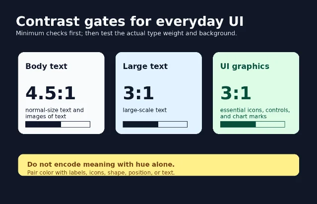
Color cannot be evaluated only by eye, because two colors that feel different in hue may still be too close in relative luminance. WCAG 2.2's contrast guidance states that normal text and images of text need at least 4.5:1 contrast, while large-scale text needs at least 3:1. 2 WCAG's non-text contrast criterion also sets a 3:1 threshold for visual information needed to identify UI components, component states, and meaningful graphical objects. 3
Digital.gov gives the same practical warning for visual designers: do not rely on color alone to communicate meaning; pair color with icons, text, or other visual cues. 4 It also recommends placing text over images only when you add a solid background or overlay behind the text, because image detail can destroy contrast unpredictably. 4
A fast review routine:
- Check body text first. If it is below 4.5:1, the palette is not ready for production. 2
- Check large labels, hero text, and numbers separately. The large-text threshold is lower, but the exact type weight and rendering still matter. 2
- Check controls, focus states, icons, and chart marks. Meaningful non-text UI information needs 3:1 against adjacent colors. 3
- Add a second cue for meaning. Error, success, warning, selected, disabled, and required states should not depend on hue alone. 4
Move from a palette to a system
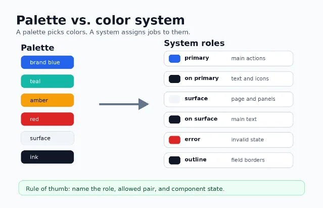
A palette says, 「we have blue, teal, amber, red, surface, and ink」. A system says, 「this blue is primary, this dark color is on primary, this neutral is surface, this red is error, and this line color is outline」.
That difference matters because modern products rarely use one static screen. Material Design describes color roles as the layer that connects color choices to UI elements; roles are mapped to components and implemented through tokens. 5 Its naming also encodes foreground/background relationships: roles such as on primary indicate colors used for text and icons placed on a corresponding background role. 5
IBM Carbon makes the same separation explicit. Carbon uses color tokens and themes: a token is a role-based identifier, while a theme determines the actual color value behind that token. 6 Carbon's guidance also warns that a token's role should not change from theme to theme; otherwise the system stops being predictable. 6
So do not hand off only hex values. Hand off a table of roles, allowed pairings, component uses, and states:
| Role | Typical job | Must be paired with |
|---|---|---|
primary | Main action, selected brand emphasis | on primary text/icon color; test the pair, not the swatch alone. 5 |
surface | Page, card, sheet, panel background | on surface for primary text and icons. 5 |
error | Invalid state, destructive warning, form failure | Text/icon/state treatment that does not rely on red alone. 4 |
outline | Borders, dividers, focus boundaries, input edges | Adjacent surfaces with enough non-text contrast when the outline carries meaning. 3 |
A practical workflow for building UI color
Use this sequence when starting a feature, redesigning a screen, or cleaning up a design system.
1. Design hierarchy in grayscale first
Strip the screen to surfaces, borders, text levels, and disabled states. If the page fails in grayscale, hue will only hide the hierarchy problem. This step forces you to solve value: the light/dark relationships that make layout scanable.
2. Add hue only where it changes meaning
Reserve high-chroma color for actions, status, categories, and brand moments. Keep neutral surfaces quiet so content can carry the page. If you need five saturated colors to make one screen understandable, the information architecture is probably doing too little work.
3. Define roles before choosing final hex values
Name the jobs first:
primary, secondary, surface, on surface, error, success, warning, outline, focus, and disabled. Then choose values that pass the required foreground/background checks. This mirrors the token logic used by Material Design and Carbon: roles create consistency; themes provide actual color values. 5 64. Test the system in states, not just in the palette file
Check default, hover, pressed, selected, focused, disabled, success, error, and warning states. WCAG's non-text guidance specifically includes UI components and states when visual information is required to identify them. 3
5. Test light theme, dark theme, and image backgrounds
A role that works on a white surface may fail on a dark theme or over a photograph. Carbon's theme model is useful here because the role name can stay stable while the underlying color value changes by theme. 6 Digital.gov's image-text warning is the simple production rule: if text sits on imagery, add an overlay or solid backing before checking contrast. 4
6. Check implementation color spaces
CSS Color Module Level 4 expands how CSS represents color: it defines CSS
<color> values and covers areas such as foreground color, group opacity, color interpolation, and gamut mapping. 7 That matters because design tools and browsers may not treat every color space or interpolation path the way a flat hex swatch suggests. Document the production format your team will use, not only the Figma swatch.Common color mistakes to catch in review
- Only changing hue when hierarchy is weak. If the problem is legibility or scan order, adjust value before hunting for another color family. 1
- Using brand color as body text. Body text needs the contrast threshold first; brand consistency comes after readability. 2
- Communicating error/success only through red/green. Add labels, icons, shapes, or position so the meaning survives color-vision differences and low-contrast contexts. 4
- Shipping hex values without roles. A color system needs named jobs and allowed pairings, not just a list of swatches. 5
- Letting roles change meaning across themes. If
outlinebecomes text in one theme and border in another, designers and engineers can no longer reason about the system. 6 - Testing the palette, not the UI. Contrast must be checked on actual foreground/background pairs, component states, images, and chart marks. 3
The short version
For everyday design work, treat color as a system of decisions rather than a mood board:
- Hue chooses the family.
- Value creates hierarchy and contrast.
- Chroma controls emphasis.
- Roles make the choices reusable across components and themes.
- Contrast checks decide whether the result is usable.
If a color decision cannot be named as a handle, a role, or an accessibility requirement, it is probably still just a preference.


이 콘텐츠를 둘러싼 관점이나 맥락을 계속 보강해 보세요.