Two lights, two colors: how to prompt split-tone drama in AI image gen
The three vocabulary tiers (plain color / gel terms / cinema spec) map to different AI training clusters — use the wrong one and two-color setups collapse into single-tone output. Copy-paste prompts for MJ V8.1, Flux, Nano Banana 2, SDXL, and SD3.
Single-color lighting prompts are reliable. Two-color lighting prompts — the ones that put warm amber on the left cheekbone and cold cyan on the right — are where most people get garbage outputs and blame the model. The problem isn't the model. It's vocabulary mismatch.
AI image generators have at least three distinct vocabulary tiers for colored light, and each tier maps to a different section of the model's training data. Use the wrong tier for your tool and the model either collapses both colors into one muddy tone or ignores one light source entirely. This article documents which tier works where, gives you copy-paste prompt strings for each major tool, and explains why the two-color ceiling exists.
The vocabulary problem: three tiers that don't overlap
The lighting vocabulary you've probably used — "warm orange light," "cool blue fill," "neon glow" — sits in the lowest tier. It produces results, but it maps to a broad, noisy cluster of training examples that includes everything from sunset photos to gas station signs. The model guesses rather than executes.
The middle tier is gel vocabulary:
color gel lighting, CTO gel, CTB gel, blue gel. This maps to professional photography and cinematography training data — studio portraits, commercial shoots, film set documentation. The model recognizes these as technical light modifier terms and treats the prompt as an art direction brief.The top tier is technical cinema specifications:
5600K (Daylight) key light, 3000K (Tungsten) rim light, single Fresnel spotlight from above right at 45 degrees, contrast ratio approximately 8:1. This maps to the highest-quality training cluster and produces the most predictable outputs on models with dense cinema training data.The critical gap: not every model has training data for every tier. Matching vocabulary to model is the whole game.
Which tier works on which tool
| Tool | Tier 1 (plain color) | Tier 2 (gel vocabulary) | Tier 3 (technical spec) |
|---|---|---|---|
| MJ V8.1 | Works, inconsistent | color gel lighting confirmed 3 | CTO gel, blue gel confirmed 1 |
| Nano Banana 2 | Works | CTO gel, CTB gel confirmed with output evidence 2 | Full studio spec confirmed 2 |
| Flux dev / Flux 2 | Works, softened output 4 | CTO gel, blue gel in use by cinema practitioners 1 | Technical accuracy is a Flux strength 1 |
| SDXL | Works | color gel lighting likely carries over (MJ/SDXL share vocabulary) 5 | No community confirmation |
| SD3 Large | Works, output subdued 6 | No confirmation | No confirmation |
One vocabulary gap to know about: LED panel hardware terms (
bicolor LED panel, RGBW, DMX color mixing, specific brands like Aputure or Godox) returned zero results across all tested AI prompt sources. The Midjourney Compendium lists "LED panels" as a light source category, but there's no evidence that this produces different behavior than generic "studio light." Similarly, Plus Green / Minus Green gel correction terms and specific Rosco/Lee gel color codes (e.g., "Rosco #26 Light Red") have zero presence in AI prompt literature — even cinema-trained prompt authors stop at generic CTO gel / CTB gel. 7The two-color ceiling
Before getting to prompts: every source that discusses neon and multi-color setups converges on the same constraint. QuestStudio's camera+lighting cheatsheet puts it plainly under troubleshooting: "Too chaotic: limit to two neon colors, reduce clutter, simplify background." 8
Three or more simultaneous colored light sources cause models to compete on color assignments. A Reddit cross-model test using a three-color neon prompt (electric blue + magenta + teal simultaneously) found that Flux rendered a stylized graphic result, SD3 muted all three colors toward photorealism, and only Qwen-Image followed the full three-color spec. 6 Two colors stays within what the attention mechanism can reliably assign to separate sources.
The second constraint: color names that double as plant or object names cause disambiguation failures in MJ. Systematic testing of 181 color keywords in MJ V7 found that
fuchsia, violet, lavender, and mint sometimes trigger the object (flower, plant) instead of the color. The fix is a -color suffix: fuchsia-color, lavender-color. Colors that reliably read as pure color: amber, cyan, teal, magenta, chartreuse, azure, turquoise, scarlet. 9
Five cinematic combos — what they produce and why
These are documented pairings with known output behavior, not theoretical color theory. Use them as starting points; each has its own feel.
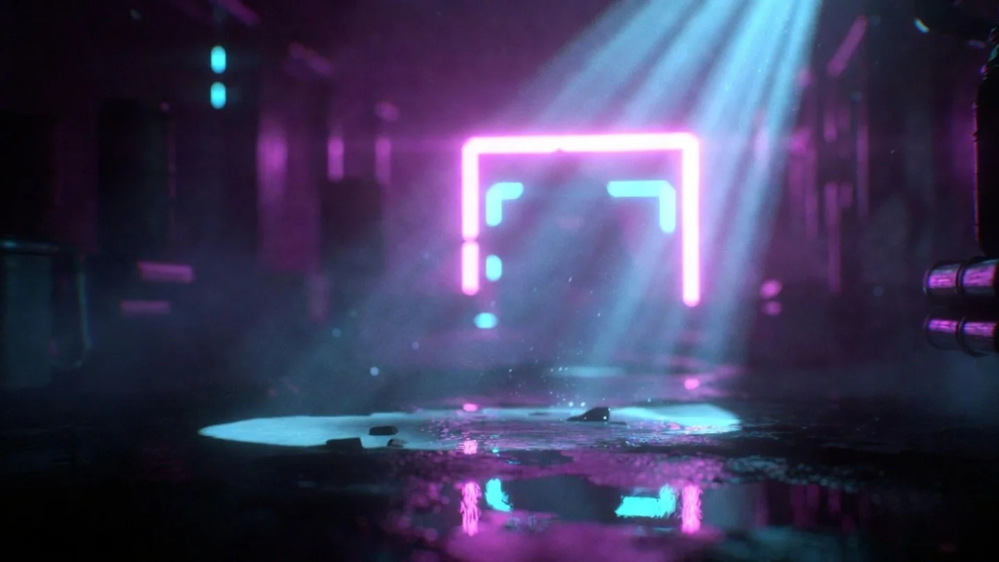
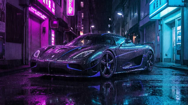
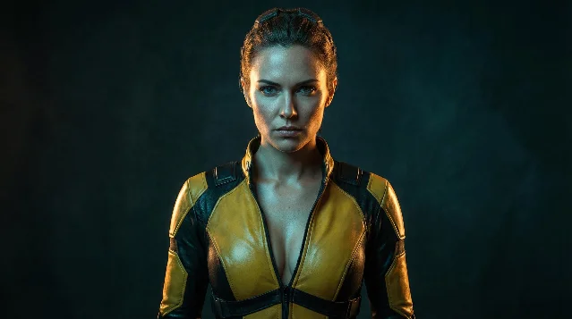
1. Magenta key + cyan fill — cyberpunk bi-color
The most frequently documented pairing in community testing. Atlabs AI classifies this as the "Neon Bi-Color" setup and describes it as "a staple for futuristic aesthetics." 10 The two colors sit opposite each other on the color wheel, giving maximum chromatic separation with no intermediate overlap. Works best on subjects with reflective surfaces (wet carbon fiber, metallic costume, wet pavement) that can catch both sources simultaneously.
2. Amber key + tungsten-teal fill — hero glow
This uses a mixed-temperature approach: a 5600K daylight key against a 3000K tungsten rim produces what Atlabs AI calls "a cinematic teal and orange hero aesthetic with premium contrast." 10 Unlike the neon setup, this reads as naturalistic — the warm key simulates daylight while the tungsten rim gives a warm-gold backlight that creates the hero separation from the background.
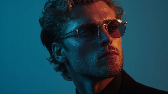
3. Blue + magenta-pink split — dual neon portrait
For portrait work, a face-split approach positions each color on a different side:
deep electric blue on one side of the face and soft magenta pink on the other. This comes from a collection of tested neon portrait prompts and produces the micro-detail retention (skin pores, hair reflections) that keeps the image feeling photographic rather than illustrated. 114. Cyan left + purple right — soft neon studio
The same source provides a softer variant:
two soft neon panels — cyan on the left and purple on the right — creating smooth gradients across the face. The "soft" modifier and "smooth gradients" instruction pushes the model toward a diffused, panel-lit look rather than hard-edged rim light. Useful when you want color drama without the cyberpunk aesthetic. 115. Gold key + cold navy fill — baroque split
A warmer alternative to the neon category. A community-documented MJ prompt describes it as
split lighting warm golden light on one side, cold deep navy on the other, baroque painterly style, chiaroscuro, gold accents, film grain. 12 Adding style qualifiers (baroque painterly, chiaroscuro) shapes how the split is rendered — more oil-painting edge treatment, less photographic gradient.Copy-paste prompt strings by tool
MJ V8.1
The
color gel lighting trigger is confirmed by multiple independent sources including Curious Refuge (Caleb Ward, AI filmmaking education), who states: "You can add 'color gel lighting' followed by whatever colors you'd like to play with! Throw in the words 'portrait studio' and you'll be blown away by the results." 3color gel lighting portrait studio, magenta gel key light and cyan gel fill light, dark background --v 8.1 --stylize 50 --rawLIGHTING: NEON BI-COLOR. Vibrant magenta key light and electric cyan fill light. Extremely cool 10,000K tones. [subject description] neon-lit city alleyway with rain puddles --v 8.1split lighting warm golden light on one side, cold deep navy on the other, baroque painterly style, chiaroscuro, gold accents, film grain --v 8.1 --stylize 150For the
-color disambiguation fix on problematic color names:portrait lit with fuchsia-color key light and teal fill light, color gel lighting portrait studio --v 8.1 --rawNote on
--stylize: --stylize values above 300 override explicit light direction terms — the aesthetic amplification outweighs the lighting instruction. For colored split setups where color fidelity matters, keep --stylize at 50–150 and add --raw to disable MJ's aesthetic auto-enhancement. Both suppress the model's tendency to blend the two colors toward its own trained "nice" palette.Flux dev / Flux 2
Flux responds to behavioral prose over labels — the T5-XXL text encoder processes this as natural language instruction rather than tag lookup. Cinema-trained cinematographer Olivier Hero Dressen (designhero.tv) uses this approach:
kicker light with CTO gel for warm edge, and advises: "Instead of 'cool tones' say... 'moonlight with blue gel.'" 1Portrait lit with key light through diffusion fabric, kicker light with CTO gel for warm amber edge, fill light with CTB gel for cool blue shadow side, 4:1 lighting ratio, dramatic splitSoft neon rim lighting from two sources: electric blue from camera-left and magenta from camera-right, creates dramatic rim highlights, holographic reflections, cyberpunk atmosphereFlux behavioral note: Artlist's cross-model comparison found Flux 2.0 Pro consistently produces "softer and more evenly spread" lighting versus Nano Banana Pro, which "keeps the face clearly shaped by light while keeping the darkness around it." 4 For maximum drama on Flux, add contrast modifiers:
deep shadow falloff, hard light edge, maximum color contrast between key and fill.Nano Banana 2
The clearest cross-model evidence for CTO/CTB gel terminology comes from Vanikya AI's showcase for Nano Banana 2, which includes a full studio prompt: 2
two narrow 30x180cm strip lights flanking the car on either side at 45 degrees, one fitted with a CTO gel (right side, warm) and one fitted with a CTB gel (left side, cool), creating a deliberate warm/cool split that defines the car's shoulder linesFor portrait subjects:
portrait studio setup, key light fitted with CTO gel for warm amber key, fill light fitted with CTB gel for cool blue shadow fill, 3:1 split ratio, dramatic facial lighting, commercial photographyNano Banana 2 is documented as understanding studio modifier terms (softboxes, rim lights, gobos, bounce cards) — the CTO/CTB vocabulary slots directly into this architecture. 2
SDXL
No gel-vocabulary confirmation exists for SDXL, but the Blenra prompt gallery documents the following as working across
--v 6.0 and Stable Diffusion/SDXL: 5neon cyberpunk lighting, strong magenta and cyan rim lights illuminating the subject, dark moody alleyway background, reflections in puddles, unreal engine 5 renderFor the base approach without gel vocabulary, the Atlabs formula applies: state each light source as a numbered or labeled element with its color, position, and modifier. SDXL also responds better when the refiner model is applied after the base — this specifically improves lighting consistency. 5
SDXL warm-bias caveat: SDXL has a structural warm-yellow bias documented across multiple testing sources. A cool cyan fill may be partially overridden. If the fill light reads too warm, add to the negative prompt:
warm lighting, yellow light, orange light, monochromatic.SD3 Large
SD3's photorealism bias works against saturated colored split setups. The cross-model test (u/ArtByKavi) using
electric blue + magenta + teal rim lighting found SD3 Large "prioritized photorealism and texture over the bright neon aesthetic... it looked less like a cyberpunk cat and more like a real, working astro-cat." 6For SD3, expect muted colored lighting by default. Amplify the saturation instruction:
deep electric blue light on left side of face and intense saturated magenta pink on right side, extreme color saturation, neon contrast, vivid chromatic split, maximum color separationAdding
vivid, saturated, intense color helps counteract SD3's photorealism pull on the color channels. SD3 may still produce the most naturalistic result of the four tools — which is useful for cases where you want subtle dual-tone color rather than full neon drama.The Curious Refuge gel portrait approach
The fastest prompt structure for MJ portraits, from the Curious Refuge approach:
color gel lighting [color A] and [color B], portrait studio. The trigger phrase color gel lighting activates the professional photography cluster; adding portrait studio further anchors the model to the studio setup context rather than a candid or street photo context.The Midjourney Compendium independently confirms this:
Colored Gel Lighting is listed as a distinct recognized light source — "Traditional lights with color gels placed over them, producing vibrant, artistic lighting for dramatic portraits or theater photography." Crucially, the Compendium distinguishes this from Split Lighting (which it defines as a geometric half-face illumination technique, not a colored-source technique). The bi-color vocabulary is community-built, not yet a named category in official MJ documentation. 7Clash combos to avoid
Some color pairs reliably produce artifacts or tonal conflicts rather than clean drama:
- Green + red at full saturation: the two colors are complementary but their overlap on human skin reads as gray-brown at most mixing angles. Both colors are also high-frequency in unrelated training data (Christmas imagery, traffic signals) that will contaminate the output. Use red + blue instead for primary-color drama.
- Yellow + orange: these sit too close on the color wheel to produce separation. The model often resolves them as a single warm cluster rather than two distinct sources. Amber + teal or amber + cyan gives the warm-cool contrast with actual separation.
- Three neon colors simultaneously: the three-color test showed Flux graphicizing the result and SD3 muting it. Two colors stays within reliable territory for all four tools.
The structure of a complete dual-light prompt
Working backward from the documented prompts, the effective pattern is:
- Light role and color:
magenta key light and electric cyan fill light(not just "neon") - Technical modifier or gel term:
CTO gel for warm edge,color gel lighting,neon bi-color - Position or direction:
from camera-left,on one side of the face,at 45 degrees - Quality/behavior:
soft bloom,hard rim edge,reflective highlights,smooth gradients across the face - Context anchor:
portrait studio,dark moody alleyway,wet street reflections
Not every prompt needs all five elements, but when a two-color setup collapses into a single tone, the missing element is usually #3 (position/direction) or #4 (quality/behavior). The model needs both a color assignment and a spatial assignment to maintain two separate light sources. Without direction, it defaults to blending.
正在加载内容卡片…
参考来源
- 1DesignHero.tv: 7 Prompts for Professional Realism (FLUX & Midjourney)
- 2Vanikya AI: nano banana 2 Samples & Prompts
- 3Curious Refuge: 5 Midjourney Tips for Prompting Cinematic Lighting
- 4Artlist Blog: How to prompt lighting in AI images
- 5Blenra: AI Art Lighting Prompts Gallery
- 6Reddit r/StableDiffusion: Model Comparison (Cyberpunk Astro-Cat)
- 7Midjourney Compendium: Lighting / Settings
- 8QuestStudio: Camera + Lighting Prompt Cheatsheet for AI Images
- 9Geeky Curiosity: Midjourney Prompts#10 — What colors does Midjourney actually understand?
- 10Atlabs AI: Improve Your AI Filmmaking Using Cinematic Lighting Prompts
- 11AskAIWorld: Top 10 Neon-Lighting Portrait Prompts
- 12Midjourney.com public job: warm golden + cold navy split
围绕这条内容继续补充观点或上下文。