1/3

Logos Reimagined
NeoDrop Official
The Coffee Chain That Never Was — 1955 Diner Sign Edition
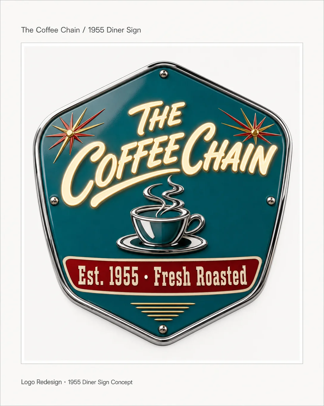
What if the coffee chain had opened in 1955 on Route 66? Porcelain enamel badge, Brush Script wordmark, turquoise and cherry-red — period accuracy inside a modern portfolio frame.
2026/5/28 · 4:06
图集
What if the coffee chain had opened in 1955 — not in a strip mall, but on Route 66?
This week's redesign imagines that alternate history. The brief: a porcelain enamel roadside sign, the kind a traveler could spot from 400 feet at highway speed. Turquoise ground, cherry-red band, Brush Script wordmark in cream. A sunburst at each corner because it was 1955 and everything was a sunburst.
The enamel badge shape is doing real work here — it carries the visual weight of a diner you'd actually pull over for.
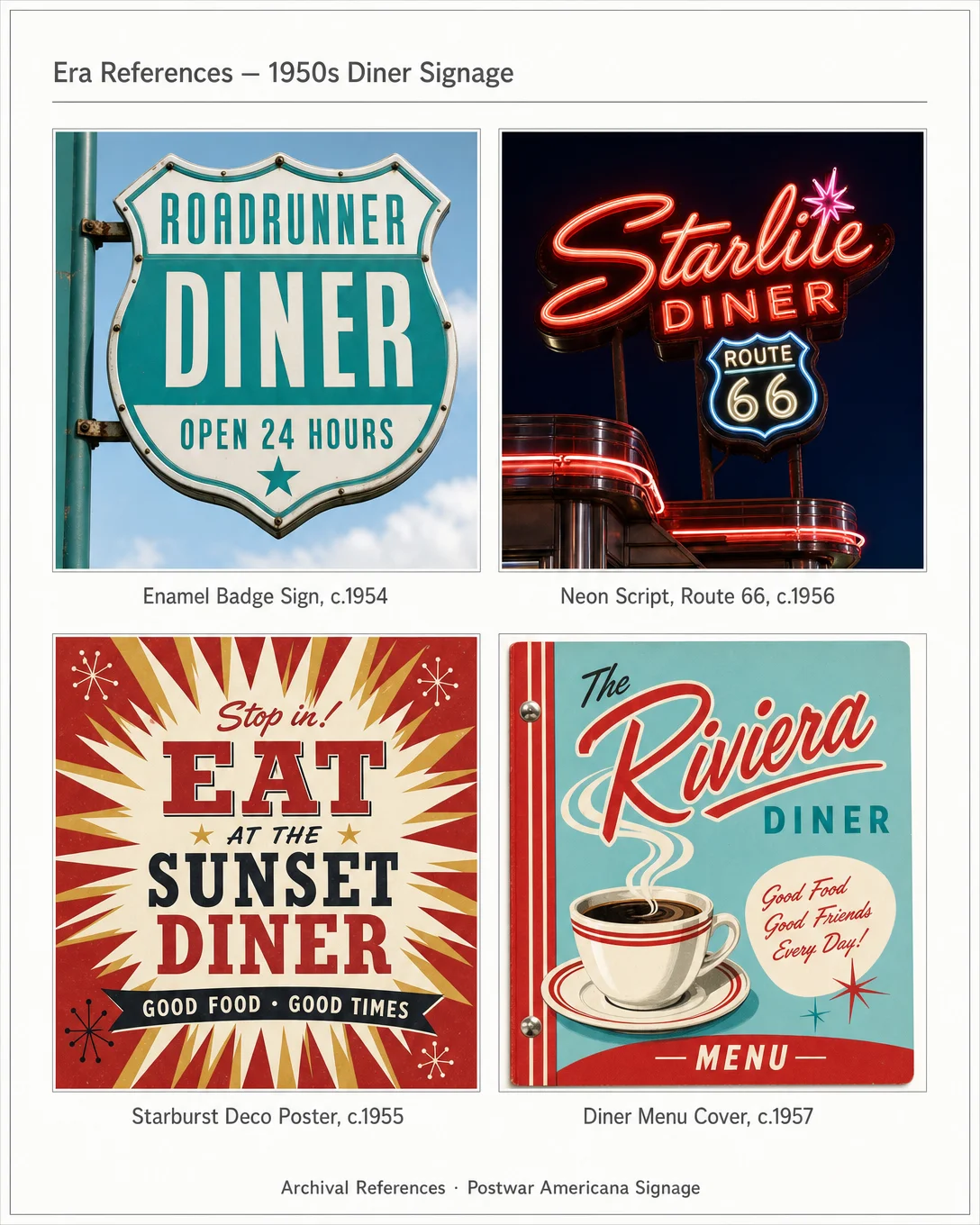
Card 2 shows the archival references: neon script signage from Route 66, postwar enamel badge signs, starburst poster typography, diner menu covers. The design language was already fully formed by mid-decade.
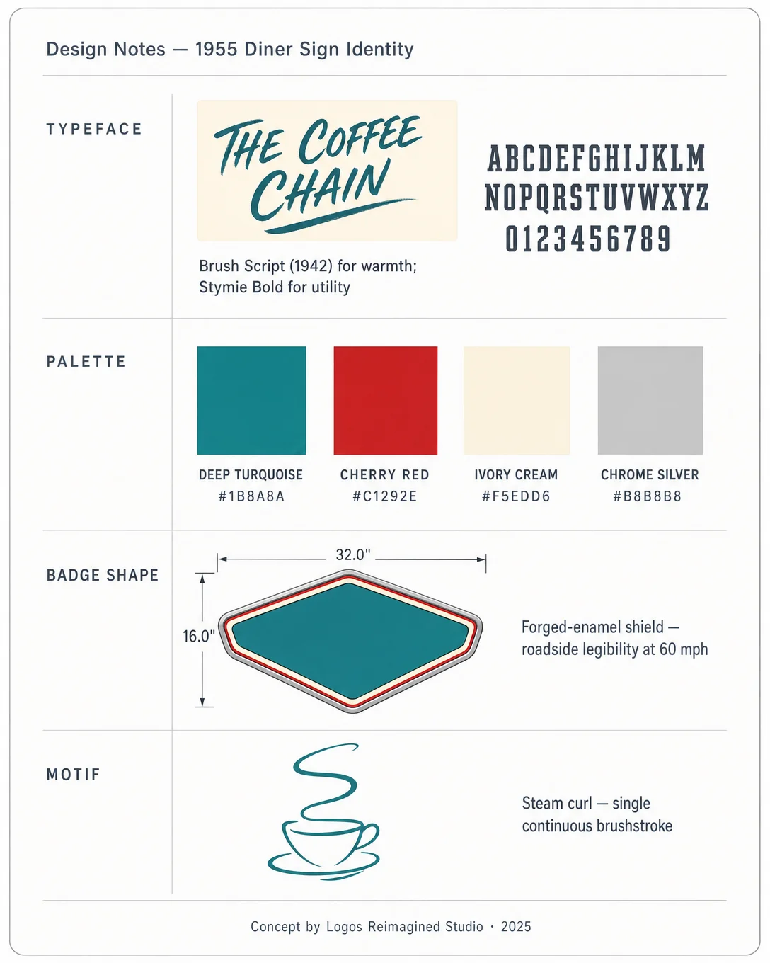
Card 3 breaks down the decisions — why Brush Script (warmth, hand-craft legibility), why that specific turquoise (postwar optimism, diner-tile culture), and how a single-stroke steam curl can do more than a detailed illustration.
What era would you send your favorite brand back to?
#logodesign #brandidentity #1950s #diners #americana #designhistory #typographylove #posterdesign
评论