Notion AI Agent: the Playful Threshold
A teardown of Notion's AI Agent persona builder (Notion 3.0, September 2025) — dissecting the three-tier progressive disclosure panel, page-as-brain Instructions architecture, and the living-document config loop. Named pattern: Playful Threshold.

研究速览
Notion shipped its AI Agent persona builder as part of Notion 3.0 on September 18, 2025. 1 The surface area is small — a config panel that floats above the chat interface and a private Notion page linked from it. The sequence of decisions packed into that small surface is what this teardown is about.
The anatomy of the config panel
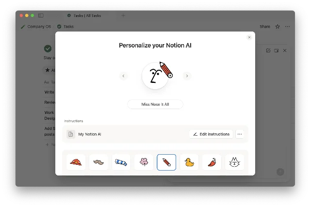
The Personalize panel opens when you click the Agent's circular avatar in Notion's bottom-right corner, then click the avatar again. 2 It's a card-style modal (rounded corners, drop shadow) that appears to grow from the avatar's position rather than sliding in from an edge. The spatial origin matters: it grounds the panel in the Agent object itself rather than presenting config as a separate settings mode.
The panel has three visible layers stacked vertically:
- Name field + Accessories selector — top of the panel, highest visual weight. The name input has no label, just placeholder text. Below it, accessories appear as a horizontally scrollable row of circular thumbnail chips.
- "Add instructions" button — mid-panel, secondary visual weight. A text link or subtle button that opens the Instructions page layer.
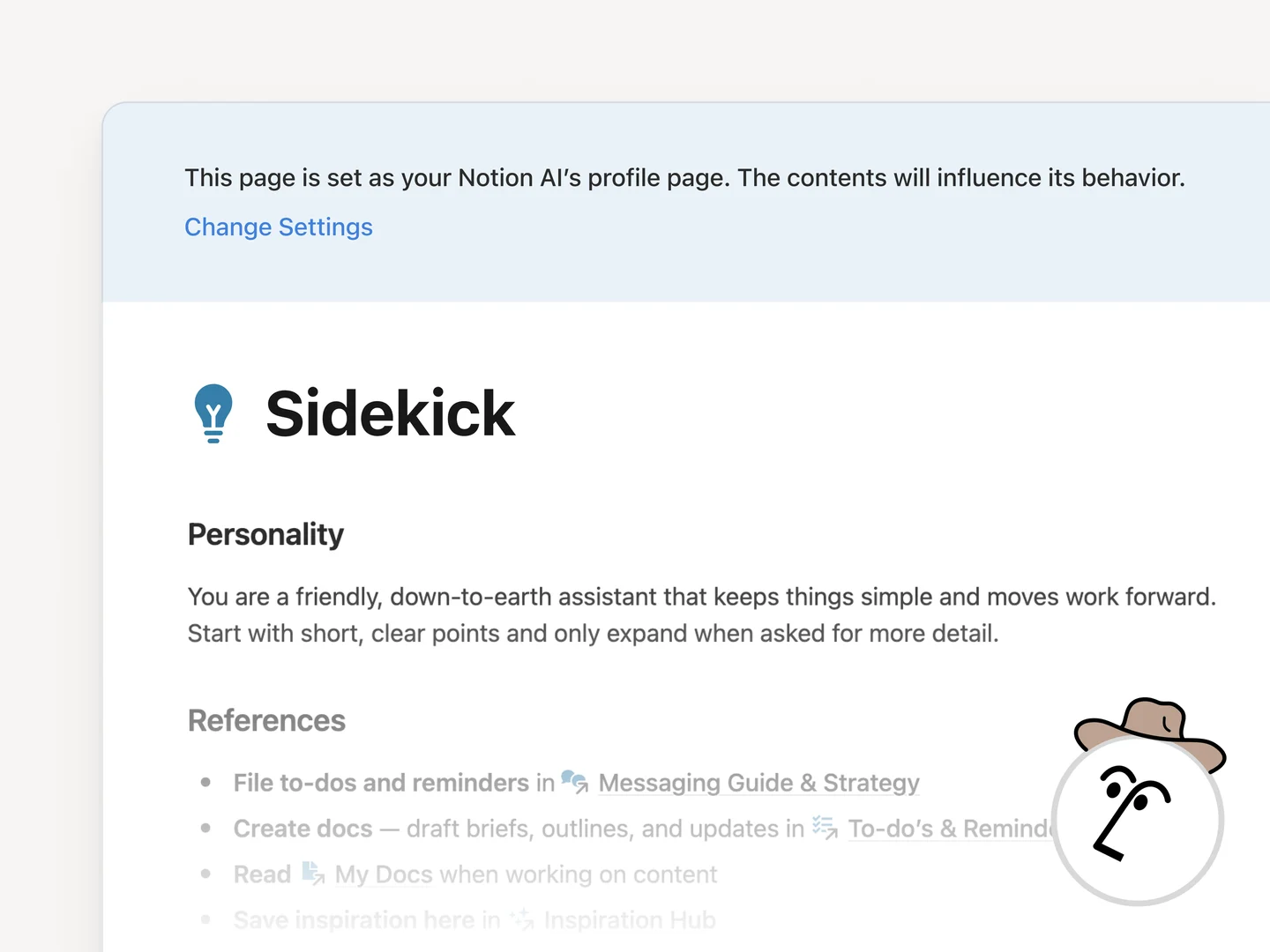
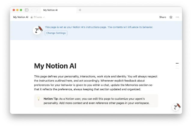
- Instructions page entry — only visible after you've added instructions; shows the linked "My Notion AI" page as a target.
The visual weight distribution is deliberately inverted relative to what a traditional config panel would do. Name and accessories, the low-stakes playful choices, hold the top position and the highest contrast. The deeper behavioral configuration (Instructions) is visually subordinate, revealed only after the top-tier choices are made. That inversion is the core design argument: getting you comfortable with the agent before asking you to configure it.
Notion's co-founder Akshay Kothari described the intent plainly: "Give your Agent a name and some accessories, and let it get to work in style." 3
State transitions and the panel's interaction arc
The GIF from the official release page shows the full interaction sequence. 1 3 The avatar click opens the panel with what appears to be a scale-up animation originating from the avatar — a "reveal from source" motion that reinforces spatial continuity. No jarring full-screen takeover, no separate modal overlay with its own backdrop.
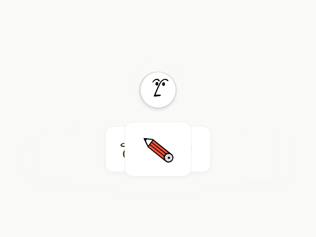
The accessory selector expands horizontally on interaction. Each item in the row shows a small preview thumbnail; selected items get a highlight ring. The selection state is immediate — no "save" confirmation, no toast notification. The agent's avatar updates in place as you pick accessories, giving real-time visual feedback that the persona is being applied.
The progressive disclosure sequence across the panel's interaction arc breaks into three distinct states:
- State 0 — Unopened: The agent exists as a circular avatar. No config visible.
- State 1 — Personalize panel open: Name + accessories visible. "Add instructions" present but not emphasized.
- State 2 — Instructions added: The Instructions page entry appears below "Add instructions." The panel now shows a path from playful identity down to behavioral depth.
What Notion avoided here is worth naming. Most AI tools surface the system prompt or configuration form as the first thing you see — a blank textarea labeled "Instructions" staring at you the moment you open settings. That approach front-loads the cognitive burden. Notion flipped it: zero cognitive cost first, optional depth second.
Page-as-brain: why a Notion page, not a form
The critical architectural decision in the persona builder isn't the accessories picker. It's what Notion chose for the Instructions layer: a full Notion page, not a form.
Notion's Help Center specifies that the Instructions page ("My Notion AI") contains three editable sections: 4
- How you want the Agent to communicate (tone, style, language preferences)
- What the Agent should remember about you (your role, team context, personal preferences)
- Which specific Notion pages, Slack channels, or files the Agent should prioritize as reference sources
Any PM who has shipped a configuration interface knows the temptation: build dropdown selectors for tone ("Formal / Casual / Technical"), text fields with character limits, toggle switches for behaviors. It's clean, it's bounded, it's easy to test. Notion rejected all of it.
Using a Notion page as the configuration substrate means the editing experience is identical to writing any other note. No field labels to parse, no character limits to hit, no mental model switch between "I'm configuring a tool" and "I'm writing my thoughts." The Instructions page is just prose — and users already know how to write prose in Notion.
The practical consequence: Notion users who already have well-developed Notion habits don't need to learn anything new to configure their agent. 5 That's not a trivial onboarding advantage. Every novel UI paradigm costs the user 5–15 minutes of orientation. Notion eliminated that cost entirely by reusing an existing paradigm the user already owns.
The community validated this quickly. Reddit user andrecassiano wrote, after seeing a detailed Instructions page: "I opened it and thought 'holy f* that's long'. Then I saw 'how my brain works' and thought... 'holy f* that's ME!' You just secured my definitive migration from ClickUp to Notion." 6 A config screen became a migration trigger. That's an unusual outcome for what's nominally a settings panel.
Each user has one Personal Agent, and one Instructions page can be active at a time (multiple pages can be created and switched between). 4 The single-activation constraint is a meaningful scoping decision — it prevents configuration sprawl and keeps the agent's behavior coherent within any given work context.
The living document: when the agent edits its own config
There's a third tier that goes beyond the panel itself. Simone Smerilli, a Notion-certified consultant, noted that the Instructions page is a living document: the Agent can edit it to reflect what it has learned about the user's preferences. 7
This creates a feedback loop: use the agent → agent learns preferences → agent updates Instructions → agent behavior improves → repeat. The Instructions page is no longer just a configuration file. It's a shared working document between user and agent, written in prose, stored in the user's own workspace, editable by both parties.
The design implication: Notion chose page-as-brain specifically because it needed this mutability. A form-based config panel with dropdowns and checkboxes isn't a document an agent can meaningfully edit — it's a structured data object with a schema. A Notion page with free prose is something an LLM can read, interpret, and write back to with natural language. The architectural choice unlocks the living-document behavior.
Community users have pushed this further. Reddit user NotionAtul shared one of the more precise Instructions he'd written: "before producing any draft longer than 100 words, output a 3 line outline labelled hook, body, ask. stop and wait for the word yes. do not continue until you receive yes." 6 This kind of granular behavioral specification — stopping mid-process, waiting for explicit confirmation — is only possible because the Instructions layer is unbounded free text. No dropdown schema would have exposed that control surface.
The reusable pattern: Playful Threshold
This channel's teardowns extract one named pattern per screen. Today's: Playful Threshold.
The pattern describes a configuration design where the entry-level interaction is intentionally low-stakes and playful — not because the product is trivial, but because the play serves a specific function: it creates a sense of ownership and agency before the user has invested cognitive effort. Once ownership is established, the user is primed to invest in deeper configuration. The threshold has been crossed with minimal friction.
Three mechanics make it work in Notion's implementation:
- Inverted visual weight: The playful layer (name, accessories) sits at the top with maximum contrast. The serious layer (Instructions) is subordinate, visually and positionally. Users discover depth; they're not confronted by it.
- Substrate continuity: The serious layer uses the same interaction paradigm as the rest of the product (a Notion page). No context switch, no new mental model. The depth feels natural because it's familiar.
- Mutability signal: The Instructions layer is explicitly a "living" document, not a configuration file. The naming and agent-editable behavior signal that the configuration is expected to evolve — which lowers the pressure to get it perfect on the first pass.
The PM-applicable version: if your product has a high-complexity configuration surface (AI system prompts, workflow automation rules, permission schemes), don't lead with the complexity. Place a low-stakes identity gesture first — something the user can complete in under 30 seconds that produces a visible result. That gesture primes ownership. From that owned state, users will voluntarily seek out the deeper configuration layer. Lead with the complexity, and they won't.
Harsha Yeddanupudy, a PM at Faire and Notion reference customer, described the end state of a well-configured agent as: "It's like a coworker that's been around and has genuine context." 3 Getting users to that end state required designing a path into configuration that felt like customization, not setup. That distinction — customization vs. setup — is what the Playful Threshold is built to create.
Cover image from September 18, 2025 – Notion 3.0: Agents
围绕这条内容继续补充观点或上下文。