Linear's issue detail view: four design decisions every PM should steal
A teardown of Linear's issue detail screen — breaking down the layout logic behind its wide content area, read-mode property sidebar, automated status transitions, and the triangular safe zone micro-interaction that most users never notice but feel every day.

Open a Linear issue and you're looking at one of the most carefully considered screens in B2B SaaS. Every visual choice — where properties sit, how much space the title gets, which interactions fire on a single keypress — traces back to a specific opinion about how engineers and PMs should think about work. Here's what the screen actually says.
The layout is an argument about where your attention belongs
Linear's issue detail view splits into two zones: a wide left column for the title and description, and a narrow right sidebar for metadata. The ratio isn't equal — the content area takes roughly 65% of the viewport on a standard 1440px monitor. That's a deliberate choice to signal that the writing matters more than the filing.
Most legacy trackers (Jira, older Asana views) flip this balance or equalize it. The result is that assignees, labels, and sprint fields visually compete with the problem statement. Linear's layout enforces a reading order: understand what the work is, then look at where it lives.
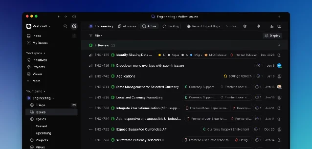
The title field is set in a noticeably larger type size than surrounding text — around 20–22px in the default view — with generous top padding before the first metadata row. This isn't decoration. It functions as a forcing function: when the title is the most visually dominant element on the screen, you have to write a good one. Teams that use Linear tend to write shorter, more specific issue titles than teams using tools where the title sits in a crowded form field.
Properties are scannable, not completable
The sidebar in Linear's issue view doesn't look like a form. There are no input boxes with borders, no "required" asterisks, no visible labels stacked left of values. Instead, each property row shows a small icon, a category name in muted text, and the value in normal-weight text — all on one line. The whole sidebar fits roughly 10 properties without a scroll.
This matters because it changes the mental model from "filling out a ticket" to "reading a card." The properties panel in Linear behaves more like a structured document than a data entry form. Clicking any property opens an inline dropdown, but the default state is read-mode.
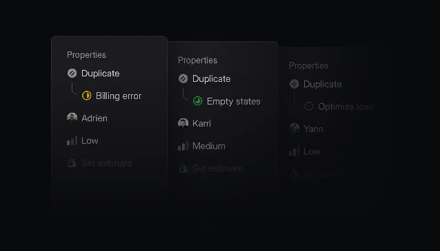
A specific detail from the changelog illustrates how seriously Linear treats this: when a Duplicate status was introduced, the original issue now appears directly in the sidebar beneath the status field 2. The team didn't just add a link — they made the relationship visible at the property hierarchy level, so the sidebar can answer "what should I do with this?" without opening another page.
The minimum required fields are exactly two: title and status. Everything else is optional 1. This reflects a philosophical stance: requiring fields creates noise, not accountability. A half-filled issue with a good title moves work forward; a fully-tagged issue with a vague title doesn't.
Status is a behavior, not a badge
Most tools treat status as a label you manually update. Linear treats it as a signal that other systems want to write to. The GitHub integration moves an issue to In Progress automatically when you copy the git branch name from the issue view. It then advances through In Review and Done as the pull request is drafted, reviewed, and merged 1.
This isn't just an automation feature — it's a design decision about what status means. If status can be written by the git workflow, it becomes a fact about the codebase rather than a fact about the tracker. The issue view reflects real state. That changes how the status badge reads: instead of "someone last updated this to In Progress," it reads "the branch exists and is being worked on."
The visual expression of this is intentionally understated. Status badges in the issue view are small colored chips — about the same visual weight as a label. They don't animate on update, they don't flash. The state change register as a quiet fact because Linear's position is that status transitions shouldn't interrupt reading. 2
Every action has four entry points, and one is always one keypress
Linear's conceptual model for taking actions is unusually explicit: you can use a button in the issue view, right-click for the contextual menu, use a keyboard shortcut, or open the command menu with
Cmd K and type the action name 1. These aren't four separate features — they're four surfaces for the same underlying action model.The keyboard shortcuts follow a spatial logic:
S opens the status picker, P opens priority, A opens assignee, L opens labels. Single characters, no modifiers, memorable because they map to the field name. C creates a new issue from anywhere. ? opens the full shortcut reference.The contextual menu is where this gets interesting from a design standpoint. Linear published a post in 2020 describing one specific micro-interaction: the triangular safe zone in nested submenus 3. When you hover a menu item that opens a submenu, the natural movement is diagonal — mouse from "Status" toward "In Progress" in the adjacent panel. Without the safe zone, that diagonal path briefly passes over a different parent item, closing the submenu. The fix uses a
clip-path triangle that keeps the submenu open as long as the mouse is moving toward it.正在加载内容卡片…
The safe zone took about 40 lines of code and is completely invisible to users. You can't screenshot it or point to it in a design review. It only reveals itself by not breaking — which is exactly how the best micro-interactions work. The shortcut hints displayed in the contextual menu serve the same invisible teaching function: every time a user performs an action via mouse, they see the keyboard shortcut they could have used next time.
The pattern beneath the patterns
What makes the Linear issue view cohere isn't any single decision — it's the consistency of the underlying principle: the interface should disappear into the work. Wide content area so writing feels primary. Read-mode properties so filing doesn't feel like form completion. Automated status so the tracker reflects the codebase. Four action surfaces so you get faster over time without being forced to.
For PMs evaluating tool design: the question isn't whether your issue tracker has keyboard shortcuts or a clean sidebar. It's whether those features reinforce a coherent model of what work means, or whether they're additive features layered on top of a different model. Linear's issue view earns its reputation because every pixel argues the same point.
Screen: Linear Issue Detail View. Teardown dimensions: information hierarchy, whitespace, state changes, micro-interactions.
围绕这条内容继续补充观点或上下文。