Linear's issue detail panel: how 240px of metadata stays calm
A deep dive into Linear's right-side properties panel — how its three-state hover model, whitespace grouping, and color-on-demand priority system pack data density without visual anxiety.

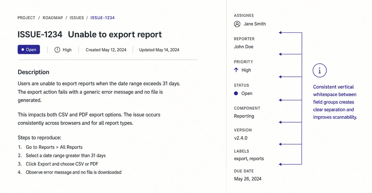
Linear's issue detail screen has become a reference point for anyone arguing that dense UIs can still feel calm. Today's teardown goes inside one specific moment: the right-side properties panel on an open issue — the column of metadata that holds assignee, status, priority, cycle, and a dozen other fields. At first glance it reads as a simple sidebar. Spend five minutes studying how it handles hierarchy, hover states, and contextual disclosure, and you start to see how many deliberate decisions are packed into roughly 240px of real estate.
The information hierarchy problem this panel solves
Every project management tool faces the same tension: issues carry a lot of metadata, but most of that metadata is irrelevant most of the time. Jira's legacy answer was to show everything at once in a large structured form with visible labels and bordered inputs. The cognitive tax is real — the eye has nowhere to rest, every field demands equal attention whether you care about it or not.
Linear's properties panel solves this differently. The field label and its value are the only elements present at rest — no input borders, no action buttons, no affordance chrome. A field like "Assignee" renders as a small greyed label stacked above a name and avatar, occupying maybe 36px of vertical space. There are no surrounding lines. The panel looks more like a metadata summary than an editable form.
This is a deliberate application of progressive disclosure at the element level: the UI presents the current state of a fact, and only reveals the mechanism for changing it when the user signals intent by hovering. 1
What whitespace is actually doing here
Linear's 2024 redesign made whitespace more principled across the whole application — the team explicitly called out reducing "visual noise" and increasing "hierarchy and density" as the twin goals, which sounds like a contradiction but isn't. 1
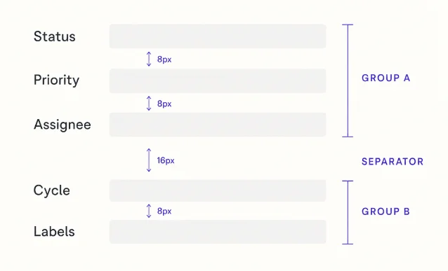
In the properties panel, whitespace does three distinct jobs:
Grouping without lines. Fields that conceptually belong together — Status, Priority, and Assignee — sit closer together than fields in other logical clusters. The 8px gap between intra-group fields versus the 16px gap between groups creates a scannable structure without any divider element. The eye groups them automatically.
Communicating editability without affordances. The absence of input chrome (border, background fill, focus ring at rest) tells you these are facts right now, not blank form fields. The mental model shifts from "fill this out" to "see what's true." This is why heavy tool users can scan an issue's state in under a second — they're reading a status board, not navigating a form.
Leaving room for hover states to feel responsive. Because the rest state has so little visual content, a very subtle background fill on hover reads as unmistakably interactive without feeling aggressive. The contrast ratio between resting state and hover state is small — but because the baseline is so clean, it's immediately noticeable.
State changes: how the panel communicates "you can act here"
The properties panel runs on a three-state model worth memorizing:
| State | Visual signal | User intent |
|---|---|---|
| Rest | Label + value, no chrome | Reading |
| Hover | Faint background fill, cursor change | Considering |
| Active (dropdown open) | Field gets a defined border, dropdown appears below | Acting |
The transition from rest to hover takes roughly 80ms — fast enough to feel instant, slow enough that it doesn't flash while you're scrolling past. Linear's design team has described micro-interactions as "signals that the system is listening" rather than decorations, and this timing choice embodies that framing. 2
One specific pattern: inline-editable text fields (like the issue title) show no resize handle or textarea border at rest. The cursor changes to a text cursor on hover, and an
editable background appears only on click. This means the interface never looks like a form — it looks like a document — until you touch it. The design trusts that users who want to edit will try to click, and rewards that attempt.The priority indicator: a micro-interaction masterclass
The Priority field in the panel deserves its own paragraph. At rest, it shows a small icon (one of four geometric shapes that signal No Priority, Low, Medium, High, or Urgent) plus a short text label. The icon and label share the same muted grey as every other metadata value — priority gets no special typographic weight at rest.
This is a sharp divergence from most tools, where "Urgent" gets a red badge and "High" gets an orange dot. Linear's argument, implicit in the design, is that badge-as-urgency-signal creates anxiety in the wrong direction. A page full of red badges trains the eye to ignore them. A page of grey icons that only reveals urgency when you look at it is slower to parse but more trustworthy.
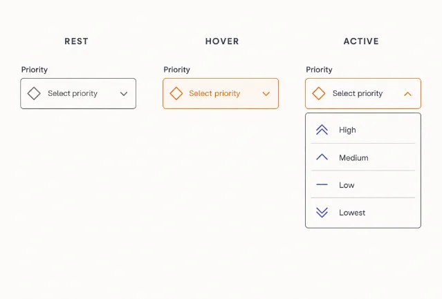
When you hover over the Priority field, the icon shifts from muted grey to the priority color (orange for Urgent, red for High, etc.), the hover fill appears behind the field, and a dropdown opens with keyboard navigation immediately available. The color is a signal for decision-making, not ambient alarm.
Why keyboard shortcuts are part of the visual design
Karri Saarinen's design philosophy has consistently held that "the best interface is one that gets out of the way." 3 Linear's properties panel is designed so that power users never have to click it. Pressing
a assigns an issue, p sets priority, s changes status — the panel's visual hierarchy is partly a map for these keyboard bindings.The fields are ordered roughly in the sequence a PM would care about: Status → Assignee → Priority → Cycle → Label. That ordering isn't random — it mirrors the natural keyboard-first workflow. A user triaging a queue can hit
s, type the new status, Escape, p, select priority, and never reach for the mouse. The panel is both a read surface and a keyboard navigation guide embedded in the visual design.For PMs building products for developers and ops teams, this is a transferable principle: the sequence of information in a UI should mirror the sequence of decisions your users make, not the sequence that was easiest to implement in your data model.
What to borrow (and what won't translate)
The properties panel works because of three conditions worth examining before copying the pattern:
- Users have high repeat-visit frequency. Linear users open the same issue multiple times over multiple days. The cost of learning a new interaction model is amortized quickly. For tools with high first-visit rates or infrequent users, the "no affordance chrome at rest" pattern will generate support tickets.
- The domain has a small, stable field set. The panel works because the fields are roughly the same across all issues. When field sets vary wildly per-record (like a CRM with custom field proliferation), the clean variable-gap grouping breaks down.
- The design system enforces consistency ruthlessly. The panel only feels calm because every hover state, every transition duration, every color token is consistent across the entire application. One inconsistent hover color in a panel breaks the implicit grammar. Karri Saarinen has written that "quality and craft from day one" is a prerequisite, not a later-stage polish effort. 3 Borrowing the visual output without the underlying system produces something that looks like Linear but feels wrong.

The broader insight: data density and visual calm are not opposites. Linear's properties panel packs more information into 240px than most tools show in a full form. It does this by treating whitespace as signal, hiding affordance chrome until intent is confirmed, and reserving color for moments of decision rather than ambient status broadcast.
Daily Product UI Teardown — each post picks one specific screen from a top product and breaks down the design decisions behind it.
围绕这条内容继续补充观点或上下文。