Color grading vocab that works across AI tools
Film stock names — Kodak Portra 400, Cinestill 800T, Fuji Pro 400H and five others — are the most reliable cross-tool color shortcut in AI image prompting. Covers why generic LUT labels underperform on Flux, per-tool behavior differences for MJ V7/V8.1 / Flux dev / SDXL / SD3, the MJ V8.1 --raw / --stylize / --exp trio for color fidelity, a full anamorphic night-scene copy-paste prompt, and a behavioral-substitution table for Flux.

Type
teal and orange color grade into Flux and you might get it — or you might get whatever Flux was already planning to give you. The label triggers something, but not reliably, and not the same way across tools. Film stock names work more consistently because they're not labels for a look; they're references to specific training data the model has actually seen.Here's how to specify color with the vocabulary that actually moves the needle.
Why "teal and orange color grade" is only half the instruction
Diffusion models don't do color grading the way DaVinci Resolve does. Color isn't an independent parameter — it's baked into the model's learned associations between content and appearance. 1 When you write
warm colors, the model looks up what "warm colors" tends to look like in its training data and reproduces that impression — which may drift significantly from any specific film or LUT reference.Flux compounds this with a structural bias: nearly all Flux dev/schnell outputs carry a teal-and-orange cast by default, because the training data skews heavily toward cinematic material where that grade is standard. 2 As r/FluxAI user u/dennison put it: "Almost all of my FLUX images come out with that teal and orange look. It's as if this model was trained on movies." That default can't be removed through prompting alone; post-processing with a LUT is the only reliable fix.
The upshot: generic color labels work better on MJ (which interprets them broadly and produces dramatic results) and less reliably on Flux (which may ignore them in favor of its training defaults). The solution isn't better label phrasing — it's switching to references the model already understands.
Film stock names: the most reliable cross-tool color shortcut
Olivier Hero Dressen (DesignHero) summarizes the principle directly: "Specific camera models, lens manufacturers, and film stocks aren't just technical jargon — they're portals to specific training data." 3 The model doesn't need to interpret what "warm" means; it can pattern-match against thousands of images tagged with that film name.
These eight stocks work consistently across MJ V7/V8.1 and Flux dev: 4 3
| Film stock | Color signature | Best use case |
|---|---|---|
Kodak Portra 400 | Natural skin tones, warm cast, fine grain | Portraits, editorial |
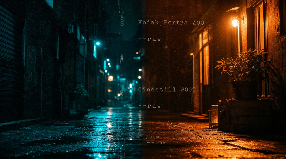
Cinestill 800T | Tungsten balance, red halation on highlights | Cyberpunk, night scenes |
Fujifilm Superia X-TRA 400 | Cool green shadows, vivid reds | Street, gritty |
Kodak Tri-X 400 | High-contrast black-and-white, heavy grain | Film noir, historical |
Technicolor | Saturated primaries, 3-strip process simulation | Vintage Hollywood |
Kodak Vision3 500T | Cinema-grade tungsten, high fidelity | Prestige film look |
Fuji Pro 400H | Cool tones, soft — "Japanese" feel | Portrait, pastel |
Kodak Ektar 100 | High contrast, strong saturation | Landscape, commercial |
The substitution logic, from DesignHero: don't write
warm colors → write shot on Kodak Portra; don't write cool tones → write shot on Fuji Pro 400H; don't write old film look → write Kodak Tri-X 400, heavy film grain. 3LUT-style labels vs. behavioral descriptions: per-tool breakdown
Beyond film stocks, a second tier of color vocabulary covers LUT-style grade names and behavioral color descriptions. These split sharply between tools.
Midjourney V7/V8.1 handles both modes. Label-style terms like
teal and orange color grade, bleach bypass, cinematic color grading, and Matrix green all function as standalone phrases in the prompt and produce recognizable results. PromptsEra's tested MJ V7 formula uses them explicitly: [Shot Size + Camera Angle] + [Subject] + [Lighting] + [Film Stock] + [Director Reference] + [Parameters]. 4Flux dev/schnell responds better to behavioral descriptions than to labels. Instead of
teal and orange color grade, write warm amber highlights with cool teal shadows. Instead of bleach bypass, write desaturated metallic tones, high contrast, silver-gray midtones. Mia Tanaka (Vidzy) recommends: "Specify color palettes. Instead of letting the model choose, describe colors: 'warm amber and cool blue contrast,' 'desaturated earth tones,' 'vibrant complementary orange and teal.'" 6 When you add a film stock name on top of the behavioral description, Flux interprets it as a technical reference rather than a mood word — the combination is more stable than either alone.SDXL: label-style grade names work similarly to MJ, with one catch — CFG (the parameter that controls how strictly the model follows your prompt, default 7) above 15–20 causes color saturation to blow out. SDXL's latent space allows values up to ±35, far beyond the range the denoiser was designed for, so extreme CFG amplifies color until it clips. 7 Keep CFG in the 5–8 range when working with explicit color grade prompts. Dynamic Thresholding (a ComfyUI/SDNext node that normalizes latent values each denoising step) prevents the blowout if you need higher CFG.
SD3/SD3.5: negative prompting is trained out, so you can't suppress unwanted color casts with
no warm tones. Use positive reframing instead: write the color you want (cool blue shadows, neutral white balance) rather than excluding what you don't want. 8MJ V8.1: the three parameters that touch color
MJ V8.1 has no dedicated color grading parameter, but three flags directly affect how accurately your color vocabulary lands.
--raw disables MJ's automatic aesthetic enhancements — the saturation boost, contrast push, and color shifts the model adds by default. For photography-grade color accuracy, this is the first thing to enable. MJ's own docs describe Raw mode as turning off the "autocruise," giving tight control over the final look for complex prompts. 9--stylize controls how strongly MJ's aesthetic taste overrides your prompt. At the default of 100, some color bias is already present. At 300+, MJ's interpretation can override explicit color instructions — a muted pastel palette prompt may come back with MJ's preferred saturation instead. 10 Woollyfern Steph recommends dropping to 50 or below when prompt color fidelity matters: "Lower values shift the balance toward your prompt text and away from Midjourney's own aesthetic interpretation." 11 Blake Crosley's recommended high-fidelity combo: --s 50 --style raw. 12--exp (exposure / HDR tone mapping, 0–100, default 0) adds a tone-mapping effect that alters dynamic range and apparent saturation. Values above 25 can override --stylize and personalization. For subtle realism, --exp 5 --style raw is the current recommended starting point. 12This YouTube tutorial by Hicksfield AI demonstrates 22 of these grade styles — including bleach bypass, Matrix green, Fujifilm Velvia, and Cyberpunk bicolor neon — with actual AI-generated video clips for each: 13
正在加载内容卡片…
One more V8.1 note:
--no for color exclusion (e.g., --no warm tones) became available in V8.1 as of the May 20 Office Hours. It's available but not fully predictable — community reports show MJ sometimes ignores color exclusions. 14 Use it as a nudge, not a guarantee.Cinematic anamorphic night scene — full copy-paste prompt
This prompt from DesignHero is tested on both Flux 2 Pro and MJ V7: 3
A cinematic street scene at night in the rain, anamorphic lens flares, horizontal blue light streaks, heavy oval bokeh, wet asphalt reflecting neon signage, T-stop 2.0, shot on Panavision C-Series anamorphic lenses, 35mm anamorphic 2.39:1 aspect ratio, cinematic teal and orange color grade, heavy atmospheric haze, film grain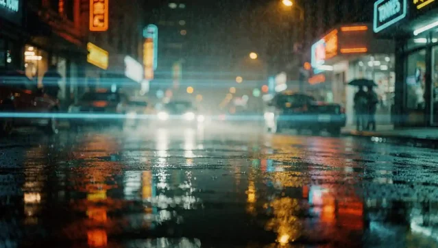
On Flux,
Panavision C-Series triggers more realistic lens flare physics. On MJ, anamorphic bokeh is the key trigger for the oval highlight shape. The T-stop 2.0 and 2.39:1 aspect ratio reinforce cinematic training data associations in both models.For Film Noir, swap the color grade section for:
Kodak Double-X black and white film stock, 10:1 lighting ratio, Cooke Panchro lenses, deep shadow crush.Cross-tool color vocab cheat sheet
| Technique | MJ V7/V8.1 | Flux dev | SDXL | SD3/SD3.5 |
|---|---|---|---|---|
Film stock name (e.g. Kodak Portra 400) | ✅ Strong | ✅ Strong | ✅ Moderate | ✅ Moderate |
LUT label (e.g. teal and orange color grade) | ✅ Works | ⚠️ Use behavioral instead | ✅ Works | ✅ Works |
Behavioral description (e.g. warm amber highlights, cool teal shadows) | ✅ Works | ✅ Preferred | ✅ Works | ✅ Preferred |
| Negative color exclusion | --no warm tones (V8.1, unreliable) | ❌ No native negative prompt | CFG-paired negative prompt | ❌ Use positive reframe |
| Color fidelity parameters | --raw --s 50 --exp 5 | guidance_scale 1.5–2.5 (portraits) | CFG 5–8, Dynamic Thresholding | Positive reframe only |
Key behavioral substitutions for Flux:
bleach bypass→desaturated metallic tones, high contrast, lifted blacks, silver-gray midtonescross-processed→extreme green cast in shadows, magenta skin tones, high saturationfilm noir desaturation→Kodak Double-X black and white film stock, heavy shadow crush, high contrastwarm/cool split→warm amber kicker light, cool blue fill from window, moonlight with blue gel
Cover image: AI-generated illustration
参考来源
- 1r/StableDiffusion — Has anyone figured out color grading in ComfyUI?
- 2r/FluxAI — Can you remove orange and teal color grading from FLUX images?
- 3DesignHero — 7 Prompts for Professional Realism
- 4PromptsEra — Midjourney Prompts for Cinematic Realism
- 5TL_ (Civitai) — Beyond the 'Finished' Image: A LOG/FLAT Color LORA for Professional AI Workflows
- 6Vidzy — 50 Best Flux Prompts for Photorealistic Images
- 7Reddit r/StableDiffusion — Fixing excessive contrast/saturation resulting from high CFG
- 8GitHub — vladmandic/sdnext Parameters Wiki
- 9Midjourney — Raw
- 10Midjourney — Stylize
- 11Woollyfern Creative — Midjourney V8.1: Tips for Better Results
- 12Blake Crosley — Midjourney V8.1 + V7 Reference
- 13YouTube (Hicksfield AI) — AI Filmmaking: 22 Color Grading Prompts That Actually Work
- 14Midjourney — No
围绕这条内容继续补充观点或上下文。