Linear's issue detail screen: structure that earns its silence
A teardown of Linear's issue detail screen — how tiered contrast in the sidebar, LCH color space, keyboard shortcuts, and deliberate whitespace work together to make a 12-field metadata panel feel calm.

Open a Linear issue. Your eye goes straight to the title — not because it's styled in a giant font, but because everything around it stepped back. That's not an accident.
The issue detail screen is where Linear's design philosophy becomes tangible. Most task-management tools treat the issue view as a form: fill in the fields, submit, move on. Linear treats it as a workspace — a place an engineer or PM will spend real time, so every pixel either earns its presence or gets cut.
Here's what's happening, layer by layer.
Information hierarchy: who gets to speak first
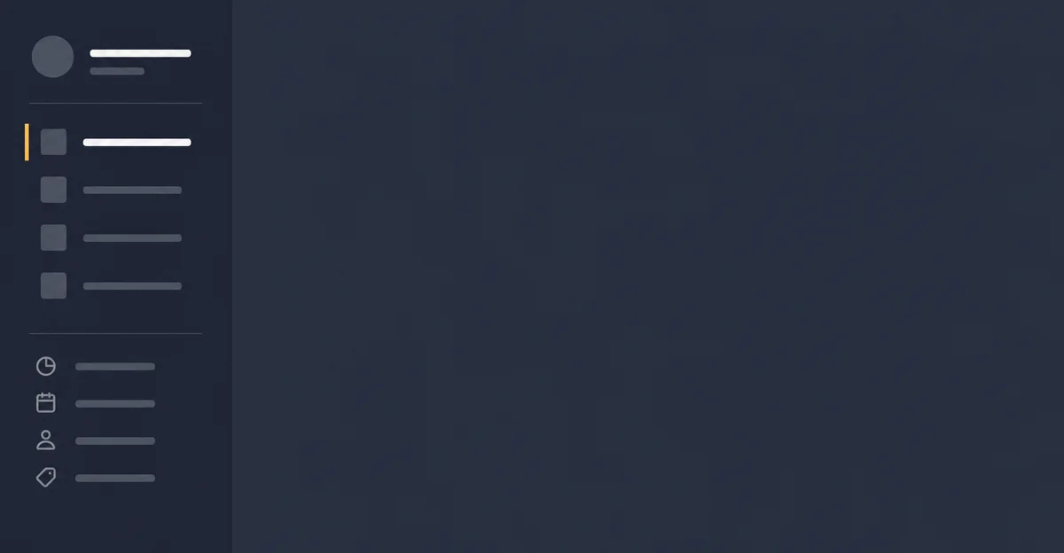
The screen splits into two columns. Left side: title and description. Right sidebar: status, assignee, priority, labels, cycle, project, milestone, parent issue, relations.
The sidebar holds at least 10-12 metadata fields. This should feel overwhelming. It doesn't, for one reason: contrast is tiered, not uniform.
Active selections — a purple "In Progress" status label, a circular avatar for the assignee — carry full opacity. Fields that haven't been set render in muted gray, roughly 50% opacity. The visual weight of each field reflects its filled state. Your eye skims the sidebar and instantly extracts the meaningful signal without having to parse every row.
Linear's design team documented this principle explicitly during their 2024 redesign: navigation and positioning elements should visually recede so the main content region holds focus 1. The issue sidebar is that principle in daily use. It doesn't disappear — it subordinates.
The title itself sits in a lightweight text input, not a heading tag with special styling. This is a subtle hierarchy decision: treat the most important text like a document, not a form field. When you're reading, it reads like prose. When you're editing, it's already focused.
Whitespace: breathing room as a functional argument
The issue content column doesn't span full-width on large screens. Linear deliberately centers it once the window grows beyond a threshold width, capping the readable line length. 2
That decision runs against the instinct to fill horizontal space. Most apps expand their main content panel to occupy every pixel. Linear chose readability over utilization. The whitespace on either side of the text isn't empty — it's the reason the content feels like a document rather than a data entry panel.
The sidebar grows proportionally with the window, so larger screens don't give you a fixed narrow sidebar floating in dead space. Instead, the sidebar stretches, giving metadata labels room to display without truncation. The trade-off was conscious: make the sidebar usable at scale rather than making the main text column wider.
Internal padding in the sidebar follows the same logic. Each metadata row has generous vertical breathing room — enough that two adjacent rows (say, "Status" and "Assignee") never feel cramped together. You can tab between them without losing your place.
State changes: visible transitions that don't announce themselves
Click the status badge in the sidebar. A menu slides up. Select a new status. The badge changes color, the menu closes, and the change propagates — all with a transition timed around 150ms.
That timing is precise. Below 100ms feels instantaneous; above 300ms feels slow. The 150ms window is long enough that the change reads as a deliberate state transition, not a glitch, but short enough that it never interrupts the flow of working through a list of issues.
The activity log at the bottom of the issue is where state changes become legible history. Status updates, assignment changes, relation additions — each gets a timestamped entry rendered in the same muted-gray register as unfilled sidebar fields. The log exists but doesn't demand attention. You check it when you need to understand how an issue evolved; it doesn't interrupt you when you don't.
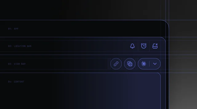
The header bar separation — location bar vs. view bar — is another state-oriented decision. The location bar shows where you are (team, project, filter). The view bar shows how the current view is configured (layout, grouping, display options). These two types of "what am I looking at" are conceptually different, and Linear split them rather than collapsing both into a single multi-purpose toolbar. When you change a view option, only the view bar updates. This scopes the visual feedback to the layer that actually changed. 1
Micro-interactions: precision at the detail level
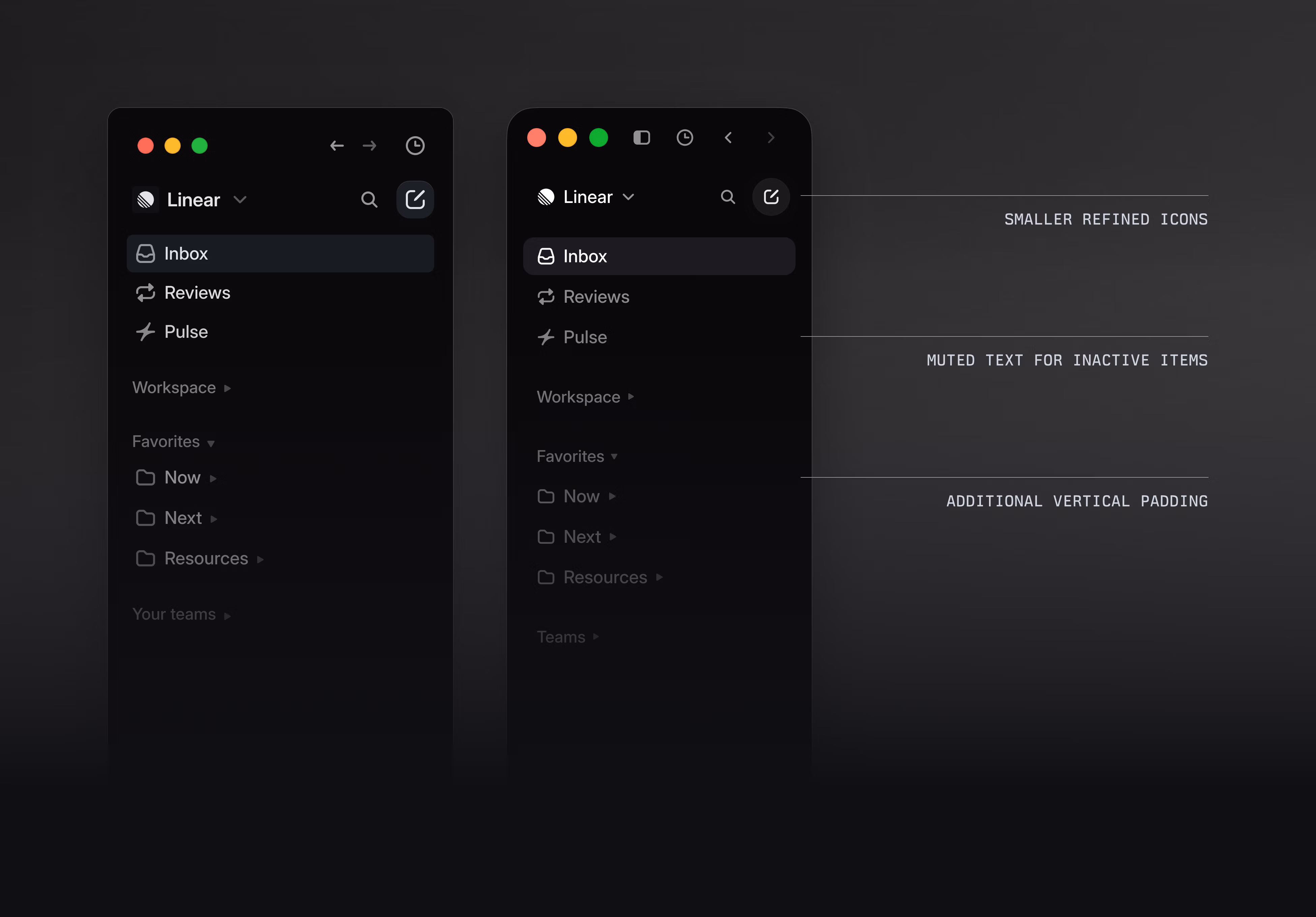
Linear's icon system went through deliberate reduction. Across the 2024 refresh, icons shrank and colored backgrounds on team icons were removed. 1 The rationale: icons should orient, not decorate. When every icon fights for attention with color and size, none of them orient efficiently. Smaller, monochrome icons in the sidebar register as glanceable landmarks rather than design elements.
Hover states on sidebar fields are minimal — a subtle background tint on the row, no animation, no growth. The hover just signals "this is interactive" without performing interaction. Compare this to apps where hover states involve multiple elements lighting up, scaling, or underlining. Linear's restraint here is a PM-facing decision: the sidebar is a quick-edit panel, not a UI playground. The hover acknowledges the affordance and gets out of the way.
Keyboard navigation follows the same logic. Every sidebar field is reachable by pressing the corresponding shortcut key:
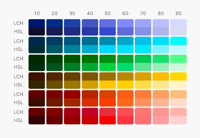
p for priority, a for assignee, s for status, l for label. You never have to reach for the mouse to set metadata. The keyboard layer is invisible until you need it, at which point it's faster than any click target.The color system underpinning all of this uses LCH color space rather than HSL. 3 LCH is perceptually uniform — two colors with the same lightness value appear equally bright to the human eye, which HSL cannot guarantee. This means Linear's muted-gray "unfilled" states and its colored "filled" states are calibrated against human perception, not just numeric hue-saturation values. The tiered contrast system that makes the sidebar scannable is only reliable because the color space is perceptually honest.
The pattern worth taking
The issue detail screen makes one bet: the cost of visual complexity is higher than the cost of simplicity. Every element in this screen has been calibrated toward minimal cognitive load — not because the screen is simple, but because the design work absorbed the complexity so the user doesn't have to.
The specific decisions — centering text on wide screens, using LCH colors for perceptual accuracy, tiering sidebar contrast by fill state, separating location from view configuration — are all downstream of that single orientation.
For PMs building their own product intuition: the next time you reach for "let's just add a field to the sidebar," ask what it will look like in its unfilled state. If it adds visual noise without being filled, it doesn't earn its row.
围绕这条内容继续补充观点或上下文。