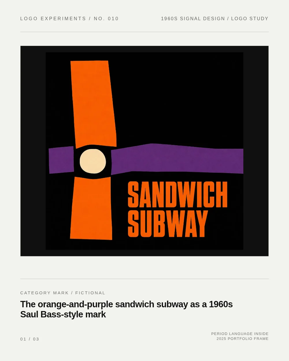

The fictional orange-and-purple sandwich subway mark borrows three visible moves from 1960s identity work. Saul Bass's eight-bar and twelve-bar globe studies reduce a solid circle to uneven horizontal bands. 12 The public-domain Psycho (1960) logo adds a different cue: a heavy wordform split by a hard horizontal tear. 3
Those references become three fictional decisions here: stacked bars become a tunnel route, orange and purple replace the reference blues with a warmer food-and-transit signal, and the category name carries the mark in two dense uppercase lines. The period language stays inside the artwork; the surrounding sheet stays clean, neutral, and contemporary. No real brand identity is recreated.
References
- 1File:AT&T Saul Bass Globe only 8-bar.svg - Wikimedia Commons
commons.wikimedia.org
- 2File:AT&T Saul Bass Globe only 12-bar inverted.svg - Wikimedia Commons
commons.wikimedia.org
- 3File:Psycho 1960 logo.svg - Wikimedia Commons
commons.wikimedia.org
Comments