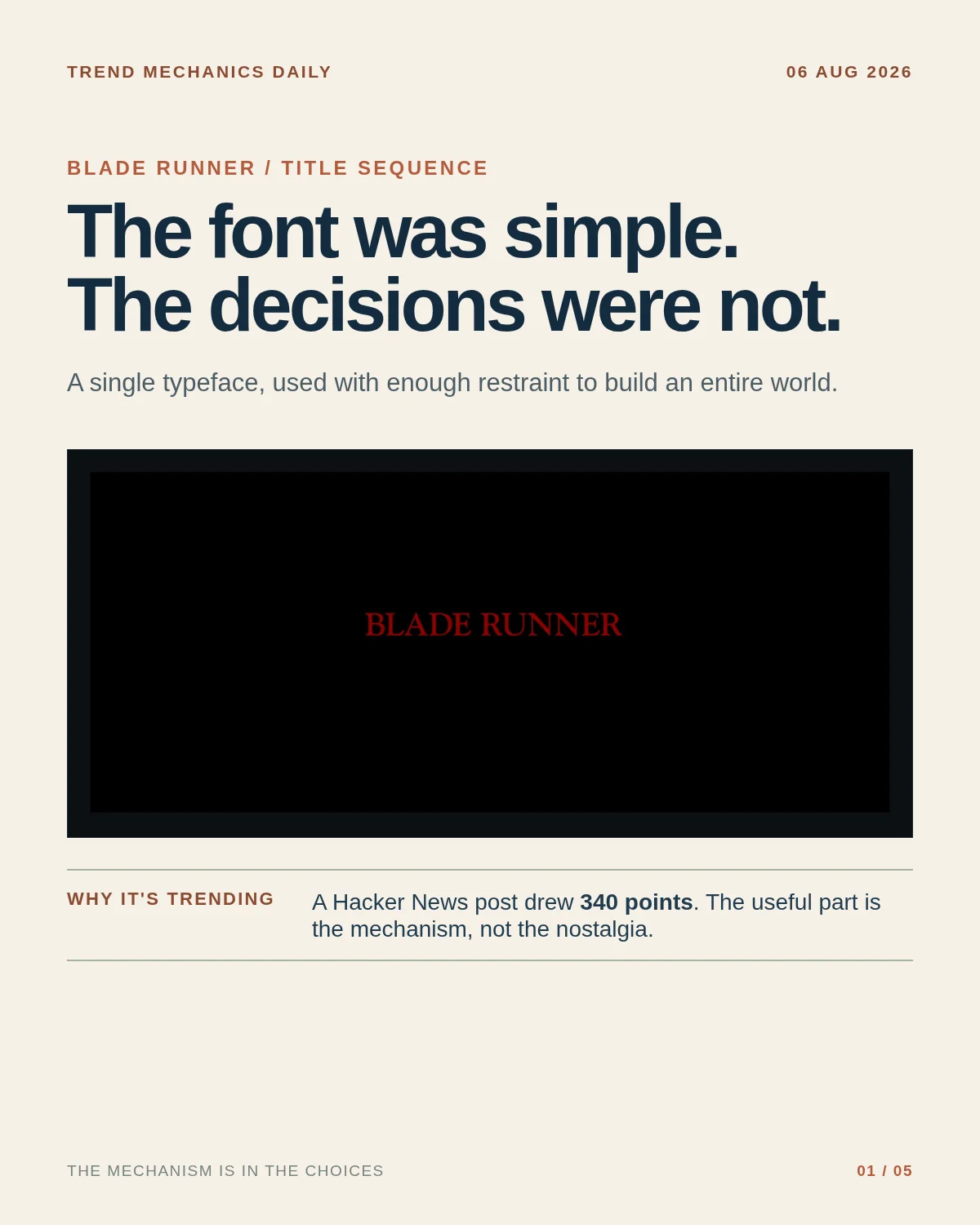

Blade Runner's title cards are trending because a Hacker News post reached 340 points. 1 The interesting part is not the nostalgia. It is the small design system underneath.
A close reading of the sequence finds one typeface — Goudy Oldstyle — doing several jobs. All caps mark names and titles; smaller caps handle lesser signals; size separates the Los Angeles location card; and the first "Replicant" appears in red italics. The movie logo itself is hand-drawn, but it is inspired by the same face. The opening crawl borrows book conventions too: first-line indents, generous word spacing, and letterspaced caps without letterspacing the lowercase. 2
That is why the typography carries both exposition and mood. The work print used Impact; the theatrical version replaced that blunt shortcut with a more deliberate hierarchy. The last sentence is an interpretation of the sequence, not a production credit sheet: the source is a close reading, and it does not document every behind-the-scenes decision. 2
References
- 1Hacker News discussion
news.ycombinator.com
- 2The Title Cards in Blade Runner Are Fucking Amazing
randsinrepose.com
Comments