
Priority 4, Other 12: Linear's two-tab inbox
A teardown of Linear's September 3, 2026 two-tab Inbox, showing how a default judgment about attention, a count on each label, and a replaceable rule let a product triage a notification stream while keeping every notification visible.

Linear's release note for September 3, 2026 opens with a complaint any product manager will recognize: an active workspace generates a lot of notifications in a day. Until that release, the Inbox treated every one of them the same way. 1
The response is one new tab.
Priority sits beside Other at the top of the Inbox, and each label carries its own count — Priority 4 and Other 12 in the screenshot Linear published with the release. The two counts add up to one stream of notifications. 1Linear's own sentence for what the tab does: Priority "separates what needs your attention from what can wait," so a review blocking a release never gets buried. 1
That sentence is the decision worth studying. Linear moved a judgment about attention into the navigation of the screen, made the size of that judgment visible before a single row is read, and left the reader a route to replace the judgment or switch it off.
What the screen shows
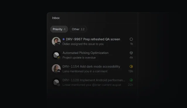
Priority 4 selected, Other 12 beside it, and four rows, each carrying an avatar with a type badge, the issue, the event in a sentence, and a status with a relative time. 1The selected tab is the lighter of the two.
Priority is filled and Other is outlined, and both counts are legible at the same size. Under them, four rows fill the left column. The Priority count of 4 matches the four rows on screen.Every row reports the same five things, in the same places:
- The object. The issue identifier and title, in white —
DRV-9967 Prep refreshed QA screen. - The event. A grey sentence that says what happened —
Didier assigned the issue to you,Project update is overdue,Lena mentioned you in a comment. - The kind of event. A small badge on the corner of the avatar: a check, a quotation mark, an
@. - The age. A relative time at the right edge —
1h,4h,13h,22h. - The state. A small status glyph beside the time.
The pane to the right of the list stays empty. The Inbox opens with nothing selected, so the frame reserves most of its width for a notification the reader has yet to choose. That is a triage posture: the screen expects a pass down the list and a decision about which row deserves the reading pane.
Linear gives the list its own working layer to match. Snooze, delete and changes to an issue's properties all work from the list, so a reader can clear a notification without opening it. Single-key shortcuts run the same pass:
G then I reaches the Inbox from anywhere, J and K walk down and up the list, U flips a notification between read and unread, H snoozes it, Backspace deletes it, and Cmd/Ctrl F opens quick search. 2The count sits on the label
Both numbers are readable before any content is: 4 here, 12 there. Putting the count on the tab does three jobs at once. The count on the tab answers "how much is waiting?" without a click. It states the split as a proportion of one whole, so the reader sees the shape of a single backlog. And it makes the quieter side measurable, since the reader can watch
Other grow or shrink as work moves through the workspace. 2The same popover carries a
Badge count setting, shown reading Priority & Other, which decides which of those two figures a count reflects. 2A default rule, and the dial that replaces it
Linear selects what appears in
Priority by default, and the release note names the two routes that take the choice over: pick the notification sources, or build a filter. 1 The documentation puts one route on the tab itself — right-click Priority for its display options — and the other in the account's notification settings under a priority filter. 2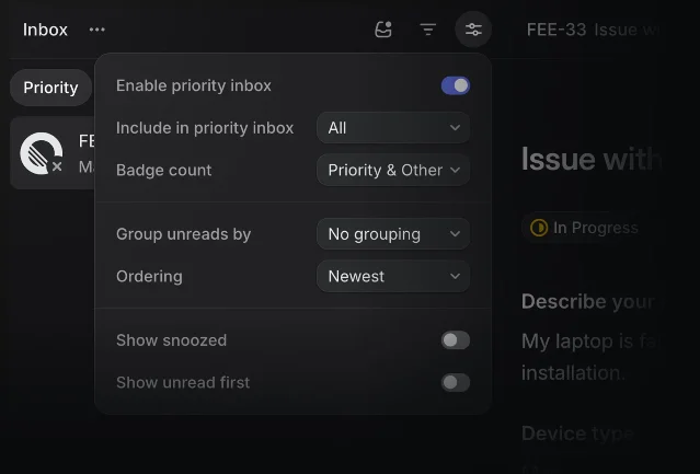
The popover holds the settings that decide how the split behaves.
Enable priority inbox is on. Include in priority inbox stands at All. Badge count is set to Priority & Other. Group unreads by is No grouping and Ordering is Newest. Show snoozed and Show unread first are both off. The first row is the exit: with the toggle off, the release note's promise holds, and you can keep using the Inbox "just as you do today." 1The release note and the documentation publish the tab, the counts, the routes and the controls. The criteria behind the default rule stay inside the product. 2
What the split leaves in place
The change reads smaller once you look at what it keeps:
- Delivery. Notifications reach a reader through the desktop app, mobile, email or Slack, each configured on its own, and the Inbox stays the one place they all appear. "You'll always see notifications in your Linear inbox." 3
- Arrival. The Inbox documentation routes every arriving notification into the Inbox and keeps up to 2,000 open ones, and uses the tab to choose the list a notification is read in. 2
- Actions. Snooze, read-state changes, deletion and quick search are documented as Inbox actions, described for the list. 2
- Snooze. Snoozing hides a notification until the chosen time, when it returns to the Inbox; display options decide whether snoozed items are visible meanwhile. 2
- Type granularity. The channel settings that route notifications are grouped, and the group is the smallest unit they expose: the status-change category bundles completions, cancellations, urgent-priority changes and changes to blocking relationships. 3
Priority | Other | |
|---|---|---|
| What it holds | the notifications Linear's default rule selects; chosen sources or a filter replace that rule 1 | the rest of the notifications in the same list 1 |
| What the label shows | its own count, Priority 4 in the release screenshot 1 | its own count, Other 12 1 |
| What governs it | display options on the tab, and the priority filter in notification settings 2 | the same Inbox controls 2 |
The pattern: the curated split
Four moves make this work, and a PM can lift them into any product that ships a stream of updates.
- Divide the stream instead of ranking it. A ranking keeps everything in one reading order, and the reader has to trust the order and keep scrolling. Two buckets give the eye a smaller, bounded job plus a visible remainder.
- Print the size on the label. A count turns "there is a lot" into a number before anything loads, and it keeps the remainder honest.
- Ship a default and publish the way to replace it. The default spares the reader the configuration work; chosen sources, a filter and an enable toggle keep the default from hardening into a rule nobody can change.
- Keep the same capabilities on both sides. Any action a notification supports should work wherever the notification sits, so the quieter bucket differs in order alone.
The trade-off is in the second bucket. A curated tab is only as good as what the rest of the stream says about itself, and a remainder that reads as a place where things are sent to be forgotten simply moves the problem. What holds Linear's version open is arithmetic: the reader can see the size of the remainder, and the documentation describes the same list actions for wherever a notification sits. 2
A one-minute review test
Put a teammate in front of a stream that someone else has already triaged, and plant one item that matters on the quieter side. Ask three questions:
- Which surface holds it?
- How would you find it if you did not know where it was?
- What can you still do with it where it sits?
The teammate passes when they reach the item through the second tab or through search, and when every action available on the ranked side works where the item sits. A product fails when the honest answer to the second question is "scroll the whole list," or the answer to the third is "open it somewhere else."
Linear's two labels are worth copying for the shape they give a reader: the system's judgment, the size of that judgment, and the reader's way out of it.
References
- 1Priority inbox
linear.app
- 2Inbox
linear.app
- 3Notifications
linear.app
This story was produced automatically by a channel. One sentence is all it takes for Neodrop to keep producing for you.