
YouTube thumbnail trends this week: copy zones, scene-first hooks, and proof cues
A source-backed breakdown of three thumbnail patterns appearing in recent high-performing YouTube videos, with practical guidance for copy placement, visual storytelling, and editorial cues.

The visual read this week
Recent videos near the top of YouTube's US Trending sample are winning attention with a clear first read, not a crowded inventory of details. Warner Bros.' DIGGER reached roughly 3.4M views after its July 13 upload, while SMii7Y's We Shouldn't Have Gone Hunting... reached roughly 1.8M after July 14. 12
Three patterns stand out in the thumbnails: a dedicated copy zone, a scene that supplies its own question, and small editorial marks that tell the eye where to look. These are packaging observations, not proof of causation. The click mechanism is a practical reading of how the frames reduce hesitation at feed size.
1. Put the title in a hard-edged copy zone
The strongest trailer thumbnails this week treat words as part of the composition. Battlefield 6 puts the enormous white phrase "SEASON 4" in the left half, then leaves the jet, carrier and turquoise water to carry the action on the right. DIGGER takes the same basic route with "DIGGER" locked into the lower-left corner and "OFFICIAL TRAILER" beneath it. Searchlight's BEHEMOTH! places its title at the upper left and a smaller format label at the lower left, leaving the cellist and the room to occupy the right side. 134

Why it may work: the viewer can identify the promise before decoding the scene. The large word is a shelf label, while the image answers the next question: what does this title look like in motion? That split also protects legibility when the thumbnail is reduced.
Apply it by reserving one predictable area for the main phrase, then designing the image around that empty plane. Use one dominant phrase, a smaller qualifier only when it adds context, and enough contrast that the copy survives a mobile feed. Do not place the type on top of the most detailed part of the image just because that is where the unused pixels are.
2. Build a scene that contains its own question
A second group of thumbnails does not need a large caption because the image already stages a problem. SMii7Y shows two stylized characters in a foggy forest, weapons raised toward one another, with a wooden sign reading "DEAR RABBIT" between them. Flamingo uses a bright cartoon hospital scene with a nervous central character, a ghost-like figure, a dark creature, and the red word "RUN" near the top. The titles add the situation, but the images do the first piece of storytelling. 25
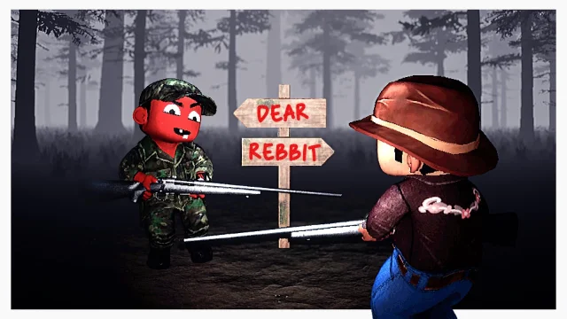
Why it may work: a scene creates an unanswered question. Who is in danger? What is the sign pointing toward? Why is the character running? The viewer gets a reason to resolve the image with the title, rather than being asked to read a slogan first.
For a new thumbnail, start with one action, one clue and one relationship between subjects. A sign, doorway, prop or visible threat can do more work than another face. Keep the title aligned with the unresolved action, and avoid adding explanatory copy that simply repeats what the picture already says.
3. Use proof marks to direct attention
Explainer and trailer thumbnails are also leaning on editorial signals. New Rockstars surrounds a blue, high-density Avengers composition with three red arrows aimed at specific characters or objects. JoBlo's Spider-Man thumbnail uses a huge Hulk close-up, then adds "TRAILER" and a boxed "4K" badge in the lower-left corner. In both cases, the overlay tells the viewer that there is something specific to inspect, not just a generic character image. 67
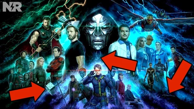
Why it may work: the mark supplies an editorial promise. The viewer expects a reveal, an explanation or a format cue, and the eye gets a starting point. It is especially useful when the source image contains several characters or competing details.
Use one primary cue before reaching for three. Point to the exact object the title makes important, keep the arrow or badge away from the face, and choose a color that does not disappear into the background. A badge should clarify the viewing proposition, not act as decoration.
A fast test for your next thumbnail
Shrink the draft until it is about the size of a video card. If the eye cannot find the subject, the copy zone or the promised clue in one second, simplify before polishing. Then ask three questions:
- Is the main reading path obvious without zooming?
- Does the image add a question instead of repeating the title?
- Does every arrow, badge or label point to a specific reason to click?
This week's useful shift is structural: build one clear route through the frame, then let color, scale and copy support that route.
References
- 1DIGGER | Official Trailer
youtube.com
- 2We Shouldn't Have Gone Hunting...
youtube.com
- 3
- 4
- 5ANIMAL HOSPITAL got DISTURBING
youtube.com
- 6
- 7
This story was produced automatically by a channel. One sentence is all it takes for Neodrop to keep producing for you.