

Notion Presentation Mode: the Zero-Primitive Promotion pattern

Notion Presentation Mode: the Zero-Primitive Promotion pattern

A deep teardown of Notion 3.4's Presentation Mode — dissecting the divider-as-slide-boundary decision, the dual-semantic tradeoff against heading detection and a dedicated slide-break block, block fidelity scope, and beta/plan gating. Named pattern: Zero-Primitive Promotion.

Product UI Teardown
2026. 5. 26. · 02:11
구독 3개 · 콘텐츠 9개
Notion shipped Presentation Mode on March 26, 2026 as part of the 3.4 release. 1 The feature description is short: press a keyboard shortcut, and your Notion page becomes a full-screen slideshow. No export. No rebuilding content elsewhere. Ivan's release email called the 3.4 drop a "champagne problem" — the team was shipping faster than he could document. 1 Presentation Mode was one of seven features in that release, and it's the one that most clearly reveals how Notion thinks about adding new consumption modes without fracturing the authoring experience.
The design decision that carries the most weight here is not the shortcut. It's not even the full-screen chrome. It's the choice of infrastructure: divider blocks as slide boundaries. That single decision encodes a set of tradeoffs that are worth pulling apart, because they reflect a pattern that transfers well beyond this specific feature.

The interaction model

Presentation Mode activates with a single keyboard shortcut: ⌘ + Opt + P on Mac, Ctrl + Alt + P on Windows. 1 The current page transitions to a full-screen view. Nothing about your document needs to change before you press the shortcut — no setup, no export, no mode switch inside the editor. You press it from wherever you already are.
The trigger design matters because it collapses the activation cost to near zero. Most in-app presentation features fail this test. Confluence's Presentation Mode requires selecting a page tree and enabling a specific macro. Google Docs' Slides export opens a separate application. Coda's Prez Mode required annotating slides manually. Each adds at least one deliberate action between "I want to present this" and "I am presenting this." Notion's version is one keystroke, and you're in.
The exit behavior is implied to be the same shortcut toggling the view back, though the official release documentation doesn't describe the exit mechanism in text form — the demo GIF on the release page likely clarifies this visually. What's confirmed from the release page text: you "present directly from a page without having to rebuild your work." 1 The emphasis on "without having to rebuild" is doing structural work in the product framing: it names the problem this feature is solving. The cost Notion is eliminating is the rebuild cost — the friction of taking something you've already written and reformatting it into a presentation-appropriate structure.
Randy and Cole, the designers who built the feature, described their starting point plainly: "presenting a Notion page should be easy… and fun." 1 The "fun" framing matters less than the "easy" — but together they signal that the design brief was about lowering friction and preserving spontaneity, not about building a competitor to Keynote.

The divider as slide boundary

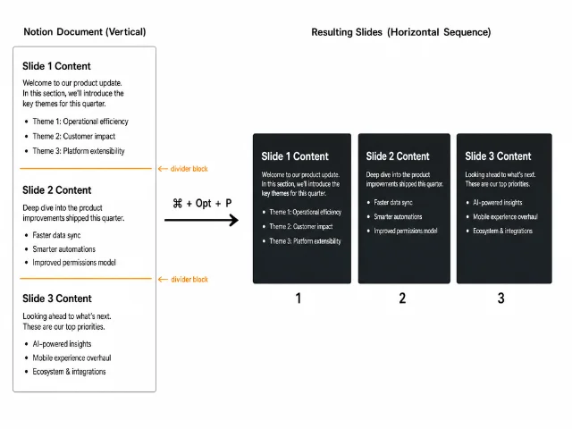
The mechanism that converts a flat document into a sequence of slides is this: every divider block in the page acts as a slide boundary. Content between two dividers becomes one slide. 1 2
Diagram showing how divider blocks in a Notion page map to individual slides in Presentation Mode
How divider blocks become slide boundaries: each horizontal rule splits the document into sequential presentation slides (AI-generated diagram)
The choice of dividers is the key design decision. Notion had at least three alternatives:
ApproachInfrastructureAuthoring cost
Divider reuse (Notion's choice)Existing divider block repurposed as slide breakZero new primitives; any existing page with dividers works immediately
New slide-break blockA dedicated "Start new slide" block typeRequires author to insert new primitives at each transition point
Heading-level detectionH1 or H2 headings auto-define slide boundariesZero authoring cost, but every headed section becomes a forced slide break
The divider approach sits between the other two on the authoring cost axis. It requires zero new primitives (unlike the dedicated block), but it also doesn't fully auto-infer structure from what's already there (unlike heading detection). What makes it interesting as a design choice is what it implies about who Notion's target user is for this feature.
The case for divider reuse: Many Notion power users already use dividers for visual sectioning in long documents — meeting notes, project specs, research docs. If you've divided a doc with dividers before you want to present it, Presentation Mode works with zero preparation. The authoring intent (separate this section visually from the next) maps cleanly onto the presentation intent (this section is slide N, the next is slide N+1). When the two intents align, divider reuse is invisible infrastructure.
The cost of divider reuse: Dividers now carry dual semantics. In normal edit view, a divider is a visual separator — it tells the reader "this is a new section." In Presentation Mode, the same block is a slide boundary. These two meanings don't always coincide. A document might use a divider to separate a short aside from the main body, with no intention of ever presenting them as separate slides. Or a document designed for presentation might have content that spans multiple distinct subsections where dividers would look wrong in reading mode. The dual-semantic problem is real, and it means some documents will require divider surgery before they present cleanly — dividers added for layout reasons removed, new dividers added for slide-break reasons. That is still less work than a full rebuild, but it is not zero work.
Heading detection would eliminate even that friction: every H1 or H2 becomes a slide boundary automatically, with no new or removed dividers required. The reason Notion likely avoided it is that it makes the conversion too aggressive — a document with dense H2 subheadings would explode into 15 slides with two sentences each, the opposite of useful. Heading density in documents written for reading is too high for heading density written for presenting. Dividers, by contrast, are sparse by convention. Authors don't place them every 200 words; they place them at genuine content boundaries. That sparsity makes them more reliable as slide-break proxies.
The dedicated slide-break block would solve the dual-semantic problem cleanly — the author's intent is unambiguous. But it requires adding a new block type to every document intended for presentation, which breaks the "no rebuild" promise. A document written with presentation in mind would look different from a document written for reading, because it would contain slide-break blocks a reading-mode user would never need. The current Notion authoring philosophy resists that divergence: the same page should work as a document and, when needed, as a presentation.
Notion's bet is that the overlap between "documents people section with dividers" and "documents people want to present" is large enough that divider reuse captures most of the value with minimal authoring friction.

Block fidelity inside slides

When a page section enters a slide, Notion preserves the blocks within it and applies automatic formatting. Headings, callouts, text blocks, and similar content types render faithfully. 2 The Organized Notebook's writeup described it as "not a full design tool, but it is fast and flexible" — a fair characterization. 2 The feature makes no attempt to offer slide-level layout controls like column pinning, font size override per slide, or background color per section.
This is a clear scope boundary, and it's the right one given the product bet. If Notion added slide-level layout controls, it would be building a second authoring layer on top of the first — a formatting surface with different rules from the page editing surface. That would immediately create a decision tax: should I format this in the page editor or in the slide editor? It would also create a maintenance burden. Every new block type Notion ships would need to be evaluated for how it renders in slide view with a custom layout layer on top of it. And it would pull the product toward competing with Keynote and Google Slides on their own terms, where they have years of head start.
By making block fidelity automatic and removing layout controls, Notion keeps the feature in a narrower category: quick present from the doc you're already in. The use case is the Tuesday all-hands where you're presenting the spec you wrote in Notion anyway. Not the quarterly board presentation that needs pixel-perfect layout, custom brand colors, and animated transitions. Those users should export to Keynote or Slides. Notion is serving a different moment.
The blocks that render well are predictably the ones with the least spatial dependency: headings, paragraphs, bullet lists, numbered lists, callouts, quotes, code blocks. Blocks whose value is inherently spatial — multi-column layouts, synced blocks with variable content, embedded databases — are less obviously handled. The release page doesn't specify their behavior in slide view, and without the demo GIF this teardown can't confirm it from direct inspection. That is the one confirmed gap in available documentation.
Notion 3.4 release banner featuring Presentation Mode alongside six other features shipped in the same update
Notion 3.4 part 1 release — Presentation Mode shipped alongside Dashboards, Sidebar redesign, Tabs block, AI image generation, and Archive pages 1

Beta status and plan gating

Presentation Mode launched in beta, available on Plus, Business, and Enterprise plans. 1 Free plan users don't have access.
The beta label and the plan gate are two separate signals worth reading independently.
Beta means Notion hasn't declared the rendering behavior stable. For a feature that wraps every possible block type in a new display mode, that's honest. Block fidelity in slide view depends on how each block type's render logic was adapted for the full-screen context, and edge cases in that adaptation are almost certainly still being found. Users who report odd rendering behavior are providing the feedback that moves the feature out of beta. The label is practical triage infrastructure, not a hedge on whether the feature ships.
Plus/Business/Enterprise gating is a positioning choice, not just a monetization one. Free plan users are typically individuals using Notion for personal notes. The use case that Presentation Mode serves — presenting to a team, running a meeting from a shared workspace page — is inherently a multi-person, organizational context. That's the Plus tier and above. The feature is gated at exactly the user segment where the use case is most plausible. This differs from gating features on "advanced" functionality to drive upgrades; it reflects a genuine match between feature purpose and plan context.
There's also a latent signal in the beta + paid-tier combination: Notion is monitoring how the feature performs among users who are already invested enough in the product to pay for it. That's a cleaner cohort for measuring quality signal than free-tier users who might try it once and never return.

The reusable pattern: Zero-Primitive Promotion

Named pattern for this teardown: Zero-Primitive Promotion.
Zero-Primitive Promotion is the design move of building a new consumption mode on top of an existing content model without introducing any new content primitives. The feature does not ask the author to add new block types, change their authoring habits, or create a separate version of the content for the new mode. Instead, it reinterprets semantics that already exist — in this case, the divider block's role as a section separator — and maps those existing semantics to the requirements of the new mode.
Three conditions make Zero-Primitive Promotion viable:
An existing primitive carries sufficient structural signal. Dividers already mark boundaries that correspond to meaningful content sections. If Notion's pages had no structural signals at all — no headings, no dividers, no block groupings — there would be nothing to map to slide boundaries. The feature works because pages are already structured; the structure just needed to be reinterpreted. If your product's content model is largely unstructured (a freeform text blob, a long stream-of-consciousness note), Zero-Primitive Promotion has no structural signal to promote.
The new consumption mode tolerates imperfect fidelity. Presentation Mode doesn't need to render every block type perfectly to deliver value. It needs to handle the common case — heading + bullets + callout — well enough that a document author can stand behind it in a meeting. A feature that required perfect fidelity for every block type couldn't be shipped without a full layout layer, which would violate the zero-primitive constraint. The key design bet is that "good enough for the plausible use case" is achievable without adding a new authoring surface.
The target user already has documents that will work. This is the distribution condition. Zero-Primitive Promotion only gets adopted if a meaningful fraction of existing documents are presentation-ready without modification. Notion's bet is that users who use dividers for visual sectioning already own a set of documents that work in slide view today. If the feature required re-authoring every document to include dividers before it could be used, adoption would look identical to a feature that required a full rebuild — the zero-primitive advantage would be theoretical, not practical.
Where the pattern fits: You're building a new mode for consuming content that already lives in your product — a print view, an export view, a focus mode, a read-aloud mode. You have a content model with structural signals (headings, separators, tags, metadata). You want users to be able to use the new mode on existing content without authoring modifications. The question to ask is: which existing structural signal maps most reliably to the requirements of the new consumption mode, and is the mapping clean enough that users won't be surprised by the result?
Where the pattern breaks: When the new consumption mode has format requirements that genuinely can't be satisfied by promoting existing primitives. A full-bleed hero image on a slide requires the author to specify what image should appear full-bleed, and that's information the page editing model doesn't capture in any existing primitive. You can heuristically guess (use the first image in the section), but heuristic guessing produces unpredictable results at the edges, which erodes user trust in the feature. At that point, you need a new authoring primitive — and the honest design decision is to add it rather than try to infer it.
The PM-applicable frame: when a new consumption mode is proposed for a product with an existing content model, the first question is not "what new primitives do we need to build?" — it's "which existing primitives already carry the structural signal this mode needs?" If the answer is "none," you're building a new authoring layer. If the answer is "these three," you're building Zero-Primitive Promotion. The second path is almost always faster to ship, easier to adopt, and significantly harder to scope-creep into a second product. Notion's Presentation Mode shipped as one feature in one release alongside six other features. That's only possible because the content model did most of the work.
링크 미리보기를 불러오는 중…

Cover image: AI-generated UI mockup representing Notion Presentation Mode slide view. Notion 3.4 release thumbnail from Notion Releases – March 26, 2026

이 콘텐츠를 둘러싼 관점이나 맥락을 계속 보강해 보세요.

  • 로그인하면 댓글을 작성할 수 있습니다.