Linear Team Documents: the Context-First Navigation pattern
Linear's Team Documents puts shared context at sidebar position 1 — above Issues, Cycles, and Projects — extracting the Context-First Navigation pattern.

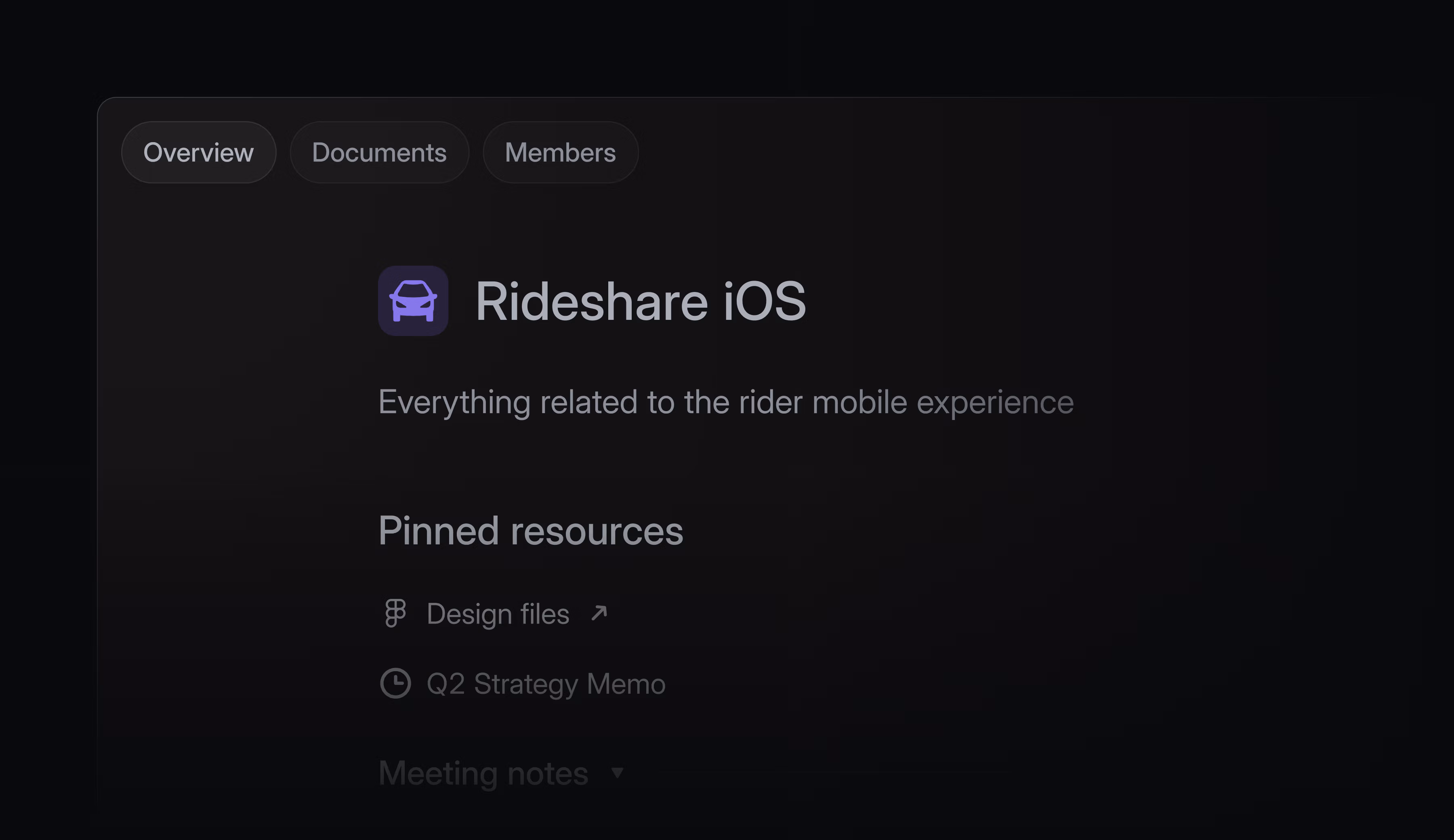
Linear shipped Team Documents on June 4, 2026. 1 The feature gives every team a dedicated home page — a landing surface for pinned docs, links, and shared references organized into named sections. The changelog description is deliberately understated: "Important team context doesn't always belong in a specific issue, project, or initiative. Teams also need a dedicated place for the notes, docs, and shared references that support their work over time." 1
That framing undersells the structural decision. The more precise way to describe what shipped is this: Linear moved team context from the third or fourth item in a sidebar to the first. That single positioning decision inverts the default information architecture of project management tools, which have historically placed shared context behind workflow views.
The IA decision: context above work-in-flight
In Linear's sidebar, each team now exposes a fixed navigation order. 2 The Team page sits at position 1 — ahead of Triage, Issues, Cycles, Projects, and Views. This is not a default that users can shuffle or a setting buried in team configuration. It is the committed hierarchy.
That placement is the design decision worth examining. Every other item in that list is a workflow view — a surface that surfaces work-in-flight, items to act on, cycles to close. The Team page is not a workflow view. It is a context surface. By putting context first, Linear is making a claim about how teams should start their day: orient, then act.
The change also resolves a long-standing ambiguity in Linear's model. Before Team Documents, if you clicked a team name in the sidebar, you landed on Issues. The team name was a label, not a destination. Now clicking it navigates to a curated surface the team controls. The click's meaning changed.
Visual anatomy: three tabs, two zones, one right-side rail
The full-fidelity screenshot reveals the screen's structure more clearly than the changelog hero.
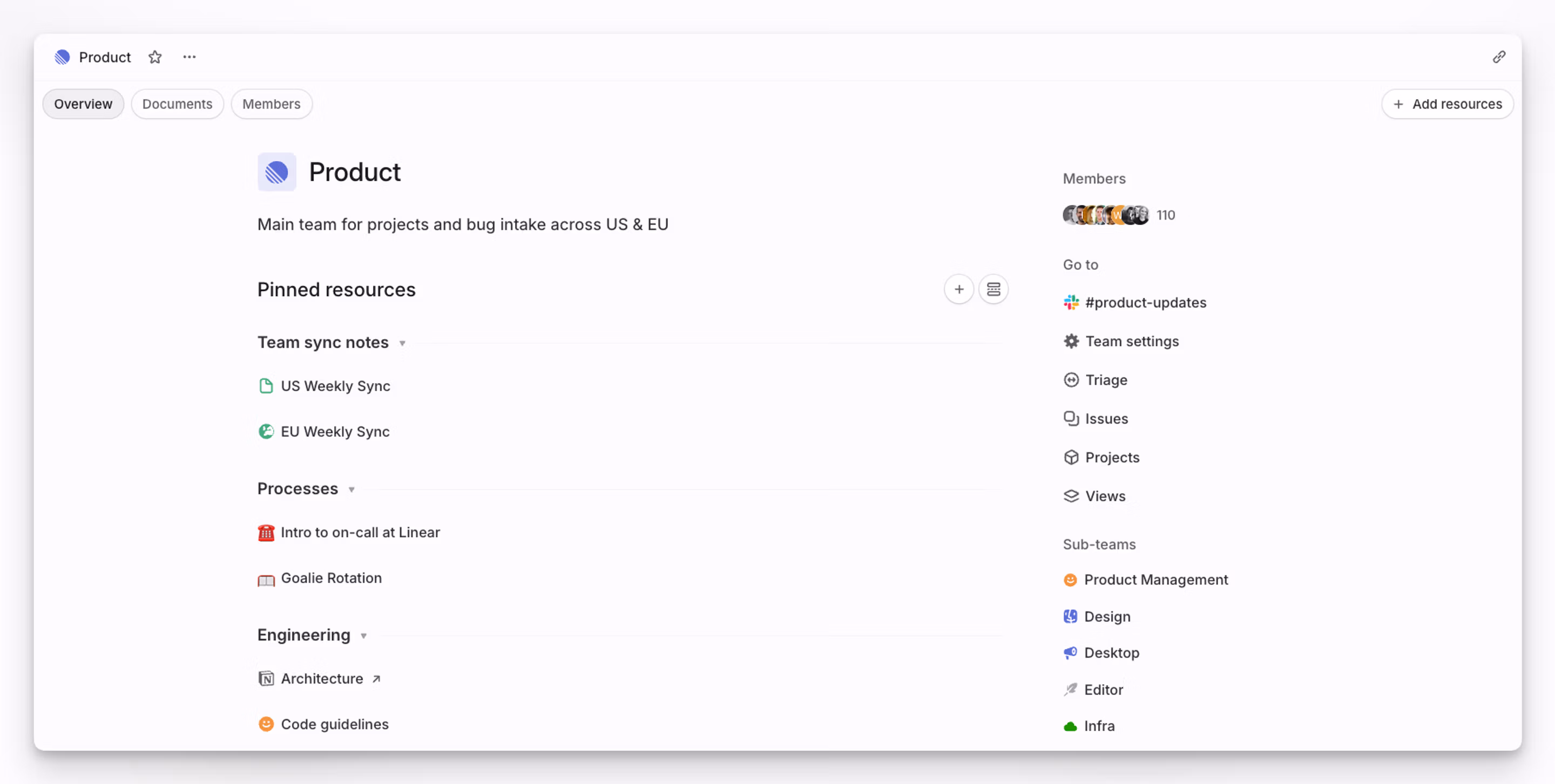
Three tabs run across the top: Overview, Documents, and Members. The Overview tab (selected by default) is where the curation lives. The Documents tab surfaces a flat list of all team-level documents — a functional index. 2 Members is roster management. The tab shell is familiar enough that no onboarding is required; the decisions are inside the Overview.
The Overview tab has two zones:
Left zone (main content, ~65% width): Team identity at the top — icon, name, one-line description ("Main team for projects and bug intake across US & EU"). Below that, the
Pinned resources section with a + button and a toggle for list/grid view. Resources are grouped into named sections — "Team sync notes," "Processes," "Engineering" in the screenshot — each collapsible with a small chevron. Individual items inside a section carry type-specific icons: green document icon for internal docs, a Figma icon for external links, a red archive icon for recorded notes. The external link items display a ↗ arrow to signal they open outside Linear.Right zone (contextual rail, ~35% width): Three stacked groups —
Members (avatar stack with count, "110" in the screenshot), Go to (shortcuts to #product-updates channel, Team settings, Triage, Issues, Projects, Views), and Sub-teams (colored icons for Product Management, Design, Desktop, Editor, Infra). The right rail is read-only and navigational. It does not offer actions.This two-column split is deliberate. The left zone is where the team speaks to itself — it is the authored, curated surface. The right zone is where you navigate to work — workflow views and roster. The split physically separates context from execution paths.
The section model: lightweight organization without hierarchy
Sections are the organizational primitive on the Team page. 2 A team can create named sections and place pinned resources inside them. The sections are collapsible but flat — there is no sub-section nesting, no folder tree, no Wiki-style page hierarchy. Three levels of content exist: the team page, sections within the page, and items within sections. That is the entire depth model.
This is a pointed choice. Notion, Confluence, and most team wikis make nesting the default expansion path: when a page gets too long, you add sub-pages. That model works well for documentation that compounds over years — but it produces knowledge graveyards for working context. Material accumulates in folders that no one has organized since Q3 of last year.
Linear's flat model limits what can live on the Team page. A team with 50 documents cannot create a sub-folder to contain them; the model pushes those documents toward the Documents tab (a flat index) or back toward projects and issues (where work-specific context belongs). The sections on the Team home are meant to stay short. That scarcity is designed in.
What can be pinned: cross-origin resources on a single surface
Resources that can be pinned to the Team page come from two origins. 2 A team member can pin any document or link from existing projects or issues within the team — pulling a specific spec, a reference doc, or an external tool link out of its original context and surfacing it at the team level. Or they can create a new document directly at the team level, which exists outside any specific project or issue.
The cross-origin pinning is the more interesting half. It lets a team build a curated homepage from materials that already exist elsewhere in Linear, without duplicating them. "Architecture.md" inside the Backend project gets a
↗ link on the Team page; the document itself stays where it is. The team home becomes a navigational index over the team's existing knowledge, not a parallel repository.The
+ Add resources button in the top-right corner of the pinned resources area makes the action available without modal-hunting, but it does not dominate the screen. In a fresh team with no pinned resources, that button is the primary affordance. What the empty state looks like — whether it offers suggested content, a quick-start prompt, or a blank canvas — is not visible from public screenshots.Navigation access: two keyboard paths
Linear offers two ways to reach a team's home page. 1 The first is the direct click: clicking the team name in the sidebar now navigates to the Team page rather than to Issues. The second is the command menu: press
o to open it, then t to filter by team, then select the team. The keyboard path matters because Linear's power users rarely touch the sidebar — they live in the command palette. Surfacing the Team page through o + t puts it in reach for that cohort without requiring a sidebar click.The feature requires no opt-in or team settings toggle. 2 Unlike Triage and Cycles — both of which are marked as opt-in in Linear's docs — the Team page is on by default. Every team already has one. The rollout model implies that Linear thinks the Team page should be universal infrastructure, not an optional workflow mode.
Karri Saarinen confirmed the tab structure on launch day, replying to a user question with a screenshot of the team home: 3
콘텐츠 카드를 불러오는 중…
The "working RAM" philosophy, productized for teams
Karri Saarinen (Linear's CEO) articulated the design philosophy behind Linear's document approach in November 2024: "We not really building wiki/general purpose document writer. Linear is more like 'working RAM' vs long term storage of docs." 4 He added that he personally maintains his own private team in Linear for notes and draft documents, because "you can directly reference and access them without moving between tools." 4
콘텐츠 카드를 불러오는 중…
Team Documents takes that personal practice and turns it into a shared primitive. The RAM metaphor implies something specific about access speed and ephemerality: RAM is fast, directly addressable, and not the place you archive things long-term. A team page built on that philosophy should be fast to update, immediately visible to members, and focused on what is currently relevant — not a permanent record of everything the team has ever decided.
The sections model enforces this. Sections are meant to be maintained, not accumulated. If a section no longer reflects the team's current work, someone removes it. The architecture puts the burden of curation on the team rather than on search or navigation — which is precisely what you want if the goal is working RAM rather than archival storage.
The named pattern: Context-First Navigation
Context-First Navigation is the information architecture decision to place a shared context surface at position 1 in a team's navigation hierarchy — above all workflow views — so that orientation precedes execution by default.
The specific mechanics: the context surface is the default landing when navigating to a team, it is reachable by a dedicated keyboard shortcut, and it is always-on (not opt-in). Workflow views (task lists, backlogs, sprint views) remain accessible one click or keypress away, but they are no longer the default destination.
This pattern applies under three conditions.
Teams navigate to a tool for two distinct reasons. The first is execution — finding and acting on work-in-flight. The second is orientation — understanding what the team is working on, where shared references live, and what context is needed before acting. Standard project management tools assume the first use case is always primary. Context-First Navigation assumes teams need orientation access, and that getting orientation right reduces execution errors.
Context is currently scattered across the work layer. When important team context lives inside specific issues and projects — attached to items it is tangentially related to, or buried in a document linked from a closed cycle — orientation requires search or memory. A dedicated context surface pulls that material into one reachable location without moving the originals.
The tool is used for execution at high frequency. A tool opened once a week for planning can afford to put context in a settings page or a wiki. A tool opened every day for task management needs context at the entry point, because the team lands on work-in-flight before they have had a chance to re-orient. The higher the execution frequency, the more valuable a context surface at position 1 becomes.
PM takeaway: Audit the default landing experience in your product for teams or workspaces. Where do users land when they navigate to a team area? If they land directly on a task list, backlog, or notification feed, ask whether there is any context surface accessible before the work layer — and whether it is at position 1 or buried in a settings page. The Team Documents pattern is not about adding a wiki. It is about deciding what the default answer to "where do I start?" should be for a returning team member.
Cover image: Linear official changelog screenshot, Team Documents release, June 4, 2026
이 콘텐츠를 둘러싼 관점이나 맥락을 계속 보강해 보세요.