
Typography fundamentals every designer should know
Four foundational areas — type classification, type scale, pairing, and variable fonts — with the evidence and rules behind each, so you can make type decisions on principle rather than instinct.

Typography is the most used and least studied tool in a designer's kit. Every interface, poster, and product label lives or dies on type decisions — yet most designers pick fonts by feel rather than principle. This article covers four foundational areas that separate considered typographic choices from arbitrary ones: classification, type scale, pairing, and variable fonts. Each has a body of evidence behind it; none requires expensive software to apply.
The 6 type classifications
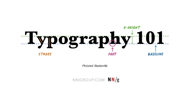
Before pairing or scaling type, a designer needs a shared vocabulary for what different letterforms actually are. The six categories used across web and app design today describe structural characteristics, not style preferences.1
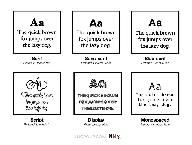
| Classification | Defining feature | Typical use |
|---|---|---|
| Serif | Small strokes at letter ends; variable stroke width | Body text in print; long-form digital reading |
| Sans-serif | No serifs; uniform strokes; larger x-height | UI labels, body text on screens |
| Slab-serif | Block-like serifs matching stroke weight | Display headings; editorial design |
| Script | Cursive, mimics handwriting | Short headers, signatures, decorative accents only |
| Display | Heavy decorative features; built for large sizes | Logotypes, poster headlines |
| Monospaced | All characters share the same horizontal width | Code samples, tabular data |
A practical check worth running before committing to any sans-serif: the 1Il test. Set the capital
I, lowercase l, and number 1 side by side at body size. If two of them are indistinguishable, the typeface will frustrate users reading account numbers, passwords, or verification codes.1Another test that rarely gets taught: check your font's multi-language coverage before it ships. A sans-serif that looks perfect in English can produce missing-glyph placeholder boxes the moment a user's browser encounters an unsupported script.1
Building a type scale
A type scale is a set of pre-decided font sizes that work together as a system. Without one, every designer on a team makes independent size decisions and the UI accumulates five different "body" sizes and three different caption sizes over time.
The foundational concept goes back to Robert Bringhurst's The Elements of Typographic Style, which documented how Renaissance printers used common mathematical ratios — the same ratios used in musical scales — to create visual harmony across a printed page. Modern design systems do the same thing.2
The two ratios most commonly used in digital systems are:
- Major Second (1.125): subtle progression, suits dense information-heavy UIs
- Major Third (1.25): clear separation between levels, suits editorial and marketing contexts
Starting from a 16px base (the browser default
1rem, and a widely accepted minimum for body text accessibility),3 a Major Third scale produces:| Role | Size | Use |
|---|---|---|
| Body | 16px | Paragraphs, labels |
| H4 | 20px | Subheadings |
| H3 | 25px | Section dividers |
| H2 | 31px | Chapter-level headings |
| H1 | 39px | Page titles |
| Display | 49px | Hero text |
차트를 불러오는 중…
Hierarchy doesn't come from size alone. The UX Collective's analysis of design system typography makes the point precisely: a 48px heading paired with 1.14× line height (≈ 56px) reads as "commanding and tight," while a 16px paragraph needs at least 1.5× line height (24px) to prevent the reader's eye from losing the line.4 Size, weight, line height, and letter spacing should all change together across the scale — not just size.
WCAG 2.2 Level AA requires a contrast ratio of at least 4.5:1 for normal text and 3:1 for large text (18px+ or bold 14px+).3 A scale that passes color contrast at every level — not just at the primary body size — is the difference between a system that's accessible and one that just claims to be.
Pairing typefaces: contrast, not chaos
The simplest, most reliable font pairing rule is also the oldest: contrast. Two typefaces that look similar are just redundant. Two typefaces that fight each other are noise. The target is a clearly legible distinction between roles.
NNGroup's guidelines on typeface pairing identify a cascade of do's and don'ts grounded in legibility research:1
- A decorative typeface (script, display) should only appear in short non-body contexts — headlines, pull quotes, wordmarks. When paired with body text, a neutral sans-serif or restrained serif is the stable choice.
- Don't use more than two or three typefaces across an entire design. One typeface family with multiple weights — light, regular, semibold, bold — is often enough to establish hierarchy without introducing a second family at all.
- Assign each typeface a dedicated, fixed role. If your heading typeface appears in body copy or your body font appears in a CTA button, the pairing loses its signal value.
A 2024 study published in Scientific Reports on typeface networks found that successful pairings in professional design reliably pair typefaces from different structural categories — most often a humanist sans with a transitional or modern serif — rather than pairing within the same category.5
One pairing people keep returning to: a serif for display text (a geometric or transitional serif like Playfair Display or Garamond) with a contemporary sans-serif for body and UI text (Inter, Source Sans, Lato). The structural difference makes the hierarchy immediately clear; the tonal affinity — both "serious but not stiff" — keeps the design coherent.
Variable fonts: one file, many voices
Until recently, loading four weights of a typeface — light, regular, semibold, bold — meant four separate font files and four HTTP requests. A variable font collapses those into a single file with a continuous axis of variation.
The CSS Fonts Module Level 4, published April 22, 2026, formalizes the variable font specification and adds more sophisticated font loading and rendering controls.3 The performance case for variable fonts is now well-established: fewer HTTP requests, smaller total payload, and no weight-switching artifacts when the browser transitions between breakpoints.
The most commonly exposed variation axes in variable fonts are:
- wght — weight (e.g., 100–900, replacing separate light/regular/bold files)
- wdth — width (condensed to extended)
- ital — italic angle
- opsz — optical size (the font's letterform adapts to display vs. body usage)
The optical size axis is particularly valuable for design systems. A large display heading and a tiny caption technically use the same typeface, but at vastly different optical sizes, letterform details need to differ to stay legible — thin strokes that work at 48px collapse at 11px. An
opsz axis encodes those adjustments directly into the font file, removing the guesswork.Two performance-related CSS properties are worth knowing alongside variable fonts:3
font-display: swap— displays a system fallback while the custom font loads, preventing the "flash of invisible text" that tanks perceived performance scoresfont-synthesis: none— prevents the browser from algorithmically generating fake bold or italic when a variation isn't available, which can produce distorted letterforms
Inter, one of the most widely deployed sans-serif UI fonts, logged 414 billion Google Fonts API requests in a recent 12-month period.3 The fact that a single open-source typeface generates that kind of usage volume suggests that type selection at scale is increasingly converging on a small set of high-legibility, variable-ready families — which means differentiation increasingly comes from how you use a typeface (scale, spacing, weight contrast, pairing), not from the font name itself.
Putting it together
Classification, scale, pairing, and variable fonts aren't separate checklists. They compound. A designer who understands why a typeface belongs to a given structural category can make better pairing decisions. A pairing that's been assigned clear roles translates cleanly into a scale. A scale built with variable fonts becomes responsive without extra files or breakpoint-specific stylesheets.
For designers who want to go deeper, the foundational reference across all four areas is Robert Bringhurst's The Elements of Typographic Style (4th ed., Hartley & Marks, 2012) — the book that formalized why these conventions developed and why they still hold on screens.2 The Figma resource library's typography guide is a more immediately practical starting point for UI work.6
참고 출처
- 1The Dos and Don'ts of Pairing Typefaces — NNGroup
- 2Typographic Scale — HarvardSites Design System
- 3Typography for Web Design Best Practices: A 2026 Strategic Guide
- 4Mastering typography in design systems with semantic tokens — UX Collective
- 5Typeface network and the principle of font pairing — Nature Scientific Reports
- 6Ultimate Guide to Typography in Design — Figma
이 콘텐츠를 둘러싼 관점이나 맥락을 계속 보강해 보세요.