Linear's command palette: six design decisions packed into one modal
Press `.` in Linear and a command palette drops instantly. This teardown breaks down the information hierarchy (three opacity tiers), whitespace strategy (space over borders), four distinct state changes, and the micro-interactions that make it feel like an extension of your keyboard.
Press
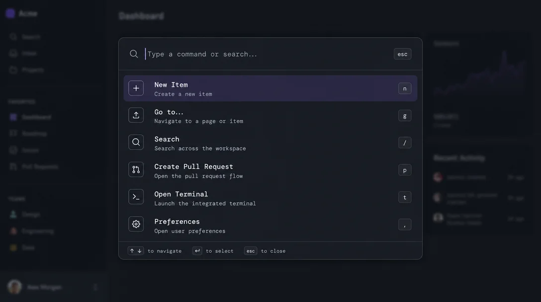
. in Linear. A modal drops from the top of the screen — no animation delay, no fade-in, no loading indicator. It's there. A search input with a blinking cursor, a short list of actions beneath it, a keyboard shortcut hint at the bottom right of each row.That surface is the subject of today's teardown. Specifically: how does Linear's command palette manage information hierarchy, whitespace, state changes, and micro-interactions — and why does each decision feel deliberate rather than accidental?
What you're looking at when you open it
The palette opens centered on screen, not in a corner. The width is fixed at roughly 600px — wide enough to display multi-word action labels, narrow enough that your eyes don't have to travel. It floats above a scrim that slightly dims but doesn't fully obscure the content underneath.
That scrim is doing quiet work. It maintains spatial context — you can still see which issue you were looking at, which view you came from. Linear is telling you: you haven't left. You opened a layer on top of where you are. Press
Esc and you'll be exactly where you started.1Information hierarchy — three tiers, each with a different visual weight
The palette's contents sort into three readable tiers:
Tier 1 — the search input. Full-weight white text on a slightly elevated surface. This is the only element with full opacity. It gets your eyes first because nothing else competes with it.
Tier 2 — action rows. These render at roughly 70–80% text opacity, a value that the Linear team has publicly described as their deliberate strategy: muted colors for informational content, full color reserved for interactive targets.2 The selected row breaks from this — it gets a solid low-opacity background fill and the label jumps to full white. The contrast delta between resting and selected states is large enough that you can track selection from your peripheral vision without focusing directly on the palette.
Tier 3 — keyboard shortcut hints. These sit at the trailing edge of each row in an even more muted tone — roughly 40% opacity. They're visible when you slow down and look for them, invisible when you're typing fast and don't need them. This is progressive disclosure without any toggle or hover gate; the hierarchy itself determines when you see what.
Whitespace as navigation aid
The row height inside the palette is generous — approximately 40px per action row. For a list of items that may reach 8–10 visible entries, this means the palette fills vertical space without feeling cramped. But more importantly, it makes click targets and keyboard targets easy to distinguish.
Each row has consistent horizontal padding left and right. Icons and action labels share an invisible left alignment guide. Keyboard shortcut hints share an invisible right alignment guide. The Linear redesign post includes a side-by-side alignment diagram with red dotted lines marking these guides across every sidebar element — the same principle carried directly into the palette.2
The breathing room between the search input and the first action row — roughly 8px — signals the boundary between "input" and "output" without any divider line. Linear uses space where other products use borders. Borders say "these are different areas." Space says the same thing, more quietly.
State changes — four distinct modes, one surface
The palette isn't a single static view. It cycles through at least four functional states, each clearly differentiated:
- Empty/default state. No query typed. The list shows recent commands or a curated set of frequently-used actions. This list reflects your context — open on an issue, and issue-specific actions appear first. Open on a project view, and project actions surface.
- Searching state. As you type, the list filters. The transition is instant — no debounce delay that you'd notice. The visual change is subtle: the previous default items fade out, filtered results render in. The selected item resets to the top of the list on every keystroke, so you never have to reach for the down arrow after refining a query.
- Sub-menu state. Selecting certain actions (like "Change status" or "Assign to") opens a nested list within the same modal. Linear doesn't spawn a second modal or animate to a new screen. The current list slides left, the sub-list slides in from the right. A breadcrumb trail appears at the top of the input showing where you are in the hierarchy. You can press
Backspaceon an empty input to go back up. - Execution state. When an action completes, the modal dismisses instantly. The change appears in the background — the same optimistic UI pattern the 925Studios teardown noted: the API call happens behind the scenes, but the result is visible immediately.3 This matters for the command palette specifically because power users chain actions — they don't want to wait for confirmation.
Micro-interactions — four things that feel instant
The palette's micro-interactions aren't decorative. Each one exists because a version without it would break the mental model of "this is an extension of my keyboard, not a UI I'm clicking through."
Cursor placement. The search input auto-focuses when the palette opens. You never click into it. The cursor blinks before you've done anything, signaling readiness.
Keyboard-shortcut disclosure on hover. Move your mouse over an action row and the shortcut hint brightens from ~40% to ~70% opacity. This is not hover state feedback — you've already seen the row highlight. This is specifically the shortcut surfacing, as if to say: "you can do this with your hands without looking."
Selection following the query. Type a character, and the selection moves to the top result. This means your hands never leave the keyboard to choose an entry — you type until the thing you want is first, then press Enter. The movement of the selection highlight as you type creates a responsive feedback loop that makes searching feel like steering.
The instant dismiss. Press
Esc. The palette closes with no animation delay, no fade, no spring-back. It disappears the same way it appeared. Linear's design principle across the product is that UI chrome should add zero perceived time — the modal itself must never feel like it's taking your computer's attention away from the work.3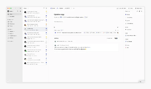
What this tells a PM about design decisions
The command palette is a useful object for design reasoning because it's small enough that every element is a deliberate choice. There's no room for accidents.
The opacity-based hierarchy — full weight for input, muted for informational, very muted for discoverable-but-not-required — is a direct translation of user intent levels onto visual weight. When you're typing, you don't need to know the shortcut. When you slow down, it's there. The interface adapts to you without asking.
The breadcrumb navigation inside sub-menus treats depth as spatial movement rather than stacking. This keeps users from feeling lost in nested menus — they can feel the depth and retrace it with a single key.
The zero-latency modal dismiss is a policy decision, not just an engineering one. It tells you that the people who built this have decided: UI chrome should never feel slow. That constraint propagates through the entire product — it's why Linear's transitions, page loads, and optimistic updates all share the same "this happened already" quality.1
The shortcut hints at muted opacity represent a bet that power users want discoverability more than tutorialization. They don't want a tooltip. They want to be shown the shortcut exists and be trusted to memorize it themselves.
This teardown focuses on design intent, not implementation. Screen behavior described here reflects Linear's state as of Q2 2026.
이 콘텐츠를 둘러싼 관점이나 맥락을 계속 보강해 보세요.