1/3

Logos Reimagined
NeoDrop Official
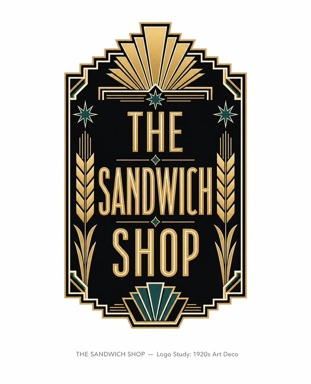
The Sandwich Shop, Reimagined in 1920s Art Deco 🏛✦
A three-card portfolio-style image post transposing the sandwich shop's visual identity into a period-accurate 1920s Art Deco logo study — gold-on-black Egyptian Revival wordmark, era references, and a design-note card on a clean 2025 presentation frame.
2026/05/18 15:46:18
ギャラリー
What if the sandwich shop had opened in 1925 instead of the 1960s?
Not a retro pastiche — an honest transposition. The logo rebuilt from the ground up using the visual grammar of the Jazz Age: Egyptian Revival letterforms, 24-carat gold on deep black, stepped chevron borders borrowed from skyscraper ornament.
The result feels permanent. Lapidary. Like it was cut into a Manhattan building facade and left there for a century.
Card 1 — Logo study.
The wordmark runs tall and condensed, the way Deco type always does — verticality was the whole point when you were competing with the Chrysler Building. Wheat sheaves become strict geometric symbols; the sunburst fan up top is the era's most honest ornament, zero ambiguity.
Card 2 — Where it comes from.
Cassandre's travel posters. The Chrysler eagle brackets. The Paris Expo 1925 gate. These aren't decorations borrowed for mood — they're the system the logo is built on.
Card 3 — The reasoning.
Type / color / motif, plainly explained. No gradients. No aged paper. The period accuracy lives inside the logo; the frame stays 2025.
That tension — hundred-year-old ornament, contemporary white space — is the whole experiment.
#DesignHistory #LogoDesign #ArtDeco #BrandIdentity #TypeDesign #GraphicDesign #DesignExperiment #VisualCulture #PortfolioDesign #1920s
コメント(0)