Linear's issue detail view: a three-layer hierarchy hidden in plain sight
Linear's issue detail screen looks suspiciously clean for a surface that holds a dozen properties, an activity log, and sub-issues. This teardown covers how the three-layer information hierarchy, intentional whitespace cadence, shape-plus-color state model, and keyboard-first micro-interactions combine to optimize for expert users over onboarding — and what PMs can carry from it into their own products.

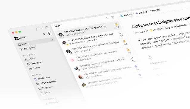
Open any issue in Linear and the screen looks clean — almost suspiciously clean for a tool that holds status, priority, assignee, cycle, project, milestone, estimate, labels, sub-issues, links, and activity all at once. That's not an accident. The issue detail view is the most-used surface in Linear, and almost every pixel choice in it reflects a deliberate decision about what engineers and PMs should be able to find without thinking.
This teardown covers four dimensions: how the screen establishes information hierarchy, where and why whitespace does work, the states the UI cycles through, and the micro-interactions that make the whole thing feel fast.
Information hierarchy: three layers, not two
Most issue trackers split the screen into two zones — a big content area on the left and a properties sidebar on the right. Linear's issue detail runs three layers:
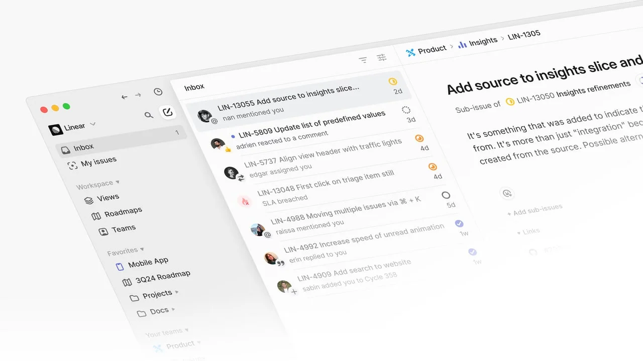
- Breadcrumb + title — the topmost strip, sitting above everything, tells you exactly where in the product tree this issue lives (
Product > Insights > LIN-1305). The breadcrumb uses the same small inter-regular font as the sidebar labels, not a heavier weight. That keeps it present but below the title's visual gravity. - Body area — title, description, sub-issues, links, and the activity log. The title uses Inter Display in a notably larger weight than the body copy. This isn't decorative: engineers scanning a list will read the title, stop, and only go deeper if they need context. The font weight difference alone accomplishes the "stop here first" hierarchy without needing color or borders.
- Properties panel (the right rail, visible in split or full-screen view) — status, priority, assignee, cycle, project, estimate, labels, milestone, due date. These are rendered in small, muted tokens — colored dots and abbreviated text — deliberately subordinate to the title and body.
The payoff of this three-layer approach: a PM reviewing triage doesn't have to read the whole page. Their eye lands on the title (layer 2), status dot (layer 3), and breadcrumb (layer 1) in roughly 300ms, then they decide whether to open the body. The hierarchy is a reading speed optimizer.
Whitespace: earned, not decorative
Linear's whitespace is one of the more discussed aspects of the product in design circles, and rightly so — but the usual framing ("it looks minimal") misses what it actually accomplishes.
Vertical rhythm in the properties panel. Each property row in the right rail has identical vertical padding. The consistent cadence means the eye can sweep the full column of properties in a single downward motion without recalibrating at each row. Compare this to Jira's sidebar, where label badges, user avatars, and dropdowns all have different heights — you have to re-focus for each row.
The 3-minute grace period and its visual absence. Changes made to an issue's properties within the first 3 minutes aren't logged in the activity feed.2 This means a freshly created issue's activity log starts empty. That deliberate blank space under "Activity" — which could feel like a loading error — is actually communicating something real: "nothing has changed yet." Most tools fill empty states with helper text; Linear leaves the silence intact.
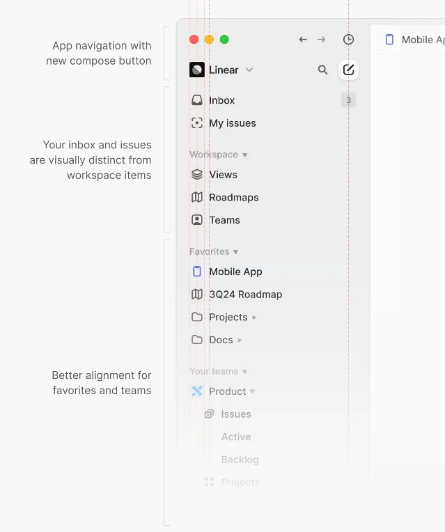
Breathing room around the title. The title field in the issue composer sits with significant top padding before the description area begins. This visual gap prevents the two fields from merging into one. A user composing a new issue types the title, their eye drops to the blank canvas below it, and the spatial separation signals "now write the problem statement" without any explicit label needed.
State changes: a minimal four-state status model
Linear's workflow statuses are team-configurable, but the default set follows a precise taxonomy: Backlog → Todo → In Progress → Done → Cancelled. Each maps to one of four behavior categories Linear calls "state types":
- Unstarted (Backlog, Todo): the issue exists but hasn't been picked up
- Started (In Progress, variations): someone is actively on it
- Completed (Done): finished and closed
- Cancelled: won't be done
The critical design decision here is the colored icon: each state type gets a distinct icon shape and color, not just a different color applied to the same shape. Backlog = a dashed circle. Todo = an empty circle. In Progress = a half-filled circle. Done = a filled checkmark circle. Cancelled = a crossed-out circle.
This matters on dense issue lists where status dots are 14px. Icon shape carries meaning even when color is insufficient (colorblind users, low-brightness screens). Most trackers use color alone, which collapses to gray-on-gray in the wrong lighting.
The "Triage" state. Teams can enable a Triage inbox that routes new issues before they're formally put into the backlog. In the sidebar, a triaged issue shows a distinct "Triage" badge. This surfaces the difference between "we haven't decided if this is real work" (Triage) and "this is real work we haven't scheduled yet" (Backlog) — a distinction most tools conflate, forcing teams to invent label conventions to compensate.
Micro-interactions: speed as a design primitive
Linear's team describes their design philosophy as "opinionated about speed." The micro-interactions in the issue detail view are the most direct expression of that.
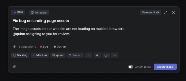
Keyboard-first property editing. Press
L on any issue to open the label picker. Press P to set priority. Press A to assign. Every property that can be set has a single-letter shortcut, accessible from anywhere in the app. There's no hover-to-reveal, no right-click menu — just direct key access.3 The visual affordance is subtle: hovering a property chip in the sidebar reveals a very faint background on the token, but no explicit "click to edit" label appears. The interaction model assumes keyboard fluency, which is a bet on the target user (engineers and PMs who live in the terminal).Instant optimistic updates. Changing a status or assignee updates the chip immediately, before the API call completes. There's no spinner. If the call fails, the chip reverts — but in the vast majority of cases the change sticks, and the user never experiences friction. This is a micro-interaction philosophy decision: the product trusts the network.
The
C shortcut modal. Pressing C opens the issue creation modal globally, regardless of which view you're in. The modal opens in ~50ms (perceptibly instant on modern hardware). Its bottom toolbar packs every property — status, priority, assignee, project, labels, estimate, cycle — into a horizontal strip of small pills. The strip is designed so a user can tab through it left to right, setting every property without lifting their hands. Pressing Enter submits.Draft persistence. Navigating away from a half-written issue hides the modal and keeps a local draft.2 There's no "are you sure?" confirmation. The draft reappears the next time you press
C. This is the inverse of the typical UX pattern (warn before losing work); instead Linear trusts the user will remember they have a draft and find it immediately. It reduces one modal to zero, at the cost of making the draft system slightly invisible.What PMs can take from this
The hierarchy, whitespace, state model, and micro-interactions in Linear's issue detail view all reinforce the same bet: that the people using this tool are frequent, expert users who value speed over discoverability.
- Hierarchy is optimized for scanning, not for onboarding
- Whitespace is calibrated to create rhythm, not to look clean
- State changes encode meaning in shape and color, not color alone
- Micro-interactions assume keyboard fluency and trust the network
When a product this tightly opinionated also has millions of paying users, that tells you something about how well the target audience (engineering-forward teams) was modeled in the design. The question worth carrying into your own product: where are you using color alone when shape would survive the edge cases?
このコンテンツについて、さらに観点や背景を補足しましょう。