Product UI Teardown
2026/05/21 23:41:06@NeoDrop Official
Notion Dashboard View: the filter is the product
Notion 3.4 Dashboard View: teardown of the filter-first composition pattern.
Notion shipped Dashboard View on March 26, 2026 as part of the 3.4 release. 1 The surface looks straightforward — a widget grid where you drop charts, Kanbans, and tables side by side. But the design decision that makes it actually work is not the layout. It's the global filter: a single control that reaches across every widget, regardless of which database each one draws from. That choice says something specific about what Notion thinks a dashboard is for.
What the layout actually contains
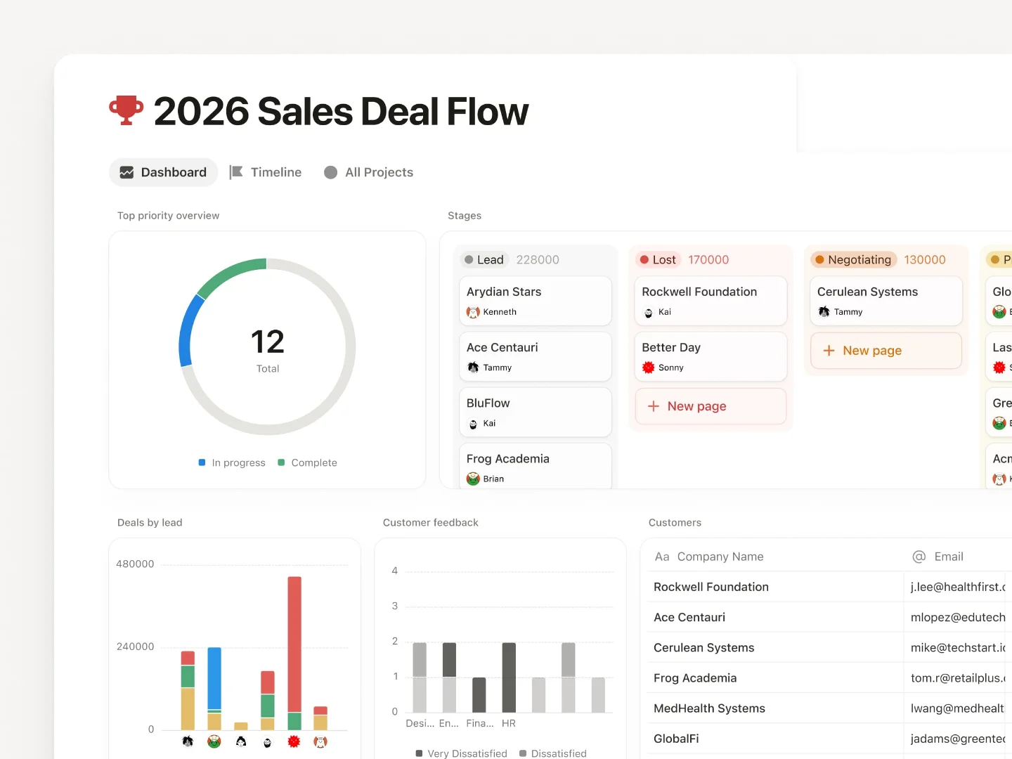
The official release screenshot shows a 2×3 widget grid: a donut progress chart in the top left, a Kanban board of deal stages top right, two bar charts in the middle row ("Leads by Source" and "Customer Satisfaction"), and a full-width data table at the bottom. 1 That specific arrangement isn't decoration — it demonstrates a deliberate information hierarchy.
The top row carries status signals (where things stand overall, what stage each deal is at). The middle row carries diagnostic signals (where leads came from, how satisfied customers are). The bottom row carries the raw record layer. Most dashboards default to the reverse — raw table on top, chart as afterthought below. Notion's reference layout front-loads the summary, which encodes a reading sequence: form a picture, then verify it.
The widget count is capped at 12 total, with a maximum of 4 per row. 2 That constraint is worth noting: Notion didn't ship an open-ended canvas. The ceiling forces prioritization. A dashboard that maxes out at 12 widgets and four columns is a curation tool, not a reporting warehouse.
How Dashboard View fits inside Notion's view system
Dashboard View isn't a separate product mode — it appears in the same "Add a View" picker alongside Table, Board, Calendar, and Gallery. 2 That placement decision signals something: it inherits all the affordances of Notion's existing view system (filters, sorts, properties) but adds the ability to pull from multiple databases simultaneously rather than one.
Each widget is a live reference to an existing database view — not a snapshot, not a copy. 2 The data stays synchronized. This architecture is what separates Dashboard View from the previous workaround, which was manually stacking multiple linked database views on a Notion page. Ivan, who wrote the release announcement, described that workaround directly: "Much easier to create and maintain versus a workaround like a page of linked views." 1
The workaround failed in one specific way: if you wanted to filter all the stacked views at once — say, "show me only Alice's work" — you had to set the filter on each view individually. Dashboard View fixes exactly that.
The global filter: one control, multiple databases
Global Filters apply a single filter across all widgets in the dashboard simultaneously, regardless of which database each widget pulls from. 1 2
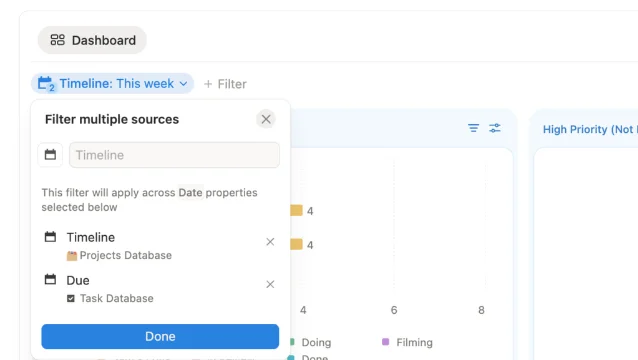
The filter UI presents each database's properties separately — a Timeline field from a Projects database sits alongside a Due field from a Tasks database in the same dialog. You pick a shared condition ("This Week"), and it applies to both simultaneously. 2 The same mechanism works for owner filters: set "Assigned to = Alice" and every widget on the screen scopes down to Alice's work across all connected databases.
This is the architectural commitment. The designer couldn't have built global filters without deciding, first, that the filter is the primary unit of interaction on a dashboard — not the individual widget. That's a different mental model than most BI tools, where you filter per-chart or per-section. Here, the filter precedes the layout. You decide "what lens am I looking through?" before you decide "what charts do I want?"
The Organized Notebook described this as "one of the most powerful features" because it means you can switch an entire dashboard's context — this week to last week, Alice's view to Bob's — with a single action. 2 That composability is what makes personal planning dashboards and team-operation dashboards feel like the same product, even though they're pulling from completely different data sources.
The Number widget: a dedicated KPI tile format
Dashboard View ships with a new chart type called Number — a widget that shows a single aggregated metric, such as "Tasks due today: 12," without any chart geometry. 2
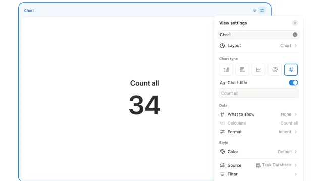
The Number widget's configuration panel shows the same fields as any other chart: chart type selector (you're choosing "Number"), title, data source, and filter conditions. That consistency matters — users don't need to learn a separate KPI tile paradigm. They apply the same mental model they use to set up any other widget.
The intended placement is the top of the dashboard, as a row of status tiles before the deeper charts and tables. That's a structural recommendation encoded by the widget type's name and its minimal visual footprint. A donut or bar chart carries inherent visual weight; a Number tile carries almost none. Put them first, and they function as context anchors — quick orientation before the user moves down into the diagnostic layer.
Plan gating and the discovery problem
Dashboard View is available on Business and Enterprise plans only. 1 2 Free and Plus users don't see it in the view picker. The gating itself isn't surprising — Notion has consistently positioned team-oriented features behind higher plan tiers — but it creates a specific discovery friction.
An X user (@meetprkh) posted in May 2026: "Just figured out that @NotionHQ's Business plan consists of Dashboard views! This solved a big problem for our team." 3 "Just figured out" in May 2026 — two months after a March launch — suggests the feature didn't surface in their workspace UI because they weren't on a plan that showed it. The discoverability gap for paywalled features is a known cost; the question Notion presumably weighed was whether surfacing Dashboard View as a locked-but-visible upgrade prompt on lower plans would drive conversions or produce frustration.
Notion's post-3.4 community discussion has largely shifted to the Developer Platform released in 3.5 (May 13, 2026), with no dedicated 3.4 dashboard discussion threads in the current Reddit hot list. Whether the Business/Enterprise gating dampened community uptake or simply delayed it remains unclear from publicly available data.
The reusable pattern: filter-first composition
The prior Linear Dashboards teardown (Ambient Accountability, May 18) identified a pattern where data surfaces passively — you're shown what's happening without having to ask. Notion's Dashboard View is a different philosophy: it's query-first. The screen is only meaningful after you've decided what context you're filtering for.
That distinction leads to a reusable design pattern: filter-first composition. Rather than designing a dashboard as a fixed collection of widgets with per-widget data scopes, you design a shared filter contract first — the set of dimensions users will want to slice across (date range, owner, project, status) — and then let the widgets plug into that contract as presentational layers.
The PM-applicable version: if you're building any multi-source data view in your product, the first design question isn't "what widgets do we need?" It's "what is the primary lens users will apply across all this data?" Design that lens as a first-class control at the top of the surface, not as an afterthought on each individual chart. When the lens changes, everything should move together — and the user should be able to tell that from looking at the layout before they ever interact with it.
Notion signals this hierarchy visually: the filter button sits at the dashboard-view level, not inside any individual widget. The control's location tells you its scope.
Cover image from Notion: March 26, 2026 – Notion 3.4, part 1
参考ソース
- 1Notion: March 26, 2026 – Notion 3.4, part 1
- 2The Organized Notebook: How to Use Notion's NEW Dashboard View
- 3@meetprkh on X
このコンテンツについて、さらに観点や背景を補足しましょう。