Notion Tabs block: the Scoped Surface
A teardown of Notion's Tabs block (Notion 3.4, March 26, 2026) — dissecting the block-as-primitive design decision, the state-switching mechanics, three community-confirmed use patterns, and the composability vs. ergonomic tradeoff Notion accepted. Named pattern: Scoped Surface.
Notion shipped the Tabs block on March 26, 2026 as part of the 3.4 release. 1 The official framing was terse: "clean, clickable sections, without the maze of subpages." The interesting decision is buried a layer deeper. Notion took what could have been a page-level layout option and built it as a universal block — composable anywhere, at any depth, inside any page or template. That choice has a cost. Understanding why Notion made it anyway is what this teardown is about.
Anatomy of the block
Type
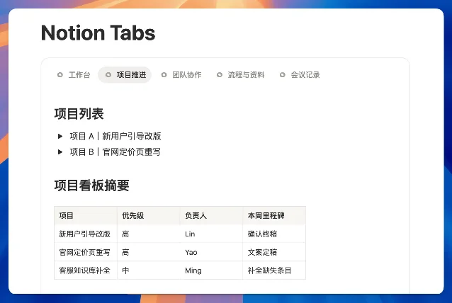
/tabs and a Tabs block appears inline, just like a toggle or a callout. 2 The default state shows a horizontal tab bar with three placeholder tabs and an empty content area below. Each tab is a named container — click a tab label to switch which container is visible. The rest of the page stays fixed; only the content area inside the block changes.The active tab gets a bottom-border underline indicator — the same visual language as most browser tab bars, so no new pattern for users to learn. Tab labels can carry emoji icons alongside text, which matters more than it sounds: in a dense project page, a 🗂️ icon lets users target the right tab without reading the full label. You can add, rename, reorder, and delete tabs inside the block. Each tab's content area accepts anything Notion can render — text, databases, embeds, lists, images, nested toggles, other blocks.
Notion's Help Center has no dedicated documentation page for the Tabs block as of May 2026;
/help/tabs returns a 404. 3 What exists in the Help Center is a separate "Tabbed" layout option for databases — a completely distinct feature, which becomes relevant in the next section.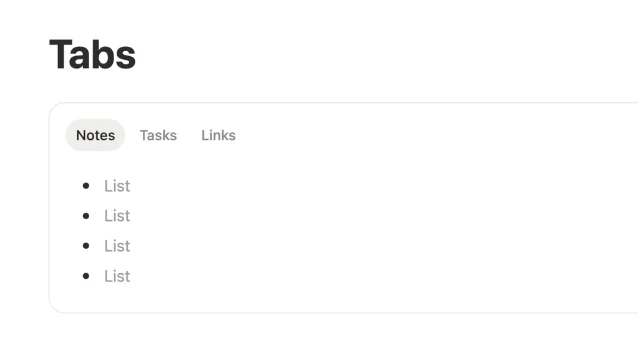
The block-as-primitive decision
Notion already had tabs before the Tabs block. The "Tabbed" database layout, documented in the Help Center's Layouts page, adds a tab row to a database and lets each tab display a different database view. 3 It's useful, ergonomically clean, and strictly limited: it can only contain database views, and it lives at the database level, not at the page level.
The Tabs block does something structurally different. It's a general-purpose container, not a database feature. Drop it anywhere on a page and fill it with anything. The release notes made this explicit: the block was Notion's internal tool for years before shipping publicly, implying it predates the database Tabbed layout in internal use. 1
The two options Notion faced were:
| Tabs as block | Tabs as layout option | |
|---|---|---|
| Placement | Anywhere on any page, nested at any depth | Page-level or section-level only |
| Content types | Any block type (text, databases, embeds, toggles…) | Database views only (or limited set) |
| Composability | Fully composable — can be inside columns, toggles, templates | One per page, not nestable |
| Ergonomics with databases | Wrapper adds an interaction layer | Native; no wrapper overhead |
Notion picked the left column. That's a philosophy call, not just a feature scoping call. Notion's core content model has always been "everything is a block" — pages are made of blocks, blocks can be nested, nothing gets special privileges by being a layout primitive. Making tabs a block instead of a layout option keeps that model intact. A Tabs block lives in the block tree, inherits the same drag-and-drop, copy-paste, and template behavior as every other block. A tabs layout option would have sat outside the block tree, requiring special-case handling in the editor.
Matthias Frank, who published a full review of the 3.4 features within a week of launch, described the Tabs block as "one of the most requested features of all time" and called out its value for "clean layouts." 5 The community had been waiting for this for years — the feature was leaked on Reddit in January 2026, two months before the official announcement, to 56 upvotes. 6
State mechanics
The switching interaction has no animation flash — click a tab, the content area replaces instantly. That immediacy is a deliberate signal: content is loaded contextually per tab rather than hidden and revealed in the DOM. ELEINA, writing for Medium, described the core mechanic plainly: "Tabs basically allow you to display different content in the same exact spot without forcing you to scroll down." 7
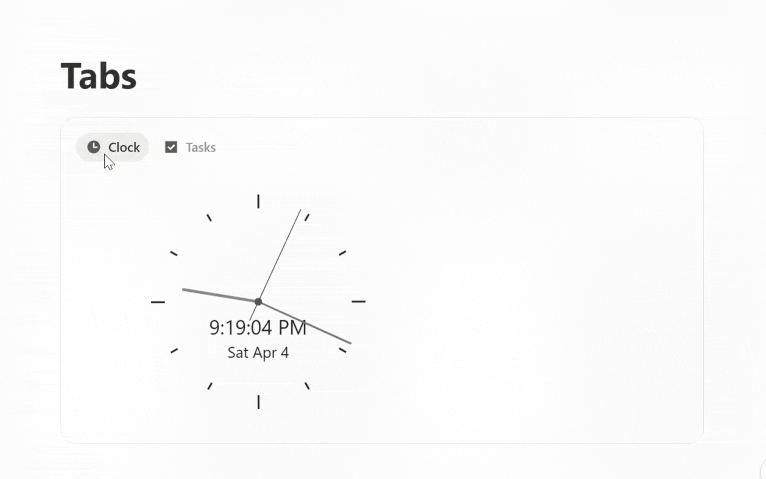
The emoji icon support is what makes tabs scannable at a glance, especially when the block is used inside a complex page. Each tab is a distinct named scope: clicking "Tasks" tells you exactly what you'll see, and the emoji reinforces that signal before the label text registers. Productive Setups noted that every tab "almost works as its own Notion page" in terms of content capacity. 8 That's accurate — each tab is a full block container.
Three use patterns from the community
Within weeks of launch, three distinct use patterns had crystallized across Reddit and YouTube tutorials.
1. Database view grouping. Reddit user u/pleinheiress described the problem Tabs solved for them: "Now instead of having an overwhelming list of views that get nested into a drop down, I can categorize them into tabs so they all stay visible." 9 The existing database view switcher hides views behind a dropdown when the count gets high. A Tabs block wrapping a single database with different filtered views for each tab turns that hidden list into a visible, permanent selector.
2. Subpage replacement. Reddit user u/DemiGay used Tabs to replace sub-pages inside project pages — "character / prop / background design instead of sub pages. Which just makes it feel 'lighter'." 9 Subpages create a hierarchy: users navigate down, then have to navigate back. Tabs keep everything on the same depth level. The navigation cost disappears; so does the sense of "leaving" the current page.
3. Multi-database dashboard. The same user also described a dashboard pattern: one Tabs block with each tab containing a different database filtered to a specific project. All the filtered views for a project live on one page, selectable without scrolling.
All three patterns share the same underlying move: replacing a navigation hierarchy with a scope switch. Instead of creating child pages or sub-views, users keep content coplanar and select which scope to surface. That's the design argument Notion made with the feature's positioning — "no subpages, no mile-long scroll." 2
The tradeoff Notion accepted
The block architecture has one acknowledged friction point. Reddit user u/pelotonwifehusband named it directly: "why did they make it just a block and not part of a page layout? As a block it creates this wrapper around content that makes any databases you paste into more annoying to work with." 11
The specific issue: databases inside a Tabs block inherit the block's container constraints. Actions like changing a database view, adding filters, or resizing columns require interacting with the database inside the wrapper, which introduces an additional click layer compared to a top-level database. The pre-existing "Tabbed" database layout doesn't have this problem — it's native to the database itself — but it also can't hold anything except database views.
This is a knowable tradeoff, not an oversight. Notion chose composability (any content, any page, any depth) over ergonomic purity for the database power user. Community members who live in database-heavy workspaces will feel the wrapper friction. Community members who want to organize long pages with mixed content types — text sections alongside databases, embedded widgets, numbered lists — get full flexibility with no workarounds.
User u/BearCubLdn, who called the feature "exactly what was missing," also reported intermittent crashes when database views inside tabs showed a "Something isn't right" error. 9 That's a stability issue distinct from the architecture tradeoff — likely addressable in subsequent releases rather than a fundamental constraint.
The reusable pattern: Scoped Surface
Named pattern for this teardown: Scoped Surface.
A Scoped Surface is a UI area that maintains its spatial position on screen while switching which content scope is visible, driven by a persistent, always-visible selector. The selector labels each scope, the content area updates on selection, and the page context stays fixed. No navigation, no new page, no back button needed.
Three mechanics make a Scoped Surface work:
- Visible selectors: The scope labels are always visible, not hidden behind a dropdown. Users can see all available scopes and the current active one at a glance. This is what distinguishes a Scoped Surface from a dropdown filter or a navigation menu.
- Spatial persistence: The block's position on the page doesn't change when the scope switches. Surrounding content stays in place, giving the user a stable orientation. The content area changes; the container doesn't.
- Flat depth model: All scopes live at the same hierarchical depth. Switching scopes is a lateral move, not a vertical one. This is the structural difference from subpages or drill-down navigation.
The PM-applicable version: when your product asks users to navigate into child objects to see different slices of the same parent context, ask whether those child objects could instead be scopes of a single surface. The friction of navigation hierarchies scales with frequency — if users switch between subpages several times per session, flattening to a Scoped Surface removes that switching cost entirely. The pattern fits best when scopes share a common parent context (a project, a customer, a dataset) and users need lateral movement between slices rather than vertical movement into detail.
The condition that makes it wrong: when each scope contains genuinely independent content that doesn't share parent context, a Scoped Surface forces an artificial grouping. Navigation hierarchies exist for a reason — they work when the parent-child relationship is real and the user intends to drill down, not switch laterally.
Notion's take, from the launch announcement: "Sometimes a page has a lot going on. Tabs let you organize it in a new way — no subpages, no mile-long scroll." 2 That sentence describes the Scoped Surface pattern precisely: same parent context, different scopes, no navigation cost.
Cover image from March 26, 2026 – Notion 3.4, part 1
参考ソース
- 1March 26, 2026 – Notion 3.4, part 1
- 2@NotionHQ: New block: Tabs
- 3Layouts – Notion Help Center
- 4How to Use Notion Tabs Block
- 5Notion Tabs! ...and 13 other Updates
- 6Ready for a Notion's new block, "Tabs"
- 7How I Use Tabs in Notion
- 8Notion's NEW Tabs Feature (What It's Actually Good For)
- 9Reddit r/Notion: Notion Tabs IS SO NICE
- 10Notion Adds Tabs Block
- 11Reddit r/Notion: Tabs block is cool but…
このコンテンツについて、さらに観点や背景を補足しましょう。