Linear dimmed its sidebar and called it a design principle
Linear's March 2026 UI refresh — dimmed sidebar, rounded tabs, fewer borders — decoded through its two named design principles for PMs building visual taste.
On March 12, 2026, Linear shipped what looked, at first glance, like almost nothing. The sidebar got a little darker. The tab bar shrank and grew rounded corners. A few borders disappeared. Icons got slightly smaller.
Most users probably didn't notice.
That, it turns out, was the point.
How software quietly contorts out of shape
Linear is a project management tool known for being fast and opinionated. But fast-moving products accumulate UI debt in a particular way: not through catastrophic decisions, but through a thousand reasonable ones.
As designers Charlie Aufmann and Maxime Heckel described it 1:
"Software rarely gets worse all at once. More often, it contorts out of shape one useful feature at a time: a new control here, another state there, an exception for one workflow followed by yet another."
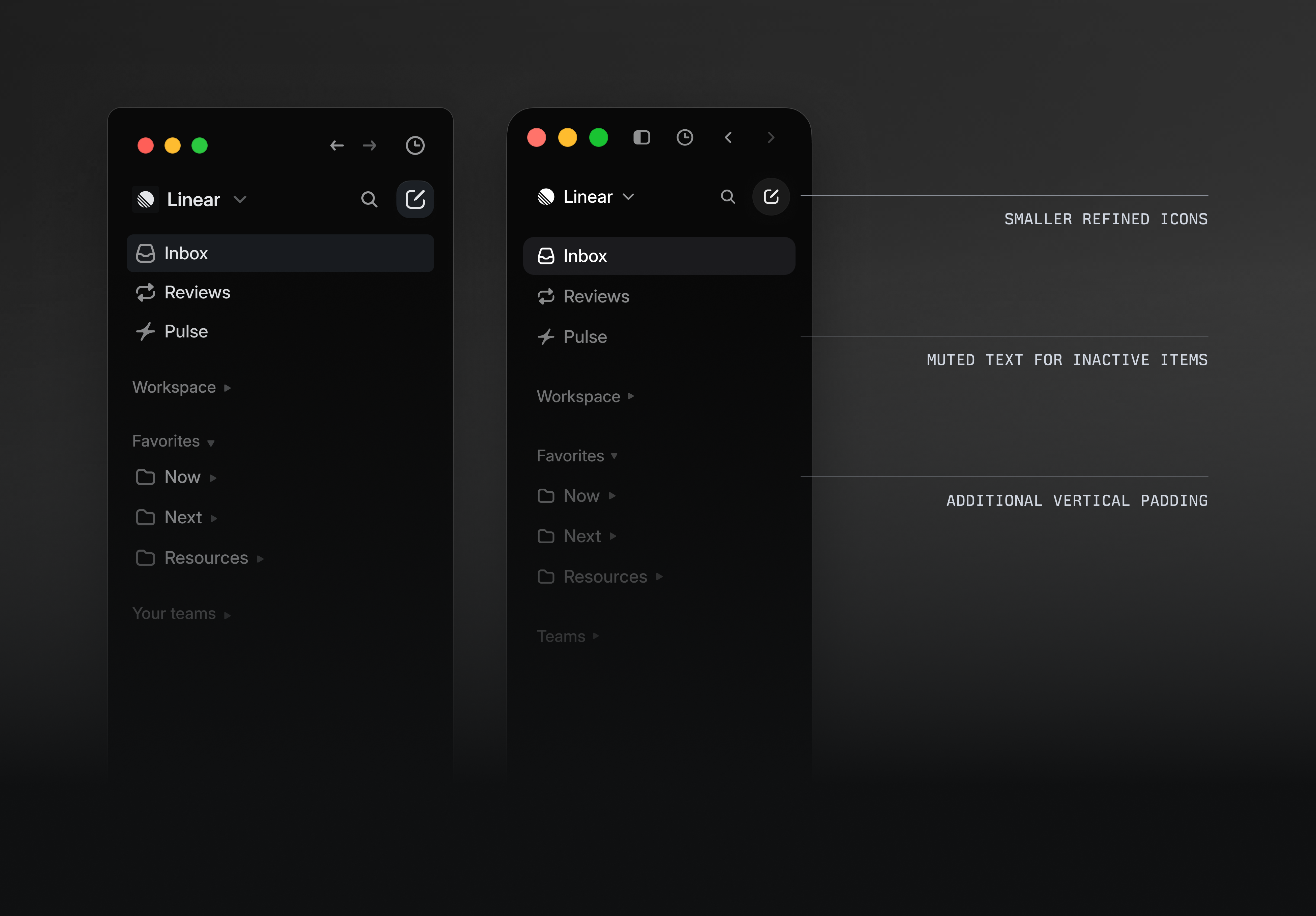
The sidebar was the most visible symptom. Originally built to orient users within the product, it had grown bright enough to remain visually prominent even after someone had already navigated where they needed to go. It kept competing for attention it had no reason to want. The tab bar at the top of the desktop app had spread to full width. Icon backgrounds had collected colors. Borders had multiplied without clear purpose.
None of this happened because of bad judgment. Each addition made sense at the time. The problem is that UI elements don't expire — they accumulate, and their combined weight is something no single decision ever voted for.
Two principles to cut with
Aufmann and Heckel, who had joined the codebase just two months before shipping this refresh, organized the work around two explicit design principles.
Principle 1: "Don't compete for attention you haven't earned." In an information-dense tool like Linear, not every element carries equal relevance to the user's current task. Elements central to what someone is actually doing should stay in focus. Elements that support orientation — the sidebar, borders, icon backgrounds — should recede once they've done their job. Competing for attention you haven't earned isn't just aesthetically noisy; it trains users to ignore parts of the interface, which means those elements can no longer signal anything when they do need to.
Principle 2: "Structure should be felt, not seen." 1 Borders and separators are a trap. They clarify relationships between UI sections, but they also add visual weight, and they tend to proliferate. Every time a new feature ships with its own boundary, the page gets a little more subdivided. The principle here isn't to remove structure — it's to push structure below the threshold of conscious perception, so users feel the organization without being distracted by the lines drawing it.
What actually changed
The refresh touched four areas 1:
Sidebar dimming. The sidebar was muted several notches. Inactive item text is now lower contrast. The goal is for the sidebar to fade into peripheral awareness once you're in it — present, but not assertive.
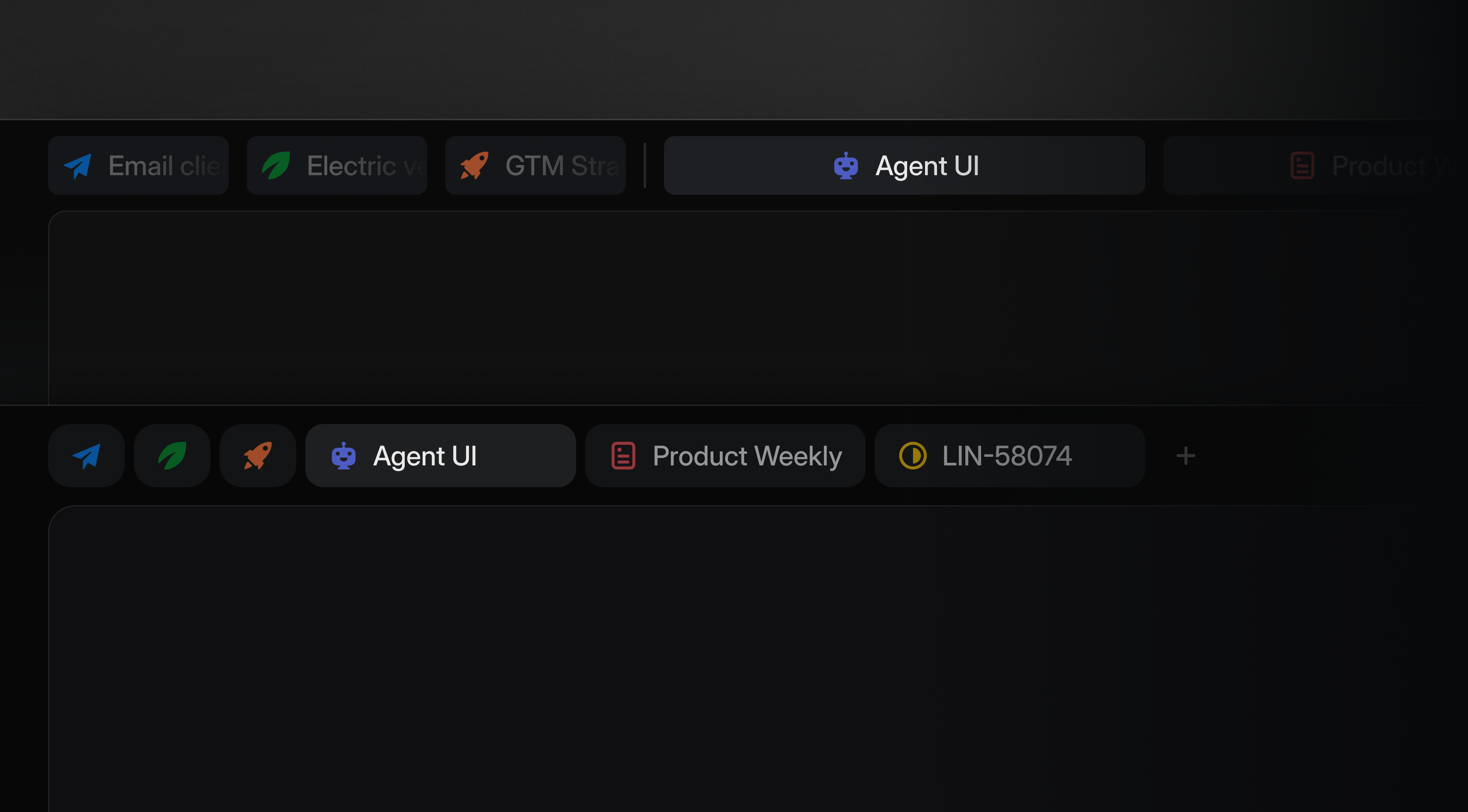
Tab bar compaction. The tab bar no longer spans full width. Tabs are now pill-shaped with rounded corners, and the first items in the bar use icon-only display. The result is a denser, quieter bar that carries the same information at less visual cost.
Border reduction. Edges were rounded, separator contrast was reduced, and unnecessary dividing lines were removed. Some structural cues that had been visible lines became implied spacing instead.
Color palette shift. The default color palette moved from a cool blue-ish gray to a warmer, less saturated gray. The change is subtle enough that most users wouldn't name it, but it pushes the interface slightly closer to neutral — less like a "software" color and more like a surface.
The two-person team built custom internal tooling to move faster: a dev toolbar with feature flag toggles for side-by-side comparison, and a color picker built with Claude Code that exposed hue, chroma, and lightness controls directly on individual design tokens. They used coding agents — Linear's own agent, Cursor, Codex, and Claude Code — to answer codebase questions and prototype ideas quickly.
The lens: visual hierarchy is a claim your UI makes
Here's what to carry into your own work.
Every element on screen is making an argument. It's saying: pay attention to me. Some elements have a strong case — they're on the user's current task path. Others are supporting cast. The problem is that supporting cast doesn't self-demote over time. You have to demote it deliberately.
Aufmann and Heckel put it plainly 1: "A big part of building good software is carefully pruning the product's edges, returning it to what is helpful and intuitive to users." Pruning is an active, recurring maintenance task — not a one-time design decision.
The invisibility signal is useful. If you ship a change and nobody notices, that's not a sign the work wasn't worth doing. For ambient UI elements — navigation, borders, structural chrome — invisibility is the success state. Users notice things that interrupt them. The goal is to stop interrupting.
Borders and separators accumulate by default. They're easy to add and rarely removed. Do a periodic pass asking: which of these lines are actually teaching the user something about the relationship between elements? The ones that aren't are borrowing visual attention without returning anything.
The instinct when a product feels cluttered is to add something — a better onboarding, a redesigned homepage, a new navigation pattern. Linear's move here was the opposite: a careful audit of what was claiming attention without earning it, followed by steady, deliberate subtraction.
"If most people don't immediately notice what changed, that's probably a good sign — most of what makes software feel good is what you aren't likely to see." — Charlie Aufmann and Maxime Heckel, Linear 1
このコンテンツについて、さらに観点や背景を補足しましょう。