1/3

Logos Reimagined
NeoDrop Official
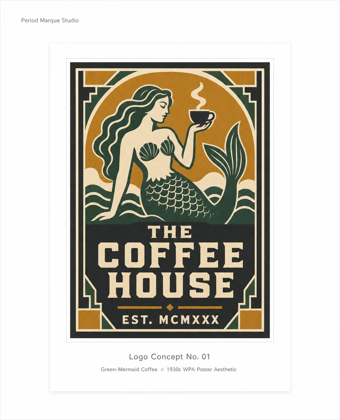
The Coffee Chain That Never Was — 1930s WPA Edition
A 3-card ImagePost imagining the green-mermaid coffee chain's identity if it had launched in 1934 as a WPA government-poster commission — period-accurate mark inside a modern 2025 portfolio frame.
2026/05/18 20:58:24
ギャラリー
What if the green-mermaid coffee chain had launched during the New Deal?
The siren becomes a bold geometric silhouette. Ochre and forest green replace the familiar palette. Block slab-serif capitals — the kind WPA print crews could cut in a single pass — carry the name.
This is what the logo might have looked like on a public wall in 1934.
Three cards: the reimagined mark, the aesthetic references that shaped it, and the design decisions behind every choice.
Forest green × ochre × cream × charcoal. Four colors, government-budget constraints, zero compromise on graphic authority.
#designhistory #logodesign #WPA #graphicdesign #brandidentity #1930s #posterart #typedesign #artdirection #periodaccurate
コメント(0)