Figma Slides Sections: the Named Anchor Navigation pattern
Figma shipped Sections for Figma Slides on May 18, 2026 — named slide rows that propagate into jump navigation in Presenter View, Audience View, and the Design Mode Layers panel. The teardown reveals that the spatial concept existed since launch in June 2024; what shipped was vocabulary formalization. Named pattern: Named Anchor Navigation — converting positional orientation into semantic orientation.

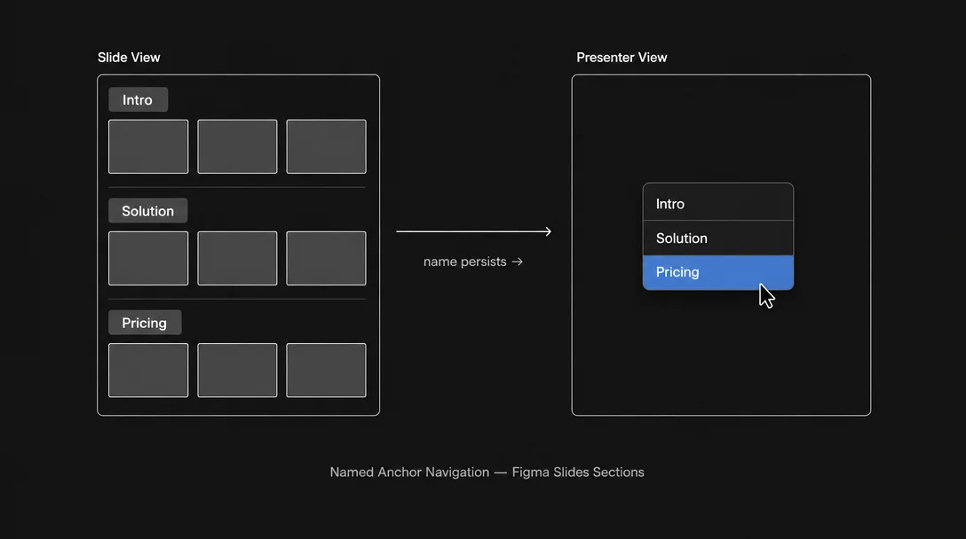
A deck has structure — a problem, a proposed solution, a set of evidence, a call to action. But until May 18, 2026, that structure lived only in the author's head and in the visual arrangement of rows in Figma Slides' Grid View. You could see the rows. You couldn't address them by name. 1
Sections changes one thing: it makes the deck's narrative structure addressable. You name a row, and that name propagates everywhere — to the Presenter View nav, to the Audience View jump menu, to the Layers panel in Design Mode. The slide row becomes a named anchor, not just a visual grouping. That is the entire feature. Let's pull it apart.
What Sections actually shipped
The official release note is precise: "Name your slide rows, drag to reorder them, and jump between sections directly from Presenter or Audience View. Sections also appear in the layers panel in Design Mode, so your deck stays easy to navigate as it grows." 1
Four capabilities in one sentence. Let's separate them.
Naming. A slide row in Slide View or Grid View can now receive a text label — a section title. This is authoring-time affordance. You're tagging the narrative beat ("Problem," "Solution," "Risks") at the structural level, not on an individual slide's content.
Drag reordering. Sections (as named rows) can be repositioned, which means restructuring the narrative arc doesn't require picking up individual slides. You move the whole story beat at once.
Jump navigation from Presenter and Audience View. During a live presentation, both the presenter and the audience (via the shareable link) can jump to any section directly. This is the runtime affordance — where the naming pays off. A client asks "can we go back to the pricing section?" The presenter clicks a name, not a thumbnail number.
Layers panel in Design Mode. When the presenter switches to Design Mode (Figma Slides' full-power design editing state, triggered with Shift+D), sections appear in the Layers panel, providing a structural overview of the deck alongside the fine-grained layer tree.
The feature is available to all Figma plans — no tier gate. 1
The three-surface anatomy
Sections express differently across Figma Slides' three primary surfaces. A PM worth their salt should be able to map any named feature across all the contexts in which it appears — so here is the full matrix.
| Surface | How sections appear | User action |
|---|---|---|
| Slide View / Grid View | Named row headers in the slide panel | Add name, drag to reorder rows |
| Presenter View / Audience View | Jump navigation — click a section name to skip directly to it | Navigate during live delivery |
| Design Mode (Layers panel) | Section labels as grouping nodes in the layer tree | Quick structural scan, layer selection |
The three-surface distribution follows a coherent logic: authoring → delivery → editing. Slide View and Grid View are where the author structures the deck. Presenter and Audience View are where the structure is used under pressure. Design Mode is where a designer or template builder needs structural orientation while working at the layer level.
This is not three separate implementations of the same feature. It is one data structure — the named row — rendered into the appropriate affordance for each user mode. The name you give in authoring shows up, unchanged, in the nav control during the presentation.
The terminology gap and what it reveals
Here is a detail that tells you something about the product history. The Figma Help Center article that the Release Notes link to — ostensibly the official documentation for this feature — still uses the term "slide groups," not "sections." 2 The document describes the drag-to-nest behavior in Slide View and the horizontal grouping in Grid View. It has not been updated to cover section naming, Presenter View jump navigation, or the Layers panel integration.
This is not an editorial oversight worth dismissing. It surfaces the product archaeology: "slide sections" appeared in the original Figma Slides launch blog in June 2024, written by PM Mihika Kapoor, describing what Grid View does — "Zooming out organizes slide sections in clear rows so that you can easily rearrange as you tighten the narrative, and changes are reflected when you jump between views." 3 The spatial concept was there. The naming layer — the ability to give those rows an explicit, user-authored label — was not.
What shipped on May 18 is the formalization of a concept the product already treated informally. The rows were sections. Now they have names. The terminology caught up to the mental model.
This matters for a PM reading this teardown: vocabulary gaps in your own product are often indicators of an unbridged concept. Users may already be working around a structural idea you haven't formalized. When they use workarounds (in this case: creating "section header" slides as visual markers inside a row), that's a signal the product acknowledges the concept implicitly but hasn't made it addressable.
The friction before the fix
Two weeks before Sections shipped, a different symptom was visible. Starting May 2, multiple users filed reports in the Figma Forum: dragging slides in Slide View's left thumbnail panel had stopped working. 4
Nine users confirmed the same failure within eight days — across macOS native app and browser (including Arc). One user described the workaround: "I might get one slide drag in before it stops working. And I find myself having to refresh the page and switching tabs to get the feature going again." 4 Another noted: "I have an urgent proposal to send out and it's making it really tricky to work with." 4 The team-side workaround was Grid View, which remained drag-functional.
The timing is not random. A drag-sort regression in Slide View, immediately before a release that formalizes drag-sortable named sections — the two events are almost certainly connected. The internal work to add section naming and drag-reordering at the row level likely touched the same interaction surface as the per-slide drag in the thumbnail panel. Whether the bug was a direct consequence of the Sections work or a coincidence, the overlap illustrates a common infrastructure risk: features that share a drag-and-drop interaction substrate will contend for the same event handling logic, and stabilizing one can temporarily destabilize the other.
For a PM: when you see a localized drag regression appear shortly before a feature release that involves drag, that's a hypothesis worth bringing to your eng team immediately, not after shipping.
The named pattern: Named Anchor Navigation
Named Anchor Navigation is the design decision to make a document's structural divisions explicitly addressable by a user-authored name — so that name becomes the shared vocabulary between author, audience, and the tool itself across all access contexts.
The contrast with the prior state is instructive. Before May 18, a Figma Slides user presenting a 40-slide deck to a client faced the same spatial navigation problem that any long-scroll document has: "jump to slide 22" is not a meaningful instruction in a presentation context; "jump to the competitive analysis section" is. Slide numbers are positional addresses. Section names are semantic addresses. The feature converts positional orientation into semantic orientation.
This is a pattern with broad applicability. Consider where it shows up elsewhere:
- Notion headers anchored with
#generate a document outline that allows deep-link navigation to any heading — the heading text is the named anchor - GitHub PR file-list uses file paths as named anchors so reviewers can jump directly to a specific changed file; the "Files changed" tab is a named anchor nav for a diff
- Linear projects use milestone names as structural anchors in the project timeline, allowing teams to navigate status around narrative beats rather than date-sequence positions
In all of these cases, the named anchor does two things simultaneously: it structures the author's thinking (you have to decide what the sections are called, which forces articulation of the narrative structure) and it creates a shared reference vocabulary for anyone consuming the document. "Let's look at the pricing section" is a sentence that works in a meeting, in a comment, in a Slack message — because the name is stable and shared.
Three conditions where Named Anchor Navigation applies:
The document is long enough that linear scrolling creates orientation cost. Under roughly 10 items or slides, numbered position works fine. Past that threshold, semantic names reduce the cognitive load of "where am I in the structure."
Multiple people interact with the same document in different roles. The author structures; the audience navigates; a designer edits; a collaborator comments. Each role needs to address the same structural location. A name anchors all of them to the same referent without each needing to maintain their own spatial map.
The structure has stable semantic identity, not just positional identity. If the sections are likely to move (narrative will be restructured, slides will be reordered), positional addresses (slide 12) become stale. Names survive reordering. Named Anchor Navigation is most valuable precisely in the "deck that keeps getting restructured before the big client meeting" scenario.
PM takeaway: Look at your own product's long-form documents, dashboards, or structured artifacts. Do users navigate them by position (scroll, page number, row index) or by concept (section name, step name, category label)? If your users have invented their own naming conventions — header slides, pinned comments, naming items "SECTION: X" — that's the vocabulary gap signal. They have already formed the mental model; the product hasn't caught up with the addressing layer. The cost to close that gap is usually low. The navigation lift it provides is not.
Figma Slides Sections is a small release. One sentence in the release notes, no blog post, no design story behind it. 1 But the feature closes a two-year-old concept gap in a way that changes the live delivery experience in a genuinely practical direction. A presenter who can say "let's jump to the risks section" and click a named control — rather than counting thumbnails — is a measurably more confident presenter. That is the whole product bet.
Cover image: AI-generated diagram
参考ソース
- 1Figma product news and release notes
- 2Add, delete, and organize slides – Figma Learn - Help Center
- 3Stack the deck with Figma Slides
- 4In Figma Slides, I can't rearrange slide order.
- 5Use design mode in Figma Slides – Figma Learn - Help Center
このコンテンツについて、さらに観点や背景を補足しましょう。