Notion's view switcher tab bar: what six icons and one dropdown negotiate every time you open a database
A close teardown of Notion's 40px view tab strip — the active-state underline, icon+label defaults, count-based overflow, layout modal design, toolbar whitespace grouping, and the per-user filter contract hiding behind every named view.
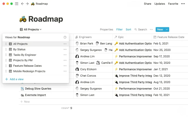
Open any Notion database and the first thing you read isn't a row or a card — it's a horizontal strip of tabs sitting just below the page title. Each tab is a named view: "All Tasks," "By Status," "Assigned to Me." To the right of the last visible tab, an overflow count reads "3 more…" At the far right, a tight cluster of utility icons — filter, sort, search, settings — precedes a "New" button. That strip is the subject of today's teardown.
The design decisions packed into this 40px-tall bar are anything but incidental. They encode Notion's answer to a genuinely hard problem: how do you give every team member a custom window into shared data without fragmenting the underlying record?
The tab bar: information hierarchy built into position
Look at the tab strip carefully. The active tab — "All Tasks" in the example — carries an underline and a slightly darker label weight. Inactive tabs are plain text at the same size. There's no background fill, no pill, no border-radius treatment: the entire active-state signal is a single bottom border line and a marginal weight difference.
This is a deliberate compression of visual hierarchy. The underline is borrowed from browser-style tabs, a pattern so learned that recognition is near-instant. By refusing a fill or pill shape, Notion keeps the tab strip from becoming its own visual block that competes with the content below. The hierarchy reads: page title → tab selection → data. Nothing in between.
The icon preceding each view name (a grid for Table, a board columns icon for Board, a calendar grid for Calendar) appears before the text and is tinted to match the tab's active/inactive state. The icon never appears without a label in the default configuration — a deliberate choice given that Notion supports 7 distinct view types. At this variety, icon-only tabs would require users to either memorize glyphs or hover to confirm intent. Label + icon reduces that cognitive load.
Notion gives each user the option to override this and show icon-only or label-only per database. The default is both. That the feature exists at all reveals the design team's awareness that teams with many well-named views will want to reclaim horizontal space. But the default errs toward comprehension over density.
Overflow: the "3 more…" decision
When a database accumulates more views than the current window width can accommodate, Notion collapses extras into an overflow affordance — the grayed-out "3 more…" text — rather than truncating, wrapping, or horizontally scrolling the tab strip. 1
The choice to show a count rather than a generic ellipsis ("…") is worth examining. "3 more…" communicates that there are exactly three hidden views — a PM can mentally audit whether the hidden set contains the view they want before clicking. A bare ellipsis offers no such signal. The count-overflow pattern appears in email clients and Slack for the same reason: when the hidden items are named, the count is free information.
What it doesn't do is indicate which three views are hidden — you can't scan the labels at a glance. That's the tradeoff. The overflow is optimized for the access pattern where you know your views by name and click confidently, not for visual discovery. A team onboarding their tenth view would need to rename views intentionally to make this work.
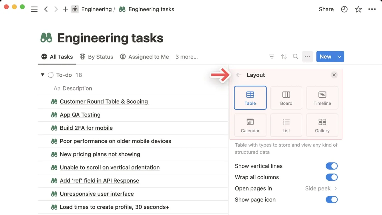
The layout picker: one modal doing two jobs
Click any view tab and a small popover appears with options to rename, duplicate, delete, copy link, and — most importantly — change the Layout. Click Layout and a 2×3 icon grid offers Table, Board, Timeline, Calendar, List, and Gallery. 2
The layout picker presents all six view types in a 2×3 icon grid. The active layout gets a blue border around its icon cell — not a checkmark. 2
The active layout gets a blue border around its icon cell — not a checkmark, not a filled background, but an outline. This is a spatial state signal: the selected layout is "contained" by its border while others remain flat. It reads as a selected radio button without the legacy form-element baggage.
Below the 2×3 grid, a short description line explains the selected layout's purpose in plain language: "Table with types to store and view any kind of structured data." This copy appears only for the currently hovered or selected layout. The progressive disclosure keeps the modal compact while surfacing the mental model for users who aren't yet fluent in Notion's layout vocabulary.
The modal also exposes per-layout settings inline — toggles for "Show vertical lines," "Wrap all columns," and a right-arrow chevron for "Open pages in." This is a meaningful state-management design choice: layout-level defaults live adjacent to layout selection rather than in a separate settings panel. The cognitive path is linear — pick layout, then adjust — without requiring navigation to a different screen.
The toolbar cluster: whitespace as grouping
To the right of the view tabs sits the toolbar: a filter funnel icon, a sort icon, a search icon, a "…" icon, and the "New" button. There are no dividers between these icons. Instead, they're spaced with uniform 8px gaps, and grouped from the database frame edge with a slightly larger margin.
The uniform gap does two things: it signals that filter/sort/search/settings are functionally related (they all mutate or query the current view state), and it separates them from the "New" button — which sits with an increased left margin plus its own blue filled background. The blue fill on "New" is the only filled-background color in the entire toolbar area. It claims attention hierarchy without any text explaining why it matters.
What's absent is also instructive: there's no "Save" button anywhere in the view bar. Changes to filters and sorts apply immediately and persist per-user, per-view without an explicit save gesture. 1 This eliminates a class of micro-decisions ("Did I save that filter?") at the cost of accidental persistence — a tradeoff Notion has consistently made in favor of reducing friction.
State changes: when active filters surface
The filter and sort icons have a subtle state change when active: a small colored dot or count badge appears alongside the icon. This is a low-loudness signal — it doesn't change the icon's size, color, or background; it adds exactly one piece of information: this view has an active constraint.
This matters for multi-person databases. A view with an active filter that isn't visually flagged would silently hide data from anyone who opens it. The badge makes the constraint visible without interrupting the reading experience. Compare this to Figma's approach of showing active layer states with inline badges on the panel, or Linear's filter bar that expands when active — Notion's implementation is on the quieter end of the spectrum, trading discoverability for visual restraint.
The per-user view state contract
One design decision that doesn't surface visually but shapes everything: in Notion, most filter and sort configurations are per-user by default rather than shared. 1 When you apply a filter to "All Tasks," you see the filtered version. Your colleague opens the same view and sees all rows.
This is the contract the view tab bar is silently upholding. The tab name itself ("All Tasks") describes the view's intent, not necessarily the current state for every user. The system trusts that shared views will carry meaningful names while allowing personal filters to adjust the lens without renaming. It's a coordination primitive that only works if teams develop naming conventions — Notion provides the mechanism, the workflow discipline is on the user.
For PMs, the design implication is real: any shared database view used for cross-functional status reviews should use "Save for everyone" filters explicitly. The per-user default is powerful for power users and invisible to anyone who doesn't know it exists.
What to take away
The Notion view switcher bar is roughly 40 pixels tall and contains at least five distinct design decisions worth naming:
- Underline-only active state keeps the tab strip from competing visually with data
- Icon + label defaults trade density for comprehension at 7-view variety
- Count-based overflow ("3 more…") gives free information before a click
- Layout modal combines type selection and per-layout settings in one surface
- Blue fill isolates "New" from query/utility icons using color alone, no dividers
None of these are accidents. Each one resolves a specific tension — between density and clarity, between flexibility and convention, between personal customization and team coordination. That's what makes them worth spending 10 minutes with.
123
このコンテンツについて、さらに観点や背景を補足しましょう。