Grid systems: the invisible structure behind every layout
Every layout decision lives on a grid — even when you can't see one. This article unpacks what grids are made of (columns, gutters, margins), the six main grid types, the history from Gutenberg to Müller-Brockmann to Figma, the 8pt grid standard for digital interfaces, and five rules every designer should keep.
Every design decision you make lives somewhere on a grid — even when you can't see it.
The blank canvas is a lie. Behind every well-structured poster, magazine spread, app screen, or dashboard is a deliberate system of columns, rows, and spacing rules that organizes visual information before a single element lands. Grid systems are that infrastructure: invisible when they're working well, immediately obvious when they're absent.
This article covers what grids are made of, the main types used across graphic design and UX/UI, the origins that still shape practice today, and the practical rules every designer should internalize.
What a grid actually is
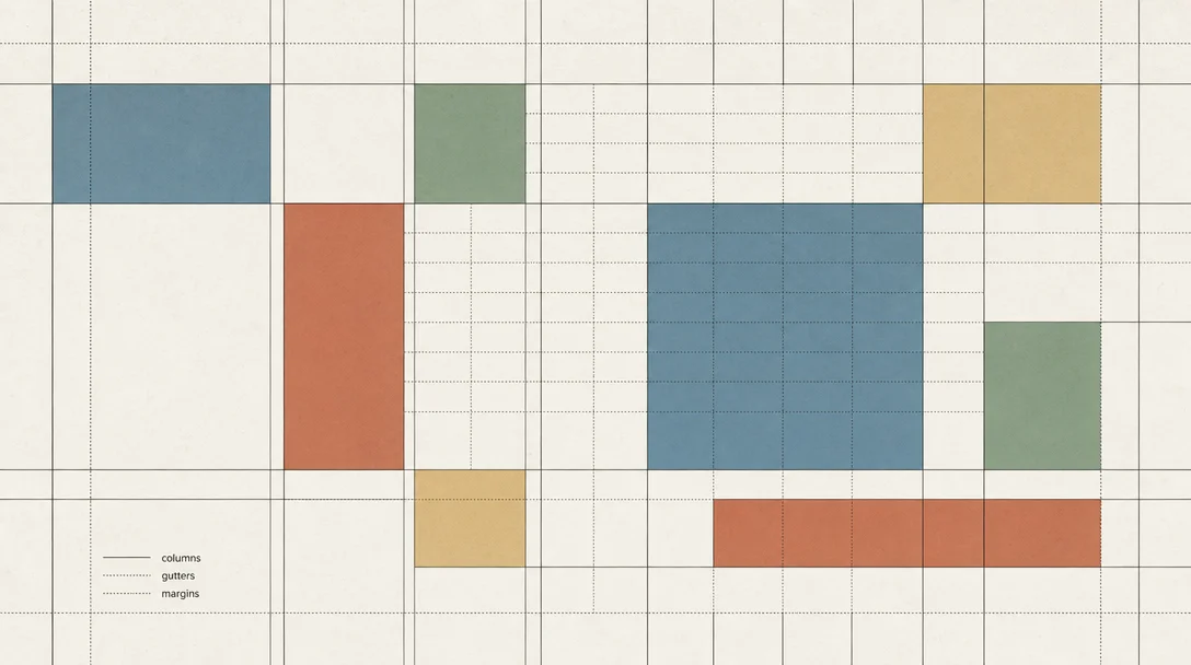
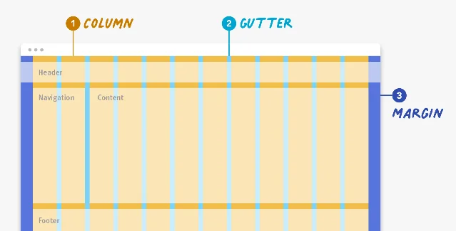
A grid is a framework of columns, gutters, and margins that defines where content can and cannot go on a surface. 1
Three parts make up any grid:
- Columns — the vertical fields that hold content. Column widths are typically defined as percentages rather than fixed pixels so layouts can reflow across screen sizes. A desktop layout might use 12 columns; a mobile layout 4.
- Gutters — the empty space between columns that visually separates adjacent content. Gutters are fixed-width values that can change at responsive breakpoints (wider screens warrant wider gutters).
- Margins — the outer padding on the left and right edges of the layout. Content lives in columns, never in margins.
That's it. Everything else — the choice of column count, gutter width, breakpoints, baseline rhythm — is configuration on top of those three fundamentals.
The main grid types
Six grid types cover most of what you'll encounter in print and digital work. 2
| Grid type | How it works | Typical use |
|---|---|---|
| Manuscript | Single-column text block with margins | Long-form books, essays |
| Column | Page split into 2–12+ vertical fields | Newspapers, magazines, web layouts |
| Modular | Columns plus horizontal rows, creating "modules" | Ecommerce listings, editorial spreads, dashboards |
| Baseline | Dense horizontal lines guiding text placement | Typography-heavy print; used in combination with column grids |
| Hierarchical | Irregular, content-driven arrangement | News homepages, editorial portfolios |
| Pixel | Individual pixel-level grid for digital screens | Icon design, pixel-precise UI work |
For most screen design the choice narrows to three: column (the daily workhorse), modular (when you're building repeatable content tiles), and hierarchical (when one element needs to dominate and content isn't uniform).
Where grids come from
Grid systems aren't a 20th-century invention. Simple column grids appear in the Dead Sea Scrolls (circa 150 BCE–70 CE), where columns organized long rolled documents into readable text blocks. 2 The Gutenberg Bible (c. 1454) uses a two-column grid — the first western book printed with movable type, constrained by the physical layout of metal letter blocks.
Newspapers through the 19th century pushed column counts higher, packing more content onto large broadsheet pages while keeping line lengths short enough to read.
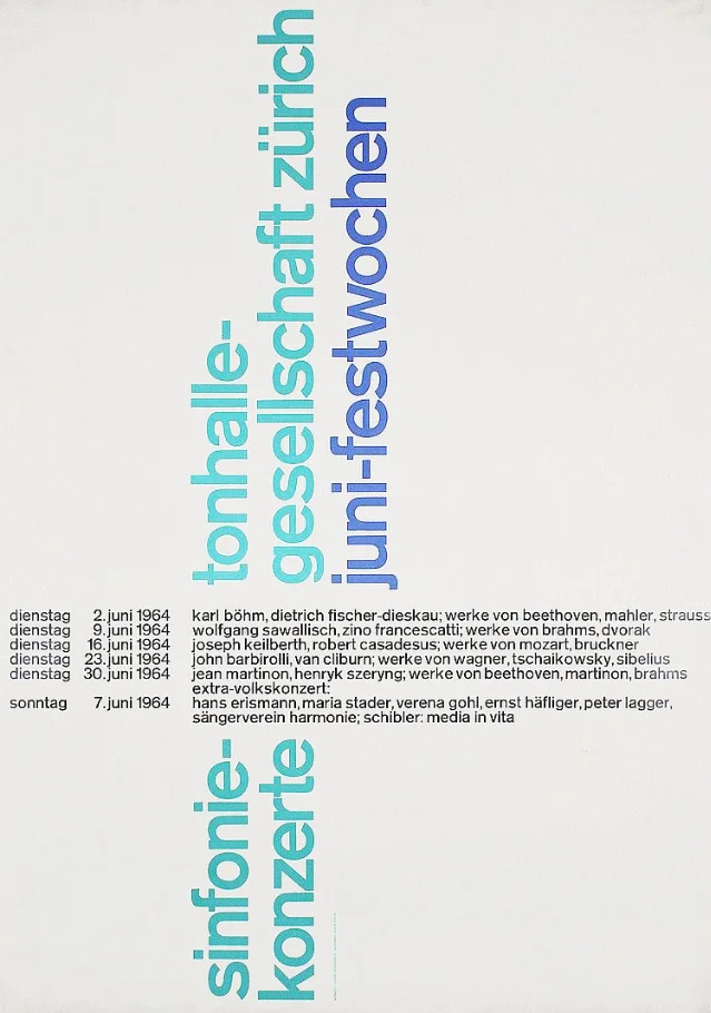
The practice was formalized in the mid-20th century by designers working in the Swiss International Typographic Style. Josef Müller-Brockmann is the name most associated with this shift. In his 1961 handbook Grid Systems in Graphic Design, he argued that grids were not just practical tools but a form of intellectual discipline — a way of making design decisions transparent, logical, and reproducible. 2
His most cited insight: the success of a grid depends not just on where elements sit within it, but on how the grid itself is positioned relative to its container — the choice of margins is as consequential as the choice of column count.
"The grid system is an aid, not a guarantee. It permits a number of possible uses and each designer can look for a solution appropriate to his personal style. But one must learn how to use the grid; it is an art that requires practice."— Josef Müller-Brockmann
Müller-Brockmann's contemporaries carried the work forward. Massimo Vignelli developed the "Unigrid" system for the U.S. National Park Service — a flexible modular structure that accommodated dozens of document formats. Wim Crouwel used grid-based constraints to develop experimental typefaces. Both treated the grid as generative, not restrictive.
Desktop publishing in the 1980s and 90s broke the physical constraints that had enforced grid discipline. Designers like David Carson deliberately subverted column structures — yet even Carson's most chaotic layouts preserved baseline alignment and left-right text boundaries, keeping some grid logic intact.
The 8pt grid in digital design
When grid systems migrated to screen interfaces, the most practical adaptation was the 8pt grid: size every dimension and spacing value as a multiple of 8 (8, 16, 24, 32, 40, 48…). 3
The reason is geometric. The majority of common screen resolutions are divisible by 8. On a device with a 2× retina display, an 8pt value renders as 16 physical pixels — clean, no sub-pixel rounding. On a 3× Super Retina display (like iPhone X at 3× scaling), the same 8pt value becomes 24 physical pixels — still exact. The math holds across virtually every device in use today.
Practically this means:
- Icons: design at 16×16, 24×24, 32×32, 40×40, 48×48 — all multiples of 8
- Spacing tokens: padding and margin values of 8, 16, 24, 32 are directly translatable from design tool to CSS
- Line heights: should be multiples of 8 (or 4, for finer control)
- Component heights: buttons at 32 or 40px, input fields at 40 or 48px
The 8pt system also serves as a communication protocol between designers and developers. 3 A developer can eyeball 8pt increments without measuring each time. Google's Material Design specification formalizes both 4px and 8px grid principles for exactly this reason. 1
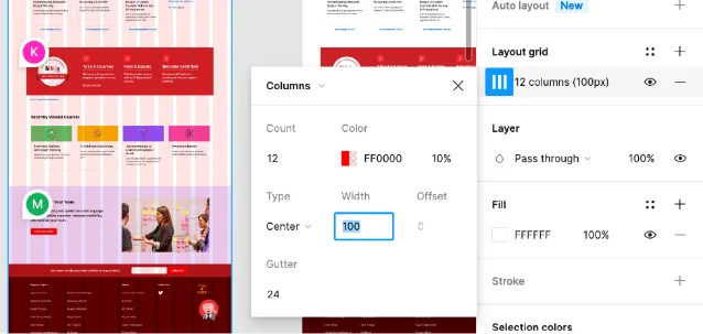
Tools like Figma make 8pt grid setup immediate: define column count, gutter width, and margin size once — the grid then enforces the system on every frame.
Responsive grids: how columns collapse
A grid is not a single configuration — it's a set of configurations tied to breakpoints.
The standard pattern: a 12-column grid at desktop scales down to a 8-column grid at tablet and a 4-column grid at mobile. 1 Content that spans 4 columns on desktop might span 8 on tablet (taking up more of the available grid) and span all 4 columns on mobile (full width).
This cascade means a well-designed grid does most of the responsive layout work automatically. Developers implement it through CSS Flexbox or CSS Grid, with breakpoints triggering column-count changes.
Bootstrap's default grid — 12 columns, 24px gutters, 60px margins on a 1440px desktop canvas — remains widely referenced because it aligns with the 8pt system and adapts cleanly to common breakpoints. 3
Five rules worth keeping
- Content lives in columns, not gutters. Elements should start and end at column edges, spanning across columns as needed. Gutters stay empty. 2
- Design the grid, don't just use one. The grid you open by habit is not necessarily the grid your project needs. Column count, gutter width, and margin decisions should follow from content requirements, not from the last project's settings.
- Margins set the relationship between content and container. Müller-Brockmann devoted significant attention to margin proportions — narrow margins read as dense and efficient, wide margins as airy and editorial. Neither is right by default.
- Baseline alignment is easy to skip on screen and hard to recover later. When text in adjacent columns shares a baseline, the layout reads as intentional. Without it, the page registers as slightly "off" even to viewers who can't explain why.
- Breaking the grid is a decision, not an accident. Some of the most effective layouts deliberately violate grid rules — images bleeding to the margin, elements spanning into the gutter — but only when the break serves a purpose (emphasis, tension, hierarchy). Accidental grid breaks read as error.
Grid systems compress thousands of individual layout decisions into a small set of rules applied consistently. That's their real value: not that they make design easier, but that they make design coherent. The same principle runs from a Dead Sea Scroll to a 12-column Figma frame — structure in service of readability.
Añade más opiniones o contexto en torno a este contenido.